Unlock the full potential of your Eduma theme with a custom layout menu! Our step-by-step guide will empower you to create an engaging and user-friendly experience. Transform your site into a vibrant learning hub that inspires and captivates. Dive in now!
How To Use Custom Layout Menu Eduma: Step-by-step Guide
Unlocking Creativity with Eduma: A Step-by-Step Guide to Custom Layout Menus
In the ever-evolving world of online education, creating an engaging and intuitive learning environment is paramount. As educators and course creators, you possess the power to transform lives, but are you harnessing the full potential of your platform? Enter Eduma, a premier WordPress theme designed specifically for educational institutions. With its robust features and user-friendly interface, Eduma empowers you to tailor your website to meet the unique needs of your audience.
One of the standout features of Eduma is the Custom Layout Menu, a tool that allows you to create navigational menus that not only enhance usability but also reflect your brand’s identity. Imagine a perfectly curated menu that guides your students effortlessly through your courses, resources, and support. In this article, we will walk you through a step-by-step guide on how to effectively utilize the Custom Layout Menu in Eduma, enabling you to elevate your online presence and inspire your learners like never before. Whether you’re a seasoned developer or a beginner, this guide will equip you with the skills needed to create a captivating and functional layout that resonates with your audience. Let’s embark on this journey together and unlock the full potential of your Eduma website!
Unlocking the Power of Custom Layout Menus in Eduma
Custom Layout Menus in Eduma provide an incredible opportunity to enhance the look and feel of your website. With the right approach, you can create a navigation experience that is not only visually appealing but also user-friendly. Here’s how to effectively utilize these menus to unlock your site’s full potential.
To begin with, it’s essential to understand the significance of custom menus. They allow you to:
- Highlight Key Pages: Direct your users’ attention to essential sections such as courses, blog posts, or contact information.
- Improve User Experience: A well-structured menu can streamline navigation, making it easier for visitors to find what they need.
- Enhance Branding: Custom menus can align with your branding strategy, reinforcing your website’s identity.
Creating a custom layout menu in Eduma is straightforward. Follow these steps for a seamless setup:
- Navigate to your WordPress dashboard and click on Appearance > Menus.
- Create a new menu by clicking on Create a new menu, naming it appropriately.
- Add desired pages, posts, or custom links to your menu structure.
- Assign the menu to a location in your theme, ensuring it’s visible on your site.
Once your menu is set up, consider customizing the layout further. Eduma allows you to style your menu using various options, including:
- Font Style: Choose fonts that align with your branding.
- Color Schemes: Use colors that resonate with your theme and make navigation intuitive.
- Hover Effects: Implement subtle animations to enhance user interaction.
To keep your visitors engaged, it’s also beneficial to analyze menu performance. By tracking user behavior through analytics, you can identify which links are performing well and which may need adjustment. This feedback is invaluable for refining your navigation strategy over time.
Here’s a quick reference table of key aspects to consider when designing your custom layout menu:
| Aspect | Tips |
|---|---|
| Menu Structure | Keep it simple and logical. |
| Visual Design | Use consistent colors and fonts. |
| Responsiveness | Ensure mobile-friendliness for all devices. |
| User Engagement | Solicit feedback and adjust based on user experience. |
By implementing these strategies, you will not only create a more effective navigation system but also foster a deeper connection with your audience. Empower your users to explore your site and discover everything you have to offer with a custom layout menu that resonates with both functionality and aesthetics.
Discovering the Benefits of a Tailored User Experience
In the realm of web design, understanding your audience is paramount. A tailored user experience allows you to match the unique preferences and behaviors of your users, creating a website that feels intuitive and engaging. By employing custom layout menus in Eduma, you can enhance functionality and aesthetics while increasing user satisfaction.
Imagine a platform where every visitor feels like the interface was designed just for them. This is achieved through:
- Personalization: Custom layout menus enable you to showcase content that resonates with specific user groups, making navigation effortless.
- Accessibility: A well-structured menu ensures that users can find what they need quickly, reducing frustration and improving retention rates.
- Brand Identity: Tailored experiences help in reinforcing your brand’s identity, as the layout can reflect your unique style and values.
Moreover, a customized menu can significantly enhance your site’s performance metrics. By organizing content effectively, you not only guide users to their desired information but also encourage them to explore more, thereby increasing engagement. This can lead to:
- Lower Bounce Rates: A clear navigation path keeps users on your site longer, reducing the likelihood that they will leave without engaging.
- Higher Conversion Rates: When users can easily find what they’re looking for, they are more likely to convert, whether that means signing up, making a purchase, or reaching out for more information.
To illustrate the impact, consider the following table showcasing before-and-after scenarios of user interaction with a customized menu:
| Metric | Before Customization | After Customization |
|---|---|---|
| Bounce Rate | 65% | 40% |
| Pages per Session | 2.5 | 4.7 |
| Conversion Rate | 1.2% | 3.5% |
Creating a tailored user experience through a custom layout menu is not just a technical enhancement; it’s a strategic investment in your audience’s satisfaction and loyalty. By prioritizing their needs, you foster a community of engaged users who see value in returning to your site. The steps to implement such a layout are straightforward, yet the benefits are profound, paving the way for a thriving online presence.
Step-by-Step Setup for Your Custom Layout Menu
To begin the journey of creating your custom layout menu with Eduma, head to your WordPress dashboard. Navigate to Appearance and then select Menus. Here, you will find the framework to build your unique menu that resonates with your brand.
Once you’re in the Menus section, you can start by creating a new menu. Enter a name that reflects the purpose of your menu, such as “Main Navigation” or “Footer Menu.” After naming it, click on the Create Menu button to proceed.
Next, it’s time to add items to your menu. You can choose from various options:
- Pages: Include essential pages like Home, About Us, and Courses.
- Posts: Link to your latest blog posts or specific categories.
- Custom Links: Direct users to external sites or specific resources.
- Categories: Help visitors find content based on their interests.
After selecting the items you want, click on Add to Menu. You can arrange the items by dragging and dropping them into your desired order. Don’t forget to create sub-items for a hierarchical structure by indenting them under a parent menu item!
Once your menu is organized, you can assign it to a location. Eduma offers multiple locations such as the primary navigation, footer, and mobile menu. Select the appropriate checkbox for the location you wish your custom menu to appear. Then, hit the Save Menu button to ensure your changes are applied.
For those who wish to enhance their menu further, consider using the Custom CSS option to style your menu to your liking. You can adjust colors, fonts, and sizes to make sure it stands out and matches your overall site aesthetic. Implementing a few lines of CSS can transform a standard menu into a remarkable one.
take a moment to preview your site. Ensure that all links are functioning properly and that the layout looks appealing on both desktop and mobile devices. This is your chance to make the final adjustments and create an unforgettable user experience. With your custom layout menu in place, you’re now ready to guide your visitors seamlessly through your educational offerings!
Choosing the Right Elements for Your Menu
When designing a menu for your Eduma site, it’s essential to select the right elements that resonate with your audience and enhance the user experience. A well-structured menu not only provides easy navigation but also reflects your brand’s identity. Here are some key considerations to keep in mind:
- Audience Needs: Understand who your users are and what they are looking for. Tailor your menu items to cater to their interests, whether they are students, educators, or administrators.
- Content Diversity: Include a mix of content types in your menu, such as courses, blog posts, events, and resources. This diversity can keep your audience engaged and returning for more.
- Clarity and Simplicity: Aim for clarity in your menu titles. Use straightforward language that communicates the purpose of each section quickly, ensuring users can find what they need without frustration.
Additionally, think about the hierarchy of your menu items. Organizing your menu in a logical order helps users navigate your site intuitively. Consider using dropdowns or mega menus to categorize related items, making it easier for users to discover relevant content.
| Menu Element | Purpose |
|---|---|
| Home | Provides a starting point for users to explore your site. |
| Courses | Highlights available learning opportunities. |
| Blog | Offers insights, tips, and updates to keep users informed. |
| Contact | Facilitates communication between users and administrators. |
Don’t forget about the aesthetics. Your menu should align with the overall design of your site, using colors, fonts, and styles that complement your brand. A visually appealing menu not only draws attention but also encourages users to explore further.
consider incorporating feedback mechanisms. Allowing users to provide input on menu usability can help you make informed adjustments, ensuring the menu evolves with your audience’s needs over time. By blending functionality with a user-focused approach, you’ll create an inviting environment that keeps users coming back.
Enhancing Navigation with Strategic Layout Design
Creating an intuitive navigation experience is essential for any educational platform, and using a custom layout menu can significantly enhance user interaction. With Eduma’s customizable layout menu, you have the flexibility to design a navigation system that resonates with your audience’s needs. This not only improves accessibility but also encourages users to explore more content.
To get started, consider the following key components in your layout design:
- Hierarchy: Organize your menu items based on importance and user behavior. Place the most critical sections at the top, making them easily accessible.
- Consistency: Maintain uniformity in your menu design across different sections of your site. This creates a cohesive experience and helps users navigate effortlessly.
- Visual Clarity: Choose contrasting colors and fonts that enhance readability. Use icons alongside text to provide quick visual cues for each section.
Incorporating these principles into your custom layout menu allows you to create a user-friendly environment. By utilizing Eduma’s built-in tools, you can easily adjust your menu layout to align with your branding. For instance, consider using a dropdown format to reduce clutter and provide a clean aesthetic while still giving users all necessary options at their fingertips.
Here’s a simple table to visualize how you can categorize your navigation items:
| Menu Category | Example Items |
|---|---|
| Courses | Mathematics, Science, Literature |
| Resources | Guides, Articles, Videos |
| Community | Forums, Events, Clubs |
| Support | FAQs, Contact Us, Live Chat |
Additionally, consider integrating search functionality within your layout. This empowers users to find what they seek quickly, thus reducing frustration and increasing satisfaction. A strategically positioned search bar can make a world of difference in the user experience.
don’t underestimate the power of feedback. Encourage your users to share their thoughts on the navigation experience. This can provide invaluable insights into how your layout is performing and where adjustments may be necessary to meet the evolving needs of your audience.
Incorporating Branding Elements for a Unique Touch
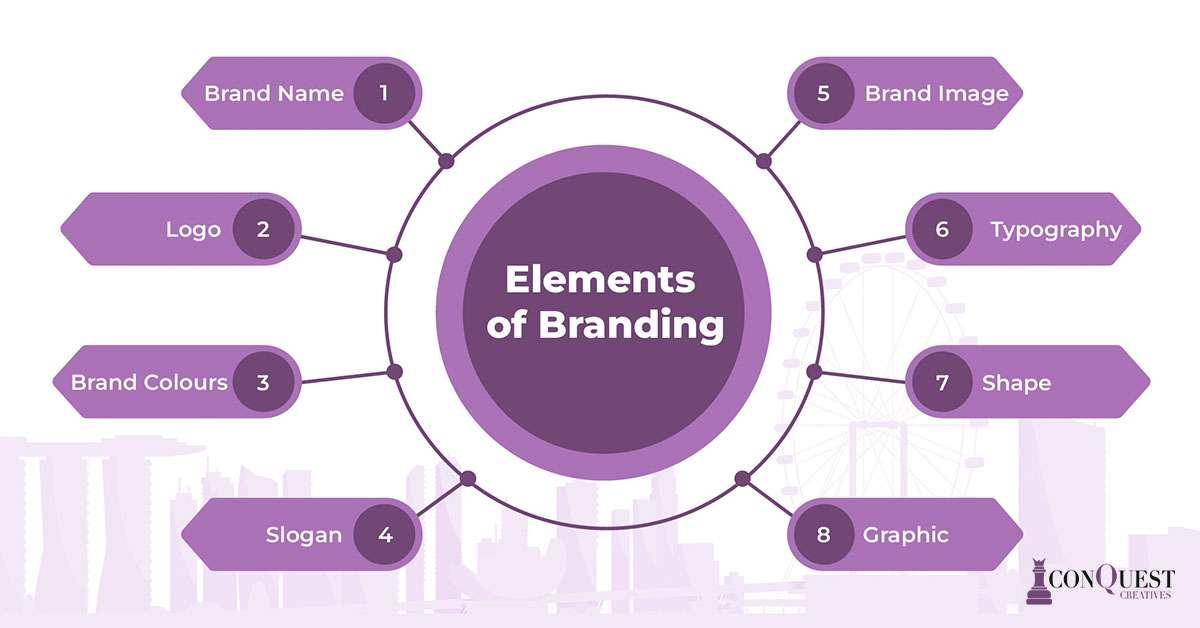
In the competitive landscape of online education, standing out is essential. By incorporating unique branding elements into your Eduma custom layout menu, you can create a memorable user experience that resonates with your audience.
Consider the following branding elements:
- Color Palette: Choose colors that reflect your brand’s personality. A cohesive color scheme can enhance visual appeal and improve brand recognition.
- Font Styles: Use distinct typography to convey your message effectively. Pairing a unique heading font with a readable body font can create a professional look.
- Logo Placement: Ensure your logo is prominently displayed in the menu. This reinforces brand identity and provides a point of reference for users.
- Custom Icons: Replace standard icons with custom ones that align with your branding. This small touch can significantly enhance the overall aesthetic.
To create a seamless integration of these elements, you can utilize CSS styles directly within your custom layout settings. For example:
.menu {
    background-color: #F5F5F5; /* Light background for contrast */
}
.menu a {
    color: #2C3E50; /* Dark text for readability */
    font-family: 'Open Sans', sans-serif; /* Consistent font style */
}
When designing your custom layout menu, think about the user journey. An intuitive layout can guide users toward important resources, enhancing their interaction with your brand. Consider creating a menu structure that includes:
| Menu Item | Description |
|---|---|
| Home | Your main landing page, showcasing top features. |
| Courses | A direct link to all available courses, easily accessible. |
| About Us | Information about your mission and team. |
| Contact | A section for users to reach out with inquiries. |
By thoughtfully designing your Eduma menu with these branding elements, you not only enhance aesthetics but also foster a deeper connection with your audience. A unique, personalized touch can transform a standard menu into a powerful tool for engagement and brand loyalty.
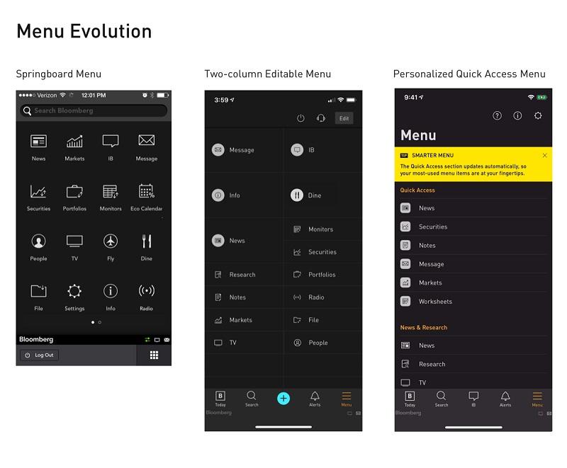
Tips for Optimizing Menu Usability and Accessibility
Creating a menu that is both usable and accessible is essential for enhancing the user experience on your site. By following some strategic design principles, you can ensure that your menu is not only visually appealing but also functional for all users. Here are some valuable tips to elevate the usability and accessibility of your custom layout menu.
- Prioritize Clarity: Use clear and concise labels for menu items. Avoid jargon or overly complex terms that may confuse users. Each label should accurately represent the content users will find on that page.
- Ensure Visual Hierarchy: Organize menu items in a way that highlights the most important elements. Use font sizes, colors, and spacing effectively to guide users naturally through the menu structure.
- Implement Keyboard Navigation: Make sure that all menu items can be accessed via keyboard shortcuts. This is crucial for users who rely on keyboards instead of a mouse, ensuring everyone can navigate your site with ease.
- Responsive Design: As users access websites from various devices, your menu should adapt seamlessly to different screen sizes. A responsive menu not only enhances usability but also improves accessibility for mobile users.
In addition to these tips, consider incorporating assistive technologies to cater to a broader audience. For instance, the use of ARIA (Accessible Rich Internet Applications) roles and attributes can significantly enhance the way screen readers interpret your menu. This creates an inclusive environment for users with visual impairments.
| Menu Element | Accessibility Tip |
|---|---|
| Dropdown Menus | Ensure they open on focus as well as click to aid keyboard navigation. |
| Icons | Accompany icons with text labels to provide context for screen reader users. |
| Color Contrast | Maintain high contrast between text and background to improve readability. |
Lastly, user testing is an invaluable part of the optimization process. Conduct tests with real users, including those with disabilities, to gather feedback. This will provide insights into areas that may need improvement, ensuring that your menu meets the needs of all users effectively.
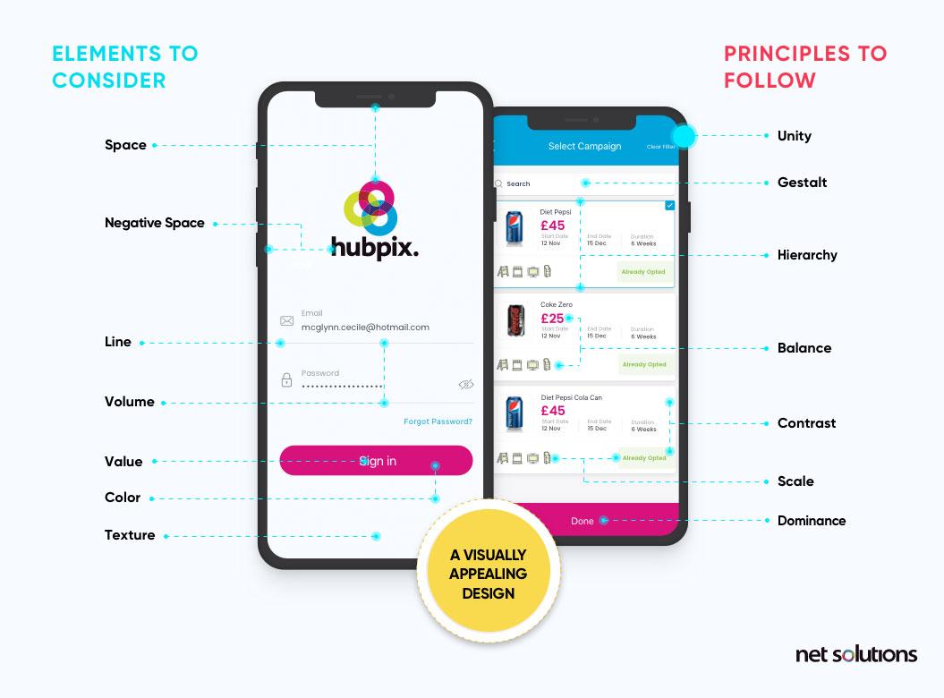
Designing a Mobile-Friendly Custom Layout Menu
Creating a mobile-friendly custom layout menu is essential for enhancing user experience and engagement on your site. With more users accessing websites through mobile devices, a responsive and visually appealing menu can make all the difference. Here are key considerations to keep in mind while designing your custom layout menu:
- Prioritize Simplicity: Aim for a clean design that makes navigation intuitive. Avoid cluttering the menu with too many options. Stick to the essentials and categorize items logically.
- Responsive Design: Ensure your layout adapts seamlessly to different screen sizes. Use CSS media queries to adjust the menu’s appearance for mobile devices, ensuring easy access with just a few taps.
- Touch-Friendly Elements: Make buttons and links large enough for easy tapping. A minimum target size of 44×44 pixels is recommended to accommodate users with varying finger sizes.
Incorporating a visually cohesive style is equally important. Here’s how you can achieve a striking yet functional menu:
- Consistent Branding: Use colors, fonts, and imagery that reflect your brand identity. This not only enhances aesthetics but also builds recognition.
- Use Icons and Labels: Combine text with intuitive icons to convey meaning quickly. This helps users navigate faster without scanning through lengthy text.
- Highlight Active Links: Use distinctive colors or styles to indicate which menu items are currently active. This provides users with a sense of direction and clarity.
Consider adding a collapsible menu feature. This not only saves screen space but also allows users to expand options only when needed, creating a cleaner interface. Implementing a hamburger icon can effectively signal this feature to users.
| Feature | Description |
|---|---|
| Hamburger Menu | Compact design that expands upon selection, saving space. |
| Sticky Navigation | Remains visible as users scroll, ensuring easy access to menu items. |
| Quick Access Links | Prominent placement of important links for faster navigation. |
don’t forget to test your design thoroughly. Use various devices and screen sizes to ensure that everything functions as intended. Gathering feedback from users can also provide valuable insights into potential improvements.
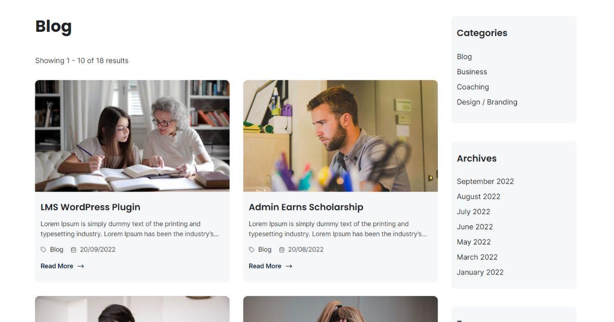
Utilizing Eduma’s Features for Maximum Impact
To harness the full potential of Eduma’s customizable layout menu, it’s essential to start with a clear vision of your site’s objectives. Begin by defining the core goals of your educational platform, which will guide the layout choices you make. Whether you aim to enhance user engagement, streamline course navigation, or boost enrollment rates, each decision should align with these goals.
Creating a User-Friendly Navigation Experience
One of the standout features of Eduma is its ability to create a user-centric navigation system. Consider the following when designing your custom layout menu:
- Prioritize Key Sections: Identify the most visited pages, such as Courses, About Us, and Contact. Ensure these are easily accessible from the main menu.
- Dropdown Menus: Utilize dropdowns to categorize courses or resources. This not only declutters the menu but also helps users find what they need quickly.
- Search Functionality: Integrate a search bar to enable users to locate specific courses or topics instantly.
Enhancing Visual Appeal
Your menu is not just a functional element; it should also reflect your brand’s identity. Eduma allows for extensive customization, including:
- Color Schemes: Choose colors that resonate with your brand and create a harmonious look across your site.
- Typography: Use fonts that enhance readability while being visually appealing. Consistent typography across the menu can significantly impact the user experience.
- Icons and Graphics: Incorporate relevant icons next to menu items to make navigation intuitive and engaging.
Testing and Iteration
Once your custom menu is live, it’s essential to collect feedback and monitor user interactions. Utilize analytics tools to track how users navigate through your site. Make adjustments based on this data to continually enhance the user experience. Consider conducting A/B testing to compare different layouts and determine which one performs best.
| Feature | Benefit |
|---|---|
| User-Centric Design | Improves navigation efficiency |
| Customizable Colors | Enhances brand recognition |
| Dropdown Menus | Reduces visual clutter |
| Search Functionality | Boosts user satisfaction |
By strategically utilizing Eduma’s custom layout menu features, you can create an impactful and engaging learning environment. Each aspect of your menu should serve a purpose and contribute to an enhanced user experience. Take the time to experiment with different designs and continuously seek user feedback to ensure your educational platform thrives.
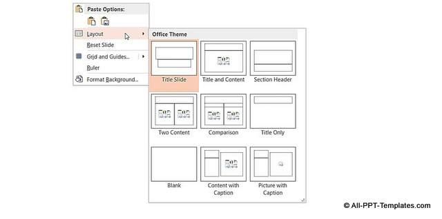
Testing and Tweaking Your Menu for Perfection
Creating a captivating menu is just the beginning of your journey to an exceptional user experience. Once your custom layout menu is in place, the real adventure begins: testing and tweaking. This phase is crucial in ensuring your menu not only looks great but also functions seamlessly. Start by gathering feedback from actual users. Their insights can help you identify any navigational issues or design flaws you might have overlooked.
Consider organizing a few usability testing sessions where you can observe users interacting with your menu. Take note of their reactions and where they seem to struggle. This firsthand information is invaluable and can guide your adjustments significantly. Here are some key areas to focus on:
- Navigation Flow: Ensure that users can easily find what they’re looking for without confusion.
- Visual Hierarchy: Check that the most important items stand out and attract attention.
- Mobile Responsiveness: Test how the menu adapts to different devices, as an increasing number of users browse on mobile.
Once you’ve collected feedback, implement small changes and observe their impact. Sometimes, a minor adjustment can make a significant difference. You might want to use A/B testing to compare different versions of your menu. For instance, you can change the placement of a critical item or alter colors to see which version resonates better with your audience.
As you refine your menu, keep an eye on analytics data. Tools like Google Analytics can reveal user behavior patterns, such as which links get the most clicks and where users drop off. Leverage this data to guide your tweaks further. A well-optimized menu is all about finding that sweet spot between aesthetics and functionality.
| Menu Element | Test Results | Action Taken |
|---|---|---|
| Home Button | High Click Rate | Maintain Current Position |
| Contact Us | Low Engagement | Reposition to Top |
| Blog Section | Moderate Interest | Enhance Visibility |
remember that the world of web design is ever-evolving. Regularly revisiting and refreshing your menu ensures it remains effective and engaging. Don’t shy away from experimenting with new trends or features that could enhance user experience. With each iteration, you’re not just tweaking a menu; you’re crafting a gateway to your content that invites users to explore and engage more deeply.
Engaging Users with Dynamic Menu Options
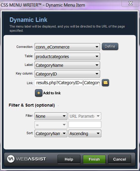
Creating an engaging user experience is essential for any online platform, and dynamic menu options play a significant role in achieving that goal. With Eduma’s custom layout menu, you can transform the way users navigate your site, making it not only easier for them to find what they need but also a more enjoyable experience overall.
The first step in utilizing dynamic menu options is to understand the user journey. Consider the various paths users may take when they arrive at your site. By offering customizable menu items tailored to their interests, you can significantly enhance their interaction with your content. Things to consider include:
- User demographics: Tailor menu options based on age, interests, and other identifying factors.
- Content priorities: Highlight courses, workshops, or resources that align with user needs.
- Seasonal updates: Rotate menu items to reflect current trends or upcoming events.
Implementing these dynamic menu options in Eduma is straightforward. Begin by accessing the menu settings in your WordPress dashboard. Here, you can easily drag and drop items to create a layout that makes sense for your audience. One effective strategy is to categorize courses or resources based on skill levels, ensuring that users can quickly find what aligns with their learning objectives.
Moreover, consider using visual elements within your menu. Icons and colors can guide users intuitively, making the navigation process more engaging. For instance, you might use:
| Menu Item | Icon | Description |
|---|---|---|
| Beginner Courses | 📘 | Perfect for those just starting out. |
| Advanced Workshops | 📗 | Designed for seasoned learners looking to deepen their skills. |
| Resources | 📚 | Access articles, videos, and more to aid your learning. |
Another powerful feature of Eduma is the ability to implement user-generated content. Allowing users to suggest menu items or vote on their favorites can make them feel more invested in the platform. This interactive element not only enriches the user experience but also fosters a sense of community among your learners.
Ultimately, the key to successful dynamic menu options lies in continuously monitoring user interaction. Utilize analytics tools to assess which menu items are most popular and adjust your offerings accordingly. By staying responsive to user needs, you can ensure that your menu remains a vibrant and essential part of your website.
Showcasing Success Stories: Inspiring Examples
Final Touches: Ensuring a Seamless User Journey
To create an exceptional experience for your users, every detail matters. The finishing touches can transform your site from merely functional to truly engaging. Here are several strategies to enhance your custom layout menu within Eduma, ensuring your visitors enjoy a seamless journey:
- Consistent Branding: Ensure that your menu reflects your brand’s aesthetic. Use colors, fonts, and styles that resonate with your overall design theme. This consistency fosters familiarity and trust.
- Intuitive Navigation: Your menu should guide users effortlessly to their desired locations. Group related items logically and consider using dropdowns for subcategories, reducing clutter and improving usability.
- Responsive Design: With a significant number of users accessing content on mobile devices, ensure your menu is fully responsive. Test its functionality across various devices to guarantee an optimal experience.
Another essential element to consider is the loading speed of your menu. A lagging menu can frustrate users and lead to high bounce rates. Optimize your menu by:
- Minimizing Image Sizes: Use compressed images to enhance loading times without compromising quality.
- Implementing Lazy Loading: Load menu items only when they become visible to the user, which can significantly improve initial loading speeds.
Additionally, consider the accessibility of your menu. A well-designed menu is inclusive for all users. To achieve this:
- Use Descriptive Labels: Ensure menu items clearly describe their destination.
- Keyboard Navigation: Make sure users can access all menu items using keyboard shortcuts for those who may rely on them.
| Menu Element | Best Practice |
|---|---|
| Main Navigation | Clear and concise labels |
| Dropdown Menus | Limit to 3-5 items |
| Mobile Menu | Toggle button for easy access |
gather feedback from users to continuously improve your layout. Implementing a feedback tool can provide invaluable insights into how users interact with your menu. Adjustments based on this data can lead to enhanced satisfaction and engagement, ultimately resulting in a more successful online platform.

Embracing Continuous Improvement for Future Success
In the ever-evolving landscape of e-learning and educational resources, the ability to adapt and improve continuously is crucial. By harnessing the power of custom layouts in Eduma, you can create a dynamic menu that not only enhances user experience but also fosters a culture of ongoing development within your educational platform.
To get started, consider the following key benefits of using a custom layout menu:
- Enhanced User Experience: A tailored menu structure allows users to navigate your site effortlessly, finding the resources they need without frustration.
- Increased Engagement: When learners can easily access content that resonates with their interests, they are more likely to engage deeply with the material.
- Brand Consistency: Custom layouts provide an opportunity to align the menu design with your brand identity, making your platform more recognizable.
- Flexibility and Scalability: A well-structured menu can grow with your offerings, accommodating new courses and resources as they become available.
Next, let’s explore the step-by-step process to implement your custom layout menu:
- Access the Theme Options: Navigate to the Eduma theme settings in your WordPress dashboard.
- Select Menu Layout: Choose the menu layout option that best fits your site’s design and user needs.
- Customize Menu Items: Add, remove, or rearrange menu items based on user feedback and evolving educational content.
- Preview Changes: Use the preview feature to see how your new menu looks and functions before making it live.
- Publish and Iterate: After launching your custom menu, gather analytics and user feedback to continuously refine and improve the layout.
| Menu Item | Purpose |
|---|---|
| Home | Landing page for new and returning users. |
| Courses | Direct access to course offerings. |
| Blog | Resources, tips, and community engagement. |
| Contact Us | Support and inquiries from users. |
Ultimately, the pursuit of excellence in your educational platform is an ongoing journey. By embracing a culture of continuous improvement, you not only enhance the functionality of your website but also enrich the learning experiences of your users. Strive to implement feedback and adapt to changing needs, ensuring that your custom layout menu evolves alongside your users’ expectations and educational advancements.
Frequently Asked Questions (FAQ)
Q&A: How To Use Custom Layout Menu Eduma – Step-by-Step Guide
Q1: What is Eduma and why should I consider using it for my educational website?
A1: Eduma is a powerful WordPress theme designed specifically for educational institutions, online courses, and e-learning platforms. It provides a professional, user-friendly interface that enhances the learning experience. By using Eduma, you can create a visually appealing and functional website that showcases your courses effectively, attracts more students, and elevates your institution’s online presence. Imagine the impact of having a website that not only looks good but also converts visitors into dedicated learners!
Q2: What is a Custom Layout Menu, and how can it benefit my site?
A2: A Custom Layout Menu allows you to personalize the navigation and layout of your website, making it more intuitive and engaging for your users. With this feature, you can organize your content in a way that highlights your courses, faculty, and resources prominently. A well-structured menu enhances user experience, keeps visitors engaged longer, and can significantly increase enrollment rates. Picture your potential students easily finding what they need to make an informed decision about their future!
Q3: How do I get started with customizing my layout menu in Eduma?
A3: Getting started is easier than you think! First, ensure you have the Eduma theme installed on your WordPress site. Navigate to the Appearance section in your dashboard, then click on Menus. Here, you can create a new menu or edit an existing one. Add items like course categories, blog posts, and important pages, and arrange them to fit your vision. Remember, your menu is like a roadmap for your visitors—guide them to their destination confidently!
Q4: Can I add icons or images to my Custom Layout Menu?
A4: Absolutely! Adding icons or images can make your menu visually appealing and help in branding your site. Use the built-in options in the Eduma theme to upload images or select icons from libraries. This not only enhances the aesthetic but also provides a quick visual reference for your visitors. Envision a menu that not only guides but also delights!
Q5: Are there any tips for making my Custom Layout Menu more effective?
A5: Certainly! Here are some tips to maximize the effectiveness of your Custom Layout Menu:
- Keep it Simple: Avoid clutter. Limit your menu items to the most essential links to improve navigation.
- Use Descriptive Labels: Choose clear, engaging names for menu items that resonate with your audience.
- Prioritize Accessibility: Make sure your menu is easy to access on all devices. A responsive design will cater to users on tablets and smartphones.
- Test and Iterate: After making changes, gather feedback from users to refine and enhance the menu further.
Q6: How can I ensure that my Custom Layout Menu aligns with my brand identity?
A6: To align your Custom Layout Menu with your brand identity, incorporate your brand colors, fonts, and logo into the menu design. Consistency is key; use the same visual elements throughout your site to strengthen your brand recognition. Think of your menu as a touchpoint—each interaction should echo your brand’s values and mission. Create an experience that resonates with your audience and leaves a lasting impression!
Q7: What if I encounter challenges while creating my Custom Layout Menu?
A7: If you face challenges, don’t hesitate to seek help! Eduma offers excellent documentation and support forums where you can ask questions and share experiences with other users. Additionally, consider reaching out to a web designer or a developer if you need tailored assistance. Remember, every challenge is an opportunity for growth and innovation. Embrace the learning process, and soon you’ll have a menu that not only meets your needs but exceeds your expectations!
Q8: How will using a Custom Layout Menu impact my online course enrollments?
A8: A well-designed Custom Layout Menu can significantly boost your online course enrollments. By making navigation intuitive and showcasing your offerings prominently, you make it easier for potential students to find and enroll in courses. Think of your menu as a sales funnel that guides visitors through their journey—from curiosity to commitment. With a few thoughtful adjustments, you could transform your site into a powerful enrollment machine!
Conclusion
Creating a Custom Layout Menu in Eduma is not just a technical task; it’s a strategic step towards enhancing the user experience and driving enrollment. By following this guide, you can craft a menu that reflects your brand, engages your audience, and ultimately inspires learners to embark on their educational journey with you. Dream big, act boldly, and watch your educational platform thrive!
Concluding Remarks
mastering the Custom Layout Menu in Eduma is not just about enhancing your website’s aesthetics; it’s about unlocking the full potential of your online learning platform. With the step-by-step guidance provided in this article, you now have the tools to create a seamless and engaging user experience for your students. Imagine the impact of a beautifully organized menu that not only reflects your brand’s identity but also simplifies navigation for your users.
As you apply these strategies, remember that every little change can lead to significant improvements in user engagement and satisfaction. Embrace the creativity that comes with customizing your layout, and let your vision shine through. The journey to a more dynamic and user-friendly educational website begins with you. So, take the leap, implement what you’ve learned, and watch as your online community thrives. Your dedication to enhancing the learning experience is not just commendable—it’s inspiring. Go ahead, transform your Eduma site today, and make a lasting impact on your students’ educational journeys!


