Struggling with column widths in WordPress? Don’t worry! Adjusting them is easier than you think. With just a few clicks, you can create a more visually appealing layout that enhances your site’s readability. Let’s dive in and transform your columns today!
How to Change Column Width in WordPress (Beginner’s Guide)
Introduction
Hey there, WordPress enthusiast! If you’ve ever tinkered with your website and found yourself frustrated by those stubborn column widths in your layout, you’re not alone. Adjusting the width of columns can feel like a daunting task, especially if you’re new to WordPress. But here’s the good news: it doesn’t have to be! In this beginner’s guide, we’ll walk you through the simple steps to change column widths in WordPress, making your site not only look better but also function more smoothly. Whether you’re aiming for a sleek, professional appearance or just want to showcase your content more effectively, mastering column widths is a game-changer. So, grab a cup of coffee and let’s dive in—your dream website is just a few clicks away!
Understanding the Importance of Column Width in Your WordPress Design
When it comes to crafting a visually appealing WordPress site, the significance of column width cannot be underestimated. It plays a crucial role in how content is perceived and consumed by your audience. If the columns are too narrow, your text may appear cramped, leading to a frustrating reading experience. Conversely, overly wide columns can make it difficult for readers to track lines of text, which could result in them leaving your site altogether.
One of the primary reasons for adjusting column width is to enhance readability. Research shows that the optimal width for text is between 50-75 characters per line. This range allows readers to scan the text comfortably without losing their place. By fine-tuning your column widths, you can ensure that your content is not just seen but also understood.
Column width also significantly influences the overall aesthetic of your website. A well-balanced layout that utilizes appropriate column widths can create a harmonious design, making your site more inviting. When your columns are proportionate, it not only looks professional but also encourages visitors to engage more with your content. Here are a few design tips to keep in mind:
- Use grid layouts: Aligning your columns within a grid system can enhance flow and visual appeal.
- Experiment with whitespace: The right amount of spacing can make your content more digestible and visually pleasing.
- Be consistent: Maintaining uniform column widths across various pages helps establish a cohesive brand identity.
In addition to aesthetics and readability, adjusting column width can also enhance your site’s functionality. For instance, if you have a sidebar on your blog, you’ll want to ensure it doesn’t overshadow your main content. A balanced column width allows for seamless integration of widgets and ads without compromising the user experience.
| Column Width | Impacts |
|---|---|
| Too Narrow | Cramped text, poor readability |
| Optimal (50-75 characters) | Enhanced readability, user engagement |
| Too Wide | Difficult line tracking, user frustration |
Ultimately, is about more than just aesthetics; it’s about creating a user-friendly experience that keeps your visitors coming back. By taking the time to adjust and perfect your column widths, you are investing in the overall success of your website.
Getting Started with the WordPress Editor: A Quick Overview
Changing the column width in WordPress is a straightforward process, but it can have a significant impact on your site’s layout and user experience. Whether you’re looking to create a spacious layout for your blog posts or a compact design for your product pages, understanding how to manipulate columns effectively is key. Let’s dive into the various methods you can use to adjust column widths with ease!
WordPress offers a couple of intuitive ways to change column widths. Here are some effective methods:
- Block Editor (Gutenberg): Utilize the block editor to create a flexible layout by adjusting the column settings directly within each block.
- Page Builders: Tools like Elementor and Beaver Builder provide drag-and-drop functionality, making it easy to resize columns visually.
- Custom CSS: If you’re comfortable with coding, you can add custom CSS to your theme’s stylesheet for more precise control over column widths.
Using the Block Editor
When working in the block editor, you can add a column block to your page or post. After adding your columns, simply click on the block settings in the right sidebar to adjust the width. You can choose different configurations such as:
| Column Layout | Width Ratio |
|---|---|
| 1 Column | 100% |
| 2 Equal Columns | 50% each |
| 3 Equal Columns | 33.33% each |
| 1 Wide Column & 1 Narrow | 75% / 25% |
Customizing with Page Builders
If you’re using a page builder plugin, adjusting column widths becomes even more visual and user-friendly. Simply drag the borders of your columns to resize them as needed. Most page builders also allow you to set responsive column widths, ensuring your website looks great on all devices.
For those who prefer a hands-on coding approach, adding a snippet of CSS code can help you set specific widths for your columns. Here’s a simple example:
        .custom-column {
            width: 40%; /* Set to your desired width */
            float: left;
            margin-right: 20px; /* Adjust spacing */
        }
Experiment with these methods to find what suits your style best. Remember, the goal is to create an aesthetically pleasing and user-friendly interface that keeps your visitors engaged!
Adjusting Column Width in Gutenberg: Step-by-Step Instructions
Adjusting the column width in Gutenberg is a straightforward process that can significantly enhance your content layout. With a few simple steps, you can create visually appealing sections that draw your reader’s attention. Here’s how you can do it:
First, you need to add a Columns block to your post or page. To do this, follow these steps:
- Click on the + icon to add a new block.
- Search for the Columns block or find it under the Layout Elements section.
- Select the desired column layout (you can choose from two, three, or four columns).
Once you have your columns in place, it’s time to adjust their widths. Each column in Gutenberg is fully customizable. Here’s how to modify the width:
- Click on the column that you want to adjust.
- On the right sidebar, you’ll find the Block settings panel.
- Look for the Column Width option, where you can select the desired width ratio (e.g., 2:1, 3:1).
In addition to adjusting the widths, you can also fine-tune the gaps between your columns. To achieve this, simply:
- Go to the Block settings panel.
- Find the Spacing options, and adjust the Column Gap as needed.
For a quick reference, here’s a table summarizing the common column width ratios and their visual impact:
| Ratio | Column Width | Visual Impact |
|---|---|---|
| 1:1 | Equal width columns | Balanced and uniform layout |
| 2:1 | Two-thirds and one-third | Emphasizes the left or right column content |
| 3:1 | Three-quarters and one-quarter | Focus on the primary content with a sidebar effect |
after adjusting your columns to your liking, don’t forget to preview your changes. Click on the Preview button to see how your adjustments will look on the live site. This step is crucial as it ensures that your layout appears professional and engaging to your audience.
Using Page Builders to Customize Column Width Effortlessly
When it comes to designing your WordPress website, achieving the perfect layout is crucial. Page builders have become a popular tool for users who want to customize their sites without needing to dive into code. With these intuitive drag-and-drop interfaces, changing the width of columns becomes a breeze. Here’s how you can make the most out of these powerful tools.
Most page builders, such as Elementor, Beaver Builder, and WPBakery, come equipped with options that allow you to adjust column widths easily. You can:
- Drag and Drop: Simply click and drag the column borders to resize them according to your preferences.
- Set Custom Widths: Input specific values in percentages or pixels to achieve the exact width you desire.
- Responsive Settings: Adjust the widths for different screen sizes to ensure your layout looks great on desktops, tablets, and mobile devices.
For visual learners, page builders often provide a live preview feature. This allows you to see how changes affect the overall layout in real-time. You can experiment with different column configurations without the fear of breaking your site. Imagine being able to adjust your content layout based on current trends or specific marketing campaigns with just a few clicks!
Another advantage of using these builders is the ability to create complex layouts without needing a developer’s help. You can combine multiple columns, implement background images, and use padding and margins to create a visually appealing design. Here’s a quick comparison of popular page builders:
| Page Builder | Ease of Use | Customization Options |
|---|---|---|
| Elementor | Beginner-Friendly | Extensive |
| Beaver Builder | Easy | Moderate |
| WPBakery | Moderate | Very Extensive |
By utilizing a page builder, you not only gain flexibility in adjusting column widths but also unlock a world of design possibilities. Don’t hesitate to play around with different layouts. Sometimes, a simple column width adjustment can significantly enhance the user experience and make your content stand out.
So, whether you’re creating a blog, portfolio, or e-commerce site, remember that customizing your column widths can help you achieve a professional and aesthetically pleasing design that resonates with your audience. Dive into the world of page builders and discover just how easy and effective it can be!
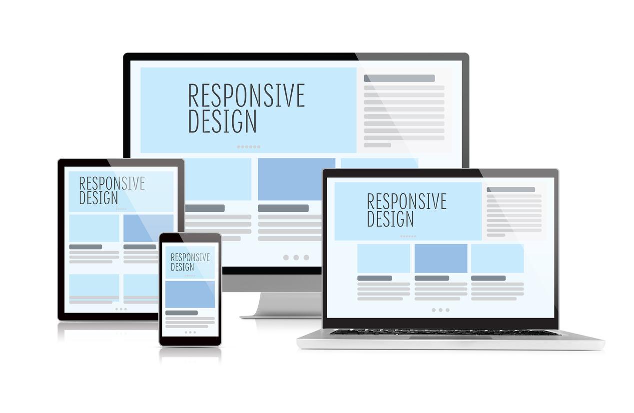
Tips for Ensuring Your Content Looks Great Across Devices
When it comes to ensuring that your content shines on every device, a few fundamental practices can make a world of difference. First and foremost, always adopt a responsive design. This means your layout should seamlessly adjust to different screen sizes, from smartphones to large desktop monitors. WordPress themes often come with built-in responsive features, but it’s good to double-check how your chosen theme behaves in various formats.
Next, pay special attention to your column widths. Too narrow, and your text can become hard to read; too wide, and it may strain the eye. A general rule of thumb is to keep your columns between 300 to 600 pixels wide on desktop and ensure they stack vertically on mobile devices. You can easily adjust these settings in the WordPress Customizer or through your page builder plugin.
To take your layout a step further, consider using media queries in your CSS. This allows you to apply specific styles to different device sizes. For instance:
 @media (max-width: 768px) {
   .your-column-class {
      width: 100%;
   }
}
This simple snippet will ensure your columns take up the full width of the screen when viewed on a tablet or mobile device, providing an optimal reading experience.
In addition to layout, be mindful of your font sizes and images. Use relative units like em or rem for fonts, as these will adjust according to the user’s preferences. For images, always use the “srcset” attribute to provide different resolutions based on the visitor’s device, ensuring quick load times without sacrificing quality.
| Device Type | Recommended Column Width | Font Size |
|---|---|---|
| Mobile | 100% | 16px |
| Tablet | 50% | 18px |
| Desktop | 33% | 20px |
don’t forget to test your content across multiple devices and browsers. Tools like Google’s Mobile-Friendly Test and BrowserStack can help you see how your site appears on different platforms, ensuring a consistent and appealing look everywhere. Consistency not only enhances user experience but also builds trust with your audience, keeping them engaged and encouraging them to return for more.

Exploring CSS for Advanced Column Width Adjustments
When it comes to fine-tuning the layout of your WordPress site, adjusting column widths can make a significant difference in how your content is perceived. Utilizing CSS for this purpose not only enhances the visual appeal but also improves user experience by making your content more accessible. With a few simple tweaks, you can create a layout that is both functional and aesthetically pleasing.
To start, it’s essential to understand the basic CSS properties that control column widths. The properties you’ll often use include:
- width: Defines the width of an element.
- max-width: Sets the maximum width an element can take, preventing it from stretching too far.
- min-width: Ensures that an element does not shrink below a specified width.
- flex: Used in flexbox layouts to control how space is distributed among items.
Here’s a quick example of CSS that adjusts column widths in a WordPress theme:
.column {
    width: 30%; /* Sets the column width to 30% of the parent container */
    float: left; /* Ensures the columns sit side-by-side */
    padding: 10px; /* Adds padding for better spacing */
}
For a more responsive design, you can use media queries to adjust column widths based on the device’s screen size. This is particularly useful for maintaining usability on mobile devices. Consider the following example:
@media (max-width: 768px) {
    .column {
        width: 100%; /* Stacks columns on smaller screens */
    }
}
Additionally, using CSS Grid can provide even greater control over column layouts. Here’s how you can define a grid-based column layout:
.container {
    display: grid;
    grid-template-columns: repeat(3, 1fr); /* Creates three equal columns */
    gap: 20px; /* Adds space between columns */
}
Lastly, if you want to see how your specific adjustments will look, implementing a simple table can help visualize your changes. Here’s a sample table showcasing different column width adjustments:
| Column Width Setting | Result |
|---|---|
| Width: 25% | Four columns side by side. |
| Width: 50% | Two columns side by side. |
| Width: 100% | Single column layout. |
With these techniques, you can explore the creative possibilities of column width adjustments in CSS for your WordPress site. By taking the time to experiment with different properties and layouts, you’ll ensure that your content looks great on any device, helping you to engage your audience more effectively.
Common Mistakes to Avoid When Changing Column Width
Changing column widths in WordPress can be a simple task, but there are several common pitfalls that many users encounter. Being aware of these mistakes can save you time and frustration. Here are some key points to consider:
- Neglecting Responsiveness: Always check how your column changes affect mobile views. A column that looks good on a desktop may not translate well on a smaller screen. Utilize tools like the WordPress Customizer to preview your changes in real-time.
- Ignoring Theme Compatibility: Different themes handle column widths differently. Make sure to test your adjustments across various themes to see how they align with your overall site design.
- Overlooking Padding and Margins: When adjusting column widths, remember to account for padding and margins. If you change a column width without considering these elements, the overall layout can become misaligned.
- Forgetting to Save Changes: It’s easy to make a series of changes and forget to save. Always ensure that you hit the update button to preserve your work. A good habit is to preview your changes before finalizing them.
Another common mistake is failing to utilize the built-in column settings provided by various page builders or the block editor. These tools often come with specific features that allow for more precise control over column width and layout.
| Common Issues | Solutions |
|---|---|
| Column width not uniform | Use consistent measurements or percentages |
| Elements overlapping | Adjust column width and spacing accordingly |
| Text clipping | Ensure sufficient width and check responsive settings |
| Inconsistent design | Align column width with overall theme style |
Lastly, always consider the user experience. Columns that are too wide or too narrow can make your content hard to read. Aim for a balanced look that enhances readability and engagement. Keep your audience in mind, and make adjustments that cater to their preferences.

Testing Your Changes: How to Preview and Publish with Confidence
Once you’ve made your adjustments to the column width in WordPress, it’s crucial to ensure that everything looks just right before going live. Taking the time to preview your site will help you spot any issues and make necessary tweaks without the pressure of public scrutiny.
To preview your changes:
- Navigate to the page or post where you made the column width adjustments.
- Click the Preview button. This is usually found at the top right corner of the editor.
- View the preview in a new tab or the same window, depending on your settings.
In the preview mode, check how your content appears across different devices. WordPress has a built-in responsive mode that allows you to toggle between desktop, tablet, and mobile views. This is an essential step because the same column widths that look good on a desktop might not be as effective on smaller screens.
Pay close attention to:
- Alignment: Ensure that your text and images are properly aligned within the columns.
- Readability: Check that the font size and style are easy to read against the new column widths.
- White Space: Look for adequate spacing between columns to avoid a cluttered appearance.
Once you’re satisfied with the preview, it’s time to publish your changes. But before you hit that Publish button, consider the following:
| Tip | Action |
|---|---|
| Check Browser Compatibility | Test on different browsers (Chrome, Firefox, Safari) to ensure consistency. |
| Ask for Feedback | Share the preview link with friends or colleagues for their opinion. |
| Backup Your Site | Consider creating a backup before making significant changes. |
Once you’ve taken these steps, you can confidently click that Publish button, knowing your column width adjustments will enhance your site’s aesthetics and functionality. Regularly revisiting your layout will keep your content fresh and engaging for your audience.
Final Thoughts: Making Your WordPress Layout Work for You
When it comes to optimizing your WordPress layout, understanding how to effectively change column widths can greatly enhance the user experience on your site. A well-structured layout not only makes your content more readable but also helps draw attention to key elements. By mastering column width adjustments, you can create a visually appealing and functional website that resonates with your audience.
Consider the following factors when adjusting your column widths:
- Content Type: Different types of content may require different layouts. For example, a blog post might benefit from wider text columns, while a product page may need narrower columns to showcase images and descriptions effectively.
- User Experience: Always prioritize user experience. Ensure that your columns don’t look cramped or overly stretched. A balanced layout can significantly improve readability and engagement.
- Responsive Design: Make sure your adjustments work well across all devices. A layout that looks great on desktops may not translate well to mobile screens. Use media queries to fine-tune your column widths for different screen sizes.
Here’s a simple table to illustrate how different column widths can affect layout aesthetics:
| Column Width | Use Case | Visual Impact |
|---|---|---|
| 50% | Standard blog layout | Balanced and easy to read |
| 33% | Sidebar with widgets | Effective for additional content |
| 75% / 25% | Content with a call-to-action | Focus on primary content while still providing an option |
Utilizing CSS can be an excellent way to refine your column widths even further. For example, adding custom classes or IDs can give you more control over the layout. Here’s a quick snippet to get you started:
.column-custom {
    width: 80%; /* Set a custom width */
    float: left; /* Allow columns to sit beside each other */
    margin-right: 20px; /* Spacing between columns */
}
Remember, experimentation is key. Don’t hesitate to play around with different settings until you find what works best for your content and audience. With a little creativity and strategic thinking, you can make your WordPress layout not just functional, but truly unique and reflective of your brand.
Frequently Asked Questions (FAQ)
Q&A: How to Change Column Width in WordPress (Beginner’s Guide)
Q1: Why should I care about column width in WordPress?
A1: Great question! The width of your columns can make a huge difference in how your content is perceived. Properly sized columns improve readability, enhance the overall layout, and can even impact user engagement. When your columns are too wide or too narrow, it can be hard for readers to follow along. So, if you want to keep your audience hooked, adjusting those columns is definitely worth your time!
Q2: How do I change column width in WordPress?
A2: Changing column width in WordPress is quite simple! Depending on your theme, you might have options in the block editor or through custom CSS. If you’re using the Gutenberg block editor, just select the column block you want to adjust, and drag the edges to resize. You can also enter specific widths in the block settings on the right panel. For a more customized look, adding a little CSS can do wonders!
Q3: Can I change column width for specific pages or posts?
A3: Absolutely! One of the great features of WordPress is its flexibility. You can change the column width on specific posts or pages without affecting the rest of your site. Just select the desired post or page, adjust the column settings, and you’re all set. This allows you to create unique layouts tailored to the content you’re presenting!
Q4: What if my theme doesn’t have options for changing column width?
A4: If your theme is a bit restrictive, don’t worry! You can always use custom CSS to adjust the column widths. Simply go to the “Customize” section in your WordPress dashboard, navigate to “Additional CSS,” and input your custom styles. There are plenty of online resources and tutorials to help you write the right CSS, so you can achieve the look you want!
Q5: Is there a plugin that can help me with column widths?
A5: Yes, indeed! There are several plugins designed to give you more control over your layout. Page builders like Elementor or Beaver Builder allow for easy customization of column widths and much more. These tools come with drag-and-drop features, making it super beginner-friendly. Plus, they often offer pre-designed templates, which can save you a lot of time!
Q6: Any tips for maintaining the balance of my layout while changing column width?
A6: Absolutely! When adjusting column widths, always keep the overall design in mind. Stick to a grid system to maintain balance and consistency across your pages. Make sure your columns complement the content without overwhelming the reader. It’s also a good idea to preview your changes on different devices to ensure it looks great everywhere!
Q7: How can I know if my changes are effective?
A7: The best way to know if your changes are effective is to gather feedback! You can ask friends or colleagues to review your site and provide their impressions. Additionally, keep an eye on your site analytics. If you notice an increase in time spent on the page or lower bounce rates, it’s likely that your adjustments are hitting the mark!
Q8: Any final advice for beginners?
A8: Don’t be afraid to experiment! Changing column widths is a fun way to personalize your website and improve user experience. Start small, make incremental changes, and always preview your work before publishing. Remember, your content is king, and the right layout can help it shine even brighter! Happy designing!
In Retrospect
And there you have it! Changing the column width in WordPress is as simple as pie once you know your way around the settings. Whether you’re looking to enhance your blog layout or optimize your website for a better user experience, mastering this skill can make a world of difference.
Remember, a well-structured and visually appealing site keeps your visitors engaged and coming back for more. So, don’t hesitate to play around with the column widths to find what works best for your content. If you have any questions or run into any hiccups along the way, feel free to reach out or drop a comment below—we’re all in this together!
Now that you’re equipped with this handy knowledge, go ahead and make those adjustments. Your readers—and your website—will thank you for it! Happy editing!


New Providers
Enjoy The Speed Of Downloading & Uploading With 1GBPS Port
Affordable Dedicated Servers & Colocation Services. Services: Dedicated Servers Colocation Private Cabinet Colocation DDoS Protection
Up to 85% off hosting + website builder

Latest News
- 8+ Free Construction Templates and Page DesignsJuly 11, 2026 16
- How to Create a Graphic Design Portfolio That Gets HiresJuly 11, 2026 16
- Otter Blocks 3.2.0: AI Page Building and a New Design LibraryJuly 11, 2026 15
- 11 Best Web Hosting Services for Developers 2026July 11, 2026 19
- How to Create a Webshop: A Step-by-Step GuideJuly 10, 2026 21

We specialize in providing Web hosting reviews. Where you can search for potential hosts.