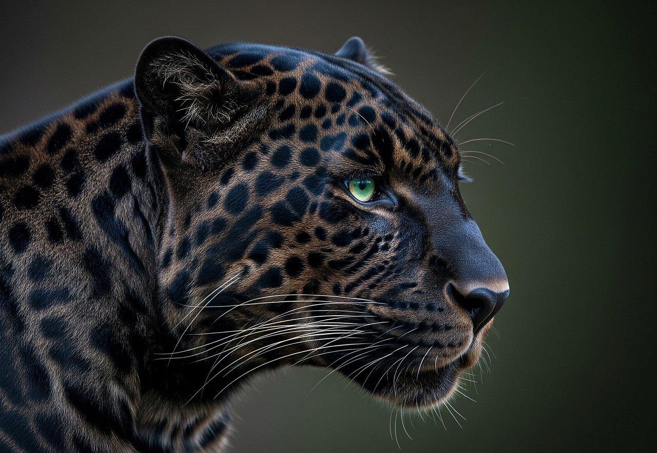
Looking to make your website pop? Adding a hero image is a fantastic way to grab attention! With just a few lines of CSS, you can create a stunning visual impact. Let’s dive into how to effortlessly elevate your site’s aesthetics!
How to Add a Hero Image With CSS
How to Add a Hero Image With CSS: Make Your Website Stand Out!
Are you ready to elevate your website’s visual appeal and capture your visitors’ attention right from the get-go? If so, you’re in the right place! Hero images are larger-than-life visuals that serve as the centerpiece of your web pages, drawing users in and setting the tone for their entire experience. In today’s digital landscape, where first impressions matter more than ever, having a stunning hero image can be the difference between a visitor bouncing away and sticking around to explore your content.
But don’t worry if you’re not a coding whiz! Adding a hero image using CSS is easier than you might think, and in this article, we’ll walk you through the process step-by-step. Whether you’re a seasoned developer or just starting out, we’ll provide practical tips and tricks to ensure your hero image looks fantastic across all devices. Let’s dive in and transform your website into a visual masterpiece that leaves a lasting impression!
Understanding the Importance of a Hero Image in Web Design
In the realm of web design, a hero image serves as the first impression any visitor has of your site. This large, eye-catching visual element is typically placed at the top of a webpage and can dramatically enhance the overall user experience. Here’s why a hero image is crucial:
- Visual Engagement: A striking hero image captures attention immediately, encouraging users to explore the content further.
- Brand Identity: It reflects your brand’s personality and values, creating a memorable connection with your audience.
- Information Delivery: A well-chosen image can convey your message or theme quickly, often more effectively than text alone.
- Emotional Impact: Images can evoke emotions, helping to create a sense of empathy and engagement with your visitors.
Moreover, incorporating a hero image into your design can significantly improve the visual hierarchy of your webpage. It allows for a clean layout where important information can be organized effectively. A hero image often acts as an anchor point that guides users through your content, making navigation smoother and more intuitive.
When implementing a hero image, consider the following aspects to maximize its effectiveness:
- Quality: Always use high-resolution images that look professional and polished.
- Relevance: The image should relate directly to your content, enhancing the message rather than distracting from it.
- Accessibility: Remember to include alt text for users with visual impairments, ensuring that everyone can appreciate your content.
To further illustrate the impact of hero images, consider the following table showcasing successful websites that effectively utilize hero images:
| Website | Hero Image Effect |
|---|---|
| Example Site 1 | Instantly draws users in with vibrant visuals that showcase their product. |
| Example Site 2 | Creates an emotional connection through imagery depicting human interaction. |
| Example Site 3 | Conveys a strong brand message with minimal text and powerful visuals. |
Ultimately, a well-executed hero image is more than just decorative; it’s a strategic asset in web design. By thoughtfully selecting and implementing a hero image, you can create an inviting and engaging experience that resonates with users, encourages interaction, and ultimately drives conversions.
Choosing the Right Dimensions for Your Hero Image
When it comes to selecting the perfect dimensions for your hero image, it’s critical to strike a balance between aesthetics and practicality. A well-sized hero image can captivate visitors right from the start, enhancing their overall experience on your website. However, choosing the wrong dimensions can lead to unwanted cropping or pixelation, undermining the quality of your design.
Consider the following factors when determining the dimensions:
- Device Responsiveness: Your hero image should look great on all devices, from desktops to mobile phones. A responsive design ensures that the image adapts seamlessly across different screen sizes.
- Aspect Ratio: Keeping a consistent aspect ratio (such as 16:9 or 4:3) helps maintain the image’s visual integrity. This is particularly important for a cohesive layout on your site.
- Content Focus: The dimensions should allow for key focal points within the image. Ensure that important elements aren’t cut off regardless of how the image is viewed.
To help you visualize the optimal dimensions, here’s a simple table showcasing popular aspect ratios and their recommended pixel sizes:
| Aspect Ratio | Width (px) | Height (px) |
|---|---|---|
| 16:9 | 1920 | 1080 |
| 4:3 | 1600 | 1200 |
| 1:1 | 1200 | 1200 |
Another important point is to consider file size. A large image file can dramatically slow down your website’s loading time, which can negatively impact user experience and SEO. Aim for a balance between quality and file size by utilizing modern image formats like WebP or compressing JPEG and PNG images without sacrificing too much quality.
Lastly, don’t forget to test your hero image across different browsers and devices. What looks perfect on your desktop may not translate the same way on a mobile device or a tablet. By testing rigorously, you can make adjustments to ensure that your hero image always makes a lasting impression.

Selecting the Perfect Image for Maximum Impact
Choosing the right image for your hero section can make or break your website’s first impression. A compelling hero image captures attention, evokes emotion, and communicates your brand’s message effectively. Here are some key considerations to keep in mind:
- Relevance: Ensure the image aligns with your content and resonates with your target audience. It should enhance your message rather than distract from it.
- Quality: Opt for high-resolution images that maintain clarity across devices. Pixelation or blurriness can diminish credibility and professionalism.
- Color Scheme: Choose images that complement your website’s color palette. Harmonious colors can evoke specific feelings and create a cohesive look.
- Emotion: Images that evoke strong emotions can help create a connection with your audience. Consider imagery that tells a story or captures a moment.
- Contrast: Ensure your text stands out against the hero image. Utilizing contrasting colors can improve readability and focus attention on your call to action.
When selecting an image, it’s also crucial to consider the file format and size. A well-optimized image not only improves loading speed but also enhances user experience. Here’s a quick comparison of popular image formats:
| Format | Best For | Pros | Cons |
|---|---|---|---|
| JPEG | Photographs | Good quality, smaller file size | Lossy compression |
| PNG | Graphics with transparency | Lossless compression, supports transparency | Larger file size compared to JPEG |
| SVG | Logos and icons | Scalable without loss of quality | Not ideal for complex images |
Don’t forget to test your hero image on various devices. A mobile-friendly design is crucial, as a significant portion of web traffic comes from smartphones. Ensure that your image scales well and maintains its impact across different screen sizes.
consider using CSS effects to enhance your hero image. Subtle overlays, animations, or parallax scrolling can add depth and intrigue, making your website more engaging. Remember, the hero image is the first thing visitors will see, so invest the time and effort to make it as captivating as possible.
Creating an Eye-Catching CSS Layout for Your Hero Image
Creating a stunning and effective hero image layout using CSS is essential for capturing your audience’s attention right from the moment they land on your webpage. A well-designed hero image sets the tone for your site and can enhance the overall user experience. Here are some key elements to consider when crafting your layout:
- Full-Width Design: Ensure your hero image spans the entire width of the viewport. This gives a dramatic effect and draws the visitor’s eye immediately.
- High-Quality Images: Use high-resolution images that are optimized for web use to maintain quality without sacrificing loading speed.
- Overlay Text: Add engaging text over the hero image to convey your message quickly. Use contrasting colors to ensure readability.
To achieve a polished look, consider using CSS properties such as background-size: cover; and background-position: center; for your hero image. This ensures that the image fills the space without losing its focal point.
Here’s a simple CSS snippet you can integrate:
.hero {
    background-image: url('your-image-url.jpg');
    background-size: cover;
    background-position: center;
    height: 100vh;
    display: flex;
    align-items: center;
    justify-content: center;
    color: white;
    text-align: center;
}
Don’t forget to make your hero section responsive! This means ensuring that it looks great on all devices, from desktops to mobile phones. A mobile-friendly layout can be achieved by using media queries:
@media (max-width: 768px) {
    .hero {
        height: 50vh;
    }
}
Lastly, consider adding a call-to-action (CTA) button that stands out. A brightly colored button with a clear message can significantly boost user engagement.
| Element | CSS Property | Purpose |
|---|---|---|
| Background Image | background-image | Sets the hero image for the section. |
| Image Size | background-size: cover | Makes the image cover the entire section. |
| Alignment | background-position: center | Centers the image in the viewport. |
| Height | height: 100vh | Sets the section’s height to full viewport height. |
Enhancing User Experience with Text Overlay Techniques
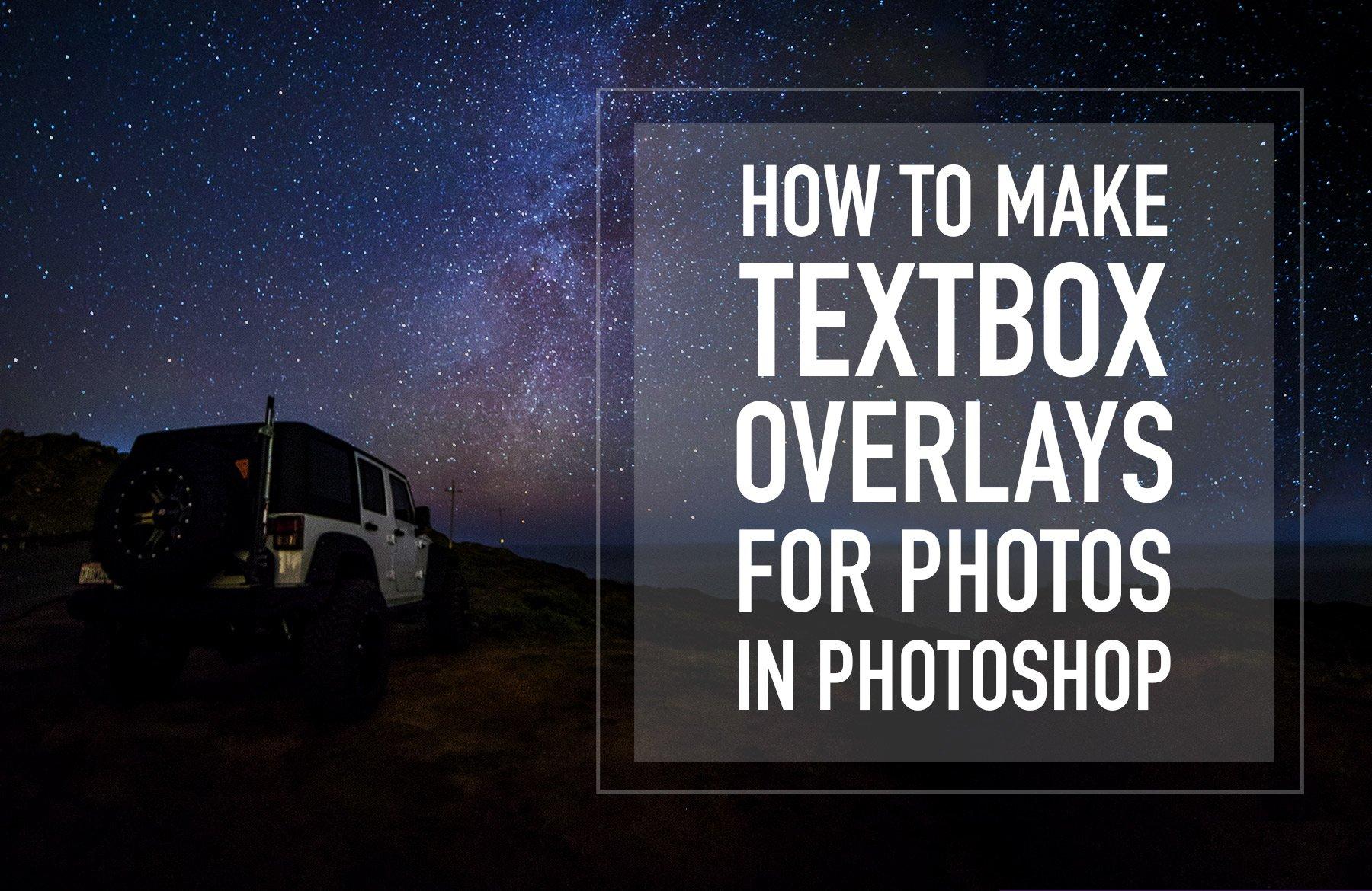
When it comes to creating an engaging hero image on your website, the text overlay is a crucial element that can dramatically enhance user experience. Well-implemented overlays not only draw attention to your content but also improve readability against various background images. Here are some techniques to consider when adding text overlays:
- Contrast is Key: Ensure your text stands out against the background by using contrasting colors. For instance, if your hero image is dark, opt for a light-colored font. CSS properties like
colorandbackground-colorcan help achieve this effect. - Shadow Effects: Adding a subtle text shadow can enhance legibility. Use the
text-shadowproperty in CSS to create depth and make your text pop against the image. - Opacity Layers: Consider implementing a semi-transparent overlay behind your text. This technique can soften the background image while ensuring your message remains prominent. Utilize the
rgbafunction in CSS for this.
Another important aspect to consider is the font choice and size. A bold, easily readable font will ensure that your message is communicated effectively. You might want to explore Google Fonts for a variety of options that can enhance your design.
| Font Style | Best Use |
|---|---|
| Roboto | Clean, modern look |
| Merriweather | Readable for longer texts |
| Montserrat | Bold headlines & call to action |
Lastly, consider the positioning of your text. Centering your text can work wonders for symmetrical designs, while left or right alignment may complement more dynamic layouts. Use the flexbox or grid properties in CSS to easily manage positioning and alignment for various screen sizes.
By utilizing these text overlay techniques, your hero images will not only captivate visitors but also guide them effectively through your content. Remember, an aesthetically pleasing design combined with practical functionality will keep users engaged and encourage them to explore your site further.
Utilizing CSS Properties for Responsive Design
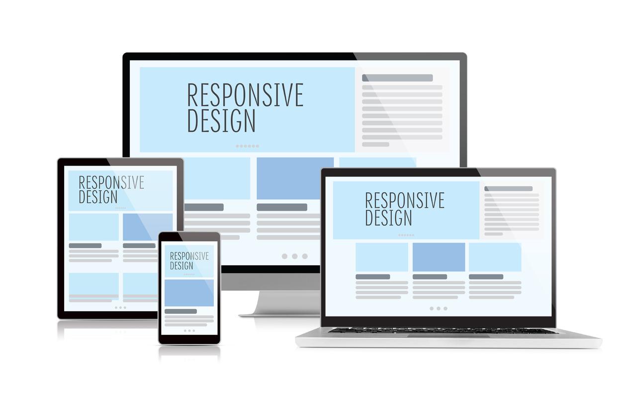
When it comes to making your hero image shine across various devices, leveraging CSS properties is essential for crafting a responsive design that captivates your audience. A hero image often serves as the first impression on your website, so ensuring it looks great on all screen sizes can significantly enhance user experience.
To start, consider using the background-size property. Setting this to cover allows your image to expand and fill the entire hero section, while maintaining its aspect ratio. This means that your image won’t be distorted regardless of the device it’s viewed on. Here’s a quick snippet:
hero-section {
    background-image: url('path/to/your/image.jpg');
    background-size: cover;
    background-position: center;
}
Next up is the media queries. These CSS rules enable you to apply different styles based on the viewport size, ensuring that your hero image adapts smoothly. For example:
@media (max-width: 768px) {
    hero-section {
        height: 300px; /* Adjust based on your layout */
    }
}
This snippet ensures that when the screen width is 768 pixels or less, your hero image height adjusts to keep it visually appealing and functional. You can adjust the height further for various breakpoints to ensure it always looks just right.
You may also want to implement the object-fit property if you are using an
img {
    width: 100%;
    height: 100%;
    object-fit: cover; /* Ensures the image covers the entire area */
}
consider adding a filter to your hero image to improve readability of any text overlay. For instance, a subtle dark overlay can help your text pop:
hero-section::before {
    content: '';
    position: absolute;
    top: 0;
    left: 0;
    width: 100%;
    height: 100%;
    background-color: rgba(0, 0, 0, 0.5); /* Dark overlay */
}
By combining these CSS techniques, you can create a visually appealing and responsive hero image that stands out on any device. Remember, the goal is to draw your visitors in, so invest the time in making that first impression count!
Incorporating Animation and Effects to Captivate Visitors
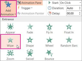
To create a truly captivating experience for your website visitors, integrating animation and effects can elevate your hero image from static to dynamic. Utilizing CSS, you can bring your hero image to life with smooth transitions, hover effects, and engaging animations that draw users in and keep them engaged.
Start by implementing a fade-in effect for your hero image. This subtle animation can be accomplished using CSS keyframes, creating an inviting ambiance as visitors land on your site. Here’s a simple example:
    .hero-image {
        opacity: 0;
        animation: fadeIn 2s forwards;
    }

    @keyframes fadeIn {
        to {
            opacity: 1;
        }
    }
Next, consider adding hover effects to enhance interactivity. This could be as simple as scaling the image or adding a color overlay when users hover over it. These effects not only make your site visually appealing but also encourage user interaction, enticing visitors to explore more of your content.
    .hero-image:hover {
        transform: scale(1.05);
        transition: transform 0.5s ease;
    }
Another powerful technique is introducing text animations over your hero image. Using CSS, you can animate headings or call-to-action buttons, making them pop as users scroll down. This not only enhances the visual hierarchy but also guides visitors to take action. Here’s a quick example of animating a heading:
    .hero-heading {
        animation: slideIn 1s ease-out forwards;
        transform: translateY(-20px);
        opacity: 0;
    }

    @keyframes slideIn {
        to {
            transform: translateY(0);
            opacity: 1;
        }
    }
For a more advanced approach, consider using CSS libraries such as Animate.css or AOS (Animate On Scroll). These libraries offer pre-built animations that you can easily integrate, saving you time while providing a polished look. Here are some features they offer:
| Library | Feature |
|---|---|
| Animate.css | Wide range of animations to choose from |
| AOS | Scroll-triggered animations for enhanced engagement |
remember that less is often more. While animations and effects can enhance the user experience, overdoing it can create distractions. Aim for a balance that enhances your hero image without overwhelming your visitors. Use animations to draw attention to key elements, ensuring that your design remains clean and navigable.

Testing and Optimizing Your Hero Image for Different Devices
When it comes to making a lasting first impression on your visitors, the hero image plays a crucial role. However, not all devices render images the same way. Testing and optimizing your hero image ensures that it looks stunning and functions well across different screen sizes.
Start by utilizing media queries in your CSS. This allows you to serve different images based on the device’s screen width. By doing so, you can tailor the appearance of your hero image for mobile, tablet, and desktop users:
@media (max-width: 600px) {
    .hero {
        background-image: url('hero-mobile.jpg');
        height: 300px;
    }
}
@media (min-width: 601px) and (max-width: 1200px) {
    .hero {
        background-image: url('hero-tablet.jpg');
        height: 500px;
    }
}
@media (min-width: 1201px) {
    .hero {
        background-image: url('hero-desktop.jpg');
        height: 700px;
    }
}
In addition to media queries, consider using image formats that are optimized for the web, such as WebP or JPEG-XR. These formats provide excellent quality at smaller file sizes, which is essential for fast loading times—especially on mobile devices. Here’s a quick comparison table of popular image formats:
| Image Format | Quality | File Size | Best Use |
|---|---|---|---|
| JPEG | High | Medium | Photos |
| PNG | Very High | Large | Graphics with Transparency |
| WebP | High | Small | Web Images |
| SVG | Scalable | Very Small | Logos and Icons |
After implementing these changes, it’s essential to test your hero image across various devices. Use tools like Google’s Mobile-Friendly Test or BrowserStack to emulate how your site appears on different screens. Pay attention to factors such as:
- Loading Speed: Ensure your images are not slowing down your site.
- Visual Impact: Check that your hero image maintains its appeal regardless of screen size.
- Responsiveness: Verify that the image resizes correctly without distortion.
By continuously testing and optimizing your hero image, you’ll create a visually appealing experience that keeps users engaged, regardless of their device. Don’t underestimate the power of a well-implemented hero image—it’s your chance to make a strong statement right from the start!
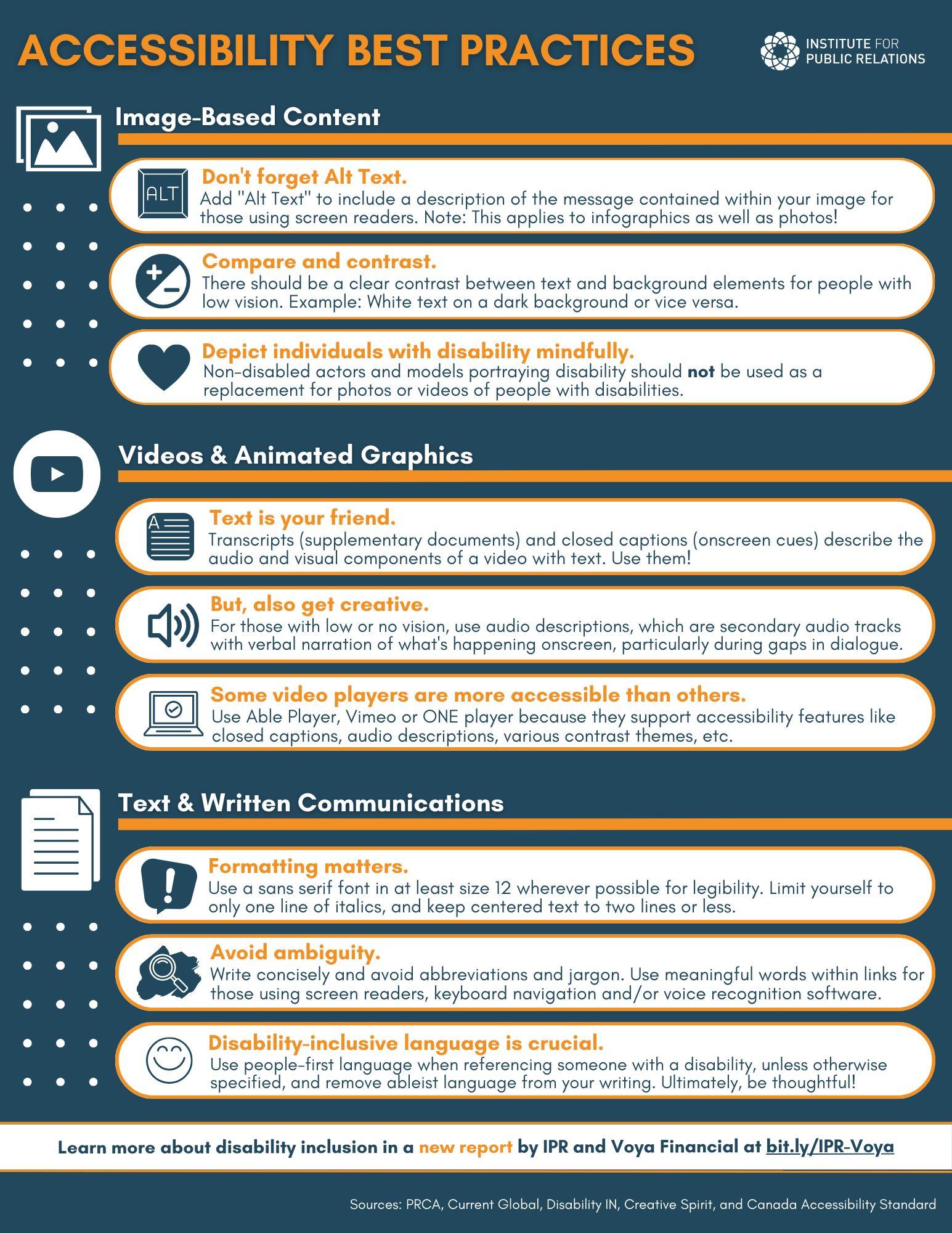
Best Practices for Accessibility and Performance
When adding a hero image with CSS, it’s essential to consider both accessibility and performance to create an inclusive and efficient web experience.
1. Optimize Image Size: Large images can significantly slow down your site. Use tools like TinyPNG or ImageCompressor to reduce file sizes without sacrificing quality. Aim for images that are no larger than necessary for their display size.
2. Implement Responsive Design: Ensure your hero image looks great on all screen sizes. Use CSS media queries to serve different image sizes based on the device. For instance:
@media (max-width: 768px) {
    .hero {
        background-image: url('small-image.jpg');
    }
}
@media (min-width: 769px) {
    .hero {
        background-image: url('large-image.jpg');
    }
}
3. Use Alt Text Wisely: Always add descriptive alt text to your images. This not only aids those using screen readers but also improves your SEO. A good alt text example might be: “A breathtaking sunset over the mountains, providing a serene backdrop for adventure”.
| Best Practice | Description |
|---|---|
| Image Formats | Use formats like JPEG and WebP for better quality and compression. |
| Lazy Loading | Implement lazy loading to improve page speed for images below the fold. |
| Color Contrast | Ensure text overlay on hero images has sufficient contrast for readability. |
4. Choose the Right CSS Properties: Use properties like object-fit and background-size to maintain image quality while adjusting to different screen sizes. For example:
.hero {
    background-image: url('hero-image.jpg');
    background-size: cover;
    object-fit: cover;
}
By following these practices, you can create an engaging hero image that not only enhances visual appeal but also ensures that your website remains accessible and performs optimally across all devices.

Final Thoughts on Elevating Your Website with a Hero Image
Implementing a hero image on your website can be a game-changer in how visitors perceive your brand. It’s not just about aesthetics; it’s about creating a powerful first impression that captures attention and communicates your message effectively. A well-chosen hero image can evoke emotions, tell a story, and guide users toward taking action.
When selecting a hero image, consider the following:
- Relevance: Ensure that the image aligns with your brand’s identity and the content of your site.
- Quality: Opt for high-resolution images to maintain a professional look.
- Emotional Impact: Choose visuals that connect with your audience on a deeper level, sparking interest and engagement.
Once you’ve selected the perfect image, the next step is to use CSS to ensure it displays beautifully across different devices. Here’s a simple breakdown of essential CSS properties to get you started:
| CSS Property | Description |
|---|---|
| background-image | Sets the hero image as the background. |
| background-size | Ensures the image covers the entire area without distortion. |
| height | Defines the height of the hero section, creating a striking visual impact. |
| position | Allows for precise placement of the image within the hero section. |
Responsive design is crucial, so make sure your hero image adapts to different screen sizes. Using media queries in your CSS can help maintain the visual integrity of your hero image on mobile devices, tablets, and desktops. By setting breakpoints, you can adjust the image size and layout to ensure it looks stunning no matter how your audience accesses your site.
don’t underestimate the power of text overlay on your hero image. Using compelling headlines, subheadings, or calls-to-action can enhance the impact of your hero image. Make sure the text is legible against the background by utilizing contrasting colors, shadows, and overlays. This not only improves readability but also draws attention to your key messages.
Elevating your website with a hero image is about marrying creativity with functionality. By investing time in choosing the right image, employing effective CSS techniques, and considering responsive design, you can significantly enhance user experience while conveying your brand’s essence. Start experimenting today and watch how a simple yet powerful visual can transform your online presence.
Frequently Asked Questions (FAQ)
Q: What exactly is a hero image?
A: A hero image is a large, eye-catching image that typically sits at the top of a webpage. It’s designed to grab visitors’ attention and set the tone for the content that follows. Think of it as the digital equivalent of a captivating movie poster—it’s your chance to make a great first impression!
Q: Why should I use a hero image on my website?
A: Using a hero image can significantly enhance your website’s visual appeal. It helps establish your brand identity, engages users immediately, and can even convey important messages or calls to action. Essentially, it’s a powerful tool for storytelling and can lead to higher engagement rates.
Q: How do I actually add a hero image using CSS?
A: Adding a hero image with CSS is pretty straightforward! First, you need to select the HTML element you want to apply the image to. Then, you can use the background-image property in your CSS. Here’s a quick example:
css
.hero {
  background-image: url('path/to/your-image.jpg');
  background-size: cover; / This will resize the image to cover the entire element /
  height: 400px; / Adjust this to your desired height /
}
By setting the background-size to cover, you ensure that the image covers the entire area without distortion. Pretty easy, right?
Q: What are some tips for selecting the right hero image?
A: Absolutely! Here are a few tips:
- Relevance: Choose an image that reflects your brand or message.
- Quality: Go for high-resolution images to ensure clarity.
- Color and Mood: Think about the emotions you want to evoke. Bright, warm colors often feel inviting, while cooler tones can convey professionalism.
- Not Too Busy: Avoid cluttered images that can distract from your message or call to action.
Q: Can I make my hero image responsive?
A: Yes, and you absolutely should! A responsive design ensures your hero image looks great on all devices. Use background-size: cover to maintain its aspect ratio, and consider using media queries to adjust styles for different screen sizes. Here’s an example:
css
@media (max-width: 768px) {
  .hero {
    height: 300px; / A smaller height for smaller screens /
  }
}
Q: What about accessibility? Are there any concerns with hero images?
A: Great question! Accessibility is crucial. Make sure to add alternative text descriptions for your hero images using the alt attribute in the
Q: Any final words of wisdom for adding a hero image?
A: Absolutely! Remember that your hero image is often the first thing visitors will see, so make it count. Keep your design consistent with your overall branding and message. Don’t hesitate to experiment with different images and styles until you find the perfect fit. Your website is a reflection of you—make it visually stunning!
The Conclusion
As we wrap up our exploration of adding a hero image with CSS, it’s clear that this simple yet powerful design element can transform your website into a visual masterpiece. By following the techniques we’ve discussed, you’ll not only enhance the aesthetic appeal of your site but also create an engaging experience for your visitors.
Remember, a captivating hero image can serve as the first impression for your audience, so don’t shy away from experimenting with different styles, sizes, and placements. Play around with settings like opacity and overlay colors to find what truly resonates with your brand’s identity.
Now, it’s your turn to put these tips into action! Fire up your favorite code editor and start designing a hero section that stands out. And don’t forget, the world of CSS is full of endless possibilities—keep learning, keep experimenting, and most importantly, have fun with it! If you have any questions or want to share your creations, feel free to drop a comment below. Happy coding!
![[New Update] Eduma Revolution Slider Removed](https://webhost.review/wp-content/uploads/2026/04/10832-new-update-eduma-revolution-slider-removed.jpg)
