Looking to enhance your WordPress site with a mega menu? It’s easier than you think! This beginner’s guide walks you through the steps to create a visually appealing, user-friendly navigation that will engage visitors and boost your site’s functionality. Let’s dive in!
How to Create a Mega Menu in WordPress? Beginner’s Guide
Introduction:
Have you ever visited a website with a mega menu and thought, “Wow, that looks amazing!”? Well, you’re not alone! Mega menus have become increasingly popular among web designers and site owners because they offer a sleek, organized way to present a wealth of information without overwhelming visitors. If you’re running a WordPress site and want to elevate your navigation game, you’re in the right place. In this beginner’s guide, we’ll walk you through the ins and outs of creating a stunning mega menu that not only enhances user experience but also showcases your brand beautifully. Whether you’re a total newbie or just looking to upgrade your skills, we’ll break everything down into simple, easy-to-follow steps. By the end of this article, you’ll be ready to impress your visitors with a mega menu that makes navigating your site a breeze. So, let’s dive in!
Understanding the Basics of Mega Menus in WordPress
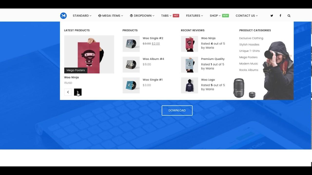
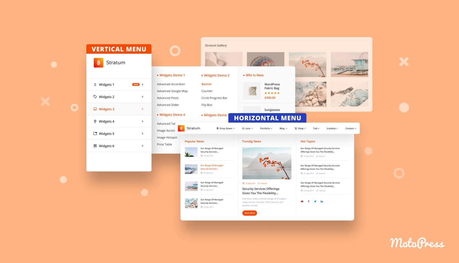
Mega menus are a powerful tool for enhancing navigation on your WordPress site. Unlike traditional dropdown menus, mega menus allow you to display a larger panel that can showcase many links, images, and even groups of categories. This makes it easier for users to find what they’re looking for without excessive clicking.
To create a mega menu, you’ll first need to ensure your WordPress theme supports this feature. Most modern themes do, but it’s always a good idea to check the documentation or demo. If your theme lacks native support for mega menus, you can use plugins such as Max Mega Menu or WP Mega Menu. These plugins provide user-friendly interfaces that integrate seamlessly with your existing menus.
Here’s a quick rundown of the general steps to set up a mega menu using a plugin:
- Install and activate your chosen mega menu plugin from the WordPress repository.
- Navigate to Appearance > Menus in your WordPress dashboard.
- Create a new menu if you haven’t already, or select an existing one to edit.
- Add menu items by dragging and dropping links, categories, or custom links into your menu structure.
- Enable the mega menu option for parent items, usually done via the plugin settings on the menu item itself.
- Customize your mega menu layout, colors, and typography through the plugin’s settings.
When designing your mega menu, keep functionality and aesthetics in mind. A well-structured mega menu should include:
- Clear Categories: Group related links together to improve navigation.
- Visual Elements: Use images or icons sparingly but effectively to draw attention.
- Responsive Design: Ensure your mega menu looks great on mobile devices.
To give you an idea of organizing your mega menu, consider the following simple layout:
| Category | Links |
|---|---|
| Products | Product Category 1, Product Category 2, Product Category 3 |
| Services | Service 1, Service 2, Service 3 |
| Contact | Contact Form, Support, Locations |
By following these guidelines and experimenting with your menu layout, you can create an inviting and user-friendly mega menu that enhances the user experience on your WordPress site. Remember, a well-designed menu not only looks good but also encourages visitors to explore your content further!
Choosing the Right Theme for Your Mega Menu
When it comes to curating an effective mega menu, the choice of theme plays a pivotal role in ensuring a seamless user experience. Look for themes that are built with mega menus in mind, as they will often come with built-in support and settings that make customization a breeze. Below are some key factors to consider when selecting the perfect theme:
- Responsive Design: Ensure that the theme you choose is responsive, meaning it adapts well to different screen sizes. A mega menu that looks great on desktop but is hard to navigate on mobile is a missed opportunity.
- Customization Options: Look for themes that offer extensive customization options. The ability to modify colors, fonts, and layout will allow you to align the mega menu with your brand identity.
- Compatibility with Plugins: Mega menus often require additional functionality provided by plugins. Check that the theme is compatible with popular menu plugins like Max Mega Menu or WP Mega Menu.
- Documentation and Support: Opt for themes with thorough documentation and strong customer support. This can save you time troubleshooting any issues that arise during the setup process.
Additionally, some themes come with pre-designed mega menu styles that can be easily imported, providing a quick win for those who may not have design expertise. This feature can help you jumpstart your navigation without having to reinvent the wheel. For example, consider themes that include:
| Theme Name | Mega Menu Support | Customization Features |
|---|---|---|
| Astra | Yes | High |
| OceanWP | Yes | Moderate |
| Divi | Yes | Extensive |
Another crucial aspect is the overall performance of the theme. A lightweight theme will ensure that your mega menu loads quickly, enhancing the overall user experience. Visitors are more likely to engage with a site that feels fast and responsive. Be sure to test the speed of potential themes through tools like Google PageSpeed Insights before making your final choice.
Lastly, consider the aesthetics of the theme. A visually appealing mega menu can entice users to explore your website further. Browse through demos and pay attention to how menus are presented. Look for themes that offer options for displaying images, icons, or even videos within the mega menu to create a more engaging experience.
Step-by-Step Guide to Setting Up Your Mega Menu
Creating a mega menu in WordPress can transform your site’s navigation and enhance the user experience immensely. With an organized layout, visitors will find it easier to explore your content. Let’s break down the steps you need to follow to get your mega menu up and running!
1. Choose a Theme that Supports Mega Menus
Not all WordPress themes come with mega menu functionality out of the box. Therefore, it’s essential to select a theme that supports this feature. Here are some popular options:
- Avada – Highly customizable with various layout options.
- Divi – Offers a user-friendly drag-and-drop builder.
- Enfold – Great for creating responsive mega menus easily.
2. Install a Mega Menu Plugin
If your chosen theme doesn’t support mega menus, don’t worry! You can enhance your site’s functionality with a plugin. Some popular options include:
- Max Mega Menu – Simple interface and customizable styles.
- WP Mega Menu – Offers a variety of pre-designed templates.
- UberMenu – Powerful and feature-rich with extensive options.
3. Create Your Mega Menu
Once you have your theme and plugin set up, it’s time to start creating your mega menu. Follow these steps:
- Navigate to Appearance > Menus.
- Create a new menu or select an existing one.
- Use the drag-and-drop interface to add pages, categories, and custom links.
- Look for the mega menu options in the settings of your plugin to enable it for specific menu items.
4. Customize Your Mega Menu
This is where the magic happens! Make your mega menu visually appealing and user-friendly:
- Change the font sizes, colors, and background styles to match your brand.
- Add icons for better visual representation of menu items.
- Consider using images or banners to highlight important sections.
5. Test Your Mega Menu
Before going live, always preview your mega menu. Check for:
- Usability on different devices (desktop, tablet, mobile).
- Loading speed and performance.
- Accessibility for all users, including those using screen readers.
6. Final Adjustments and Updates
After ensuring everything is functioning properly, make any final tweaks. Remember to keep your mega menu updated with new content and links as your site evolves. Regular updates will keep your navigation fresh and relevant!
Customizing Your Mega Menu for a Unique Look
When it comes to designing your mega menu, the goal is to create something that not only looks great but also enhances usability. A well-tailored mega menu can help direct visitors to key areas of your site, making it essential to focus on customization.
One of the first steps in customizing your mega menu is choosing the right color scheme. You can align your menu colors with your brand’s identity by matching the menu background and text colors to your site’s overall palette. Consider these tips:
- Contrast is Key: Ensure your text stands out against the background.
- Brand Colors: Use your brand’s primary colors for a cohesive look.
- Hover Effects: Experiment with hover effects like color changes or underlining to enhance interactivity.
Typography is another critical element. The right font can significantly impact readability and aesthetics. Choose fonts that not only represent your brand but also maintain clarity, especially on larger menus. Here are some suggestions:
- Sans-serif fonts: Great for modern websites, providing a clean and contemporary look.
- Serif fonts: Ideal for more traditional brands, conveying reliability and professionalism.
Moreover, don’t underestimate the power of images and icons. Incorporating visual elements within your mega menu can help users quickly identify categories. You might consider using:
- Logos: Place them strategically to reinforce branding.
- Icons: Use simple icons next to menu items for quick visual cues.
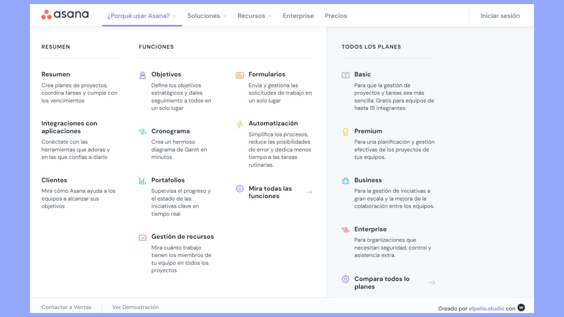
the layout of your mega menu can make a world of difference. A clean and organized structure will enhance the user experience. Consider using a grid layout to categorize items more effectively, or even a multi-column design to accommodate more links without overwhelming visitors. Below is a simple example of a grid layout:
| Category | Sub-category 1 | Sub-category 2 |
|---|---|---|
| Products | New Arrivals | Best Sellers |
| Services | Consulting | Support |
| Resources | Blog | Tutorials |
By focusing on these customization aspects, you can create a mega menu that not only looks unique but also serves as a powerful tool for navigation, leading to higher engagement and conversions on your website.
Adding Icons and Images to Enhance Your Mega Menu
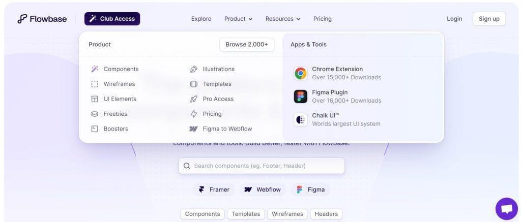
Enhancing your mega menu with icons and images is a fantastic way to grab attention and make navigation more intuitive for your users. By incorporating visuals, you not only elevate the aesthetic appeal of your menu but also provide visual cues that can improve user experience significantly.
To start with, consider the following tips:
- Choose Relevant Icons: Opt for icons that clearly represent the categories or services you offer. For instance, a shopping cart icon is instantly recognizable for an e-commerce site.
- Maintain Visual Consistency: Ensure that the style of your icons and images aligns with your overall website design. This creates a cohesive look that enhances brand identity.
- Use High-Quality Images: Blurry or pixelated images can detract from the professionalism of your site. Make sure to use high-resolution images that look great across devices.
WordPress makes it easy to add icons and images to your mega menu. You can use plugins such as Max Mega Menu or WP Mega Menu, which offer built-in options for inserting images and icons. These plugins provide a user-friendly interface that allows you to drag and drop elements, making the process seamless.
For those who prefer a more hands-on approach, you can also embed images using HTML. Here’s a simple example of how to structure your mega menu with icons:
Additionally, you can include a table that categorizes your icons or images. Here’s a quick reference table that showcases different options:
| Menu Item | Icon/Image Type | Purpose |
|---|---|---|
| Home | House Icon | Directs users to the homepage |
| Shop | Shopping Cart | Access to product listings |
| Blog | Notebook Icon | Access to articles and posts |
| Contact | Envelope Icon | Information about reaching out |
adding icons and images to your mega menu isn’t just about aesthetics; it’s about functionality and user engagement. By thoughtfully incorporating visuals, you can create a more dynamic and user-friendly navigation experience that stands out from the crowd.
Best Practices for Organizing Your Menu Items
When it comes to organizing your menu items, clarity and accessibility are key. A well-structured menu not only enhances user experience but also can significantly impact your site’s navigation and SEO. Here are some best practices to consider:
- Group Related Items: Categorize similar items together. This not only makes it easier for users to find what they are looking for but also helps in creating a logical flow. For example, if you run a restaurant, consider grouping starters, mains, and desserts separately.
- Limit Top-Level Menu Items: Too many top-level items can overwhelm visitors. Aim for a maximum of 7-8 main categories to keep it simple and user-friendly.
- Use Descriptive Labels: Ensure that your menu item labels are clear and descriptive. Avoid jargon or overly clever titles that might confuse visitors. Instead, use straightforward language that conveys exactly what the user can expect.
Visual hierarchy plays a significant role in menu design as well. Using different font sizes, colors, or even icons can help emphasize certain categories or items, guiding users through your menu effortlessly. This can lead to better engagement and a higher likelihood of users finding what they need, thus improving overall site navigation.
Consider incorporating dropdown menus for subcategories without cluttering the main menu. This approach allows deeper organization without overwhelming your visitors. Here’s a simple example:
| Main Category | Subcategories |
|---|---|
| Products | Electronics, Clothing, Home Goods |
| Services | Consulting, Design, Support |
| Blog | Tutorials, News, Tips |
Lastly, don’t forget to regularly review and update your menu. As your site grows, certain items may become obsolete, while new offerings might need to be added. Keeping your menu fresh not only reflects well on your brand but also keeps your visitors engaged and returning for more.
Integrating Plugins to Supercharge Your Mega Menu
Enhancing your mega menu with plugins can take your website’s navigation to the next level. By utilizing the right tools, you can create a more interactive and engaging experience for your users, making it easier for them to find exactly what they need. Here are some essential plugins that can supercharge your mega menu:
- Max Mega Menu: This plugin allows you to convert your existing menu into a mega menu with just a few clicks. It offers drag-and-drop functionality for arranging menu items and supports widgets, which means you can add anything from a search bar to social media links directly into your mega menu.
- WP Mega Menu: With this plugin, you can create highly customizable mega menus. It offers a live preview feature so you can see changes in real-time, and you can also use icons, images, and background colors to make your menu visually appealing.
- UberMenu: Known for its versatility, UberMenu provides advanced layout options, allowing you to create a multi-column design. You can also integrate dynamic content, such as recent posts or custom post types, keeping your menu fresh and informative.
Choosing the right plugin is crucial, but understanding how to integrate it effectively is equally important. Follow these steps to seamlessly incorporate your chosen plugin:
- Install and activate the plugin through your WordPress dashboard.
- Navigate to the menu settings to configure the basic options.
- Utilize the drag-and-drop feature to arrange menu items according to your preferences.
- Add any additional elements such as icons, images, or widgets to enhance the user experience.
- Before finalizing, preview your mega menu to ensure everything looks great and functions properly.
Wondering how it all comes together? Here’s a simple table showcasing some features of the most popular mega menu plugins:
| Plugin Name | Features | Price |
|---|---|---|
| Max Mega Menu | Drag-and-drop, widget support, responsive design | Free |
| WP Mega Menu | Customizable styles, live preview, icon support | Free/Premium |
| UberMenu | Multi-column layouts, dynamic content, advanced styling | $49 |
Integrating plugins into your mega menu not only enhances functionality but also improves the overall aesthetic appeal of your website. The key to a successful mega menu lies in balancing usability with effective design. Don’t hesitate to experiment with different plugins and configurations until you find the perfect fit for your site’s needs. Your visitors will appreciate the effort when they can navigate your content with ease!
Testing and Troubleshooting Your Mega Menu
Once you’ve set up your mega menu, the next step is to ensure it functions correctly and meets user expectations. Testing and troubleshooting your menu is essential for providing an optimal user experience. Here are some effective strategies to help you check everything is running smoothly:
- Cross-Browser Testing: Verify that your mega menu looks and works well across different browsers such as Chrome, Firefox, Safari, and Edge. Each browser can display styles differently, and it’s crucial to catch any inconsistencies.
- Mobile Responsiveness: Check how your mega menu operates on mobile devices. Ensure that it collapses properly and remains user-friendly. Use tools like Google’s Mobile-Friendly Test to help you identify any issues.
- Hover and Click Functionality: Test all hover states and click actions within the menu. Make sure sub-menus open and close properly, and that links navigate to the correct pages.
- Loading Speed: Use tools like GTmetrix or Google PageSpeed Insights to check if your mega menu affects your website’s loading speed. A slow menu can deter visitors from staying on your site.
If you encounter any issues, troubleshooting becomes your next focus. Here are some common problems and potential solutions:
| Issue | Possible Solution |
|---|---|
| Sub-menus not appearing | Check your theme settings and ensure that all necessary scripts are enqueued. |
| Styling conflicts | Inspect CSS rules using browser developer tools to identify conflicting styles. |
| Links not working | Verify that the correct URL is set and that there are no JavaScript errors in the console. |
| Accessibility issues | Make sure you’re using ARIA roles and attributes to enhance usability for screen readers. |
Lastly, don’t hesitate to gather feedback from users. Run usability tests or ask friends to navigate your site. User insights can offer invaluable data on how well your mega menu performs. You may discover minor tweaks that dramatically enhance user interaction.
By regularly , you ensure that it not only looks great but also serves its purpose effectively. A well-functioning mega menu can significantly enhance your site’s navigation and user satisfaction, ultimately benefiting your overall website performance.
Optimizing Your Mega Menu for Mobile Users
When it comes to designing a mega menu for mobile users, simplicity and accessibility are key. Unlike desktop interfaces, mobile devices have limited screen space, making it essential to streamline your menu for easy navigation. Here are some effective strategies to ensure your mega menu is mobile-friendly:
- Prioritize Content: Identify the most important categories and items that users need quick access to. Make sure these are prominently featured in your mobile menu.
- Use Collapsible Sections: Instead of overwhelming users with a long list, utilize collapsible panels. This allows users to expand sections as needed, keeping the interface clean.
- Implement Touch-Friendly Design: Ensure that buttons and links are large enough to tap easily. Aim for a minimum of 44×44 pixels for touch targets to enhance usability.
- Limit Dropdowns: While dropdowns can be useful, too many can confuse users. Stick to one level of dropdowns to maintain simplicity.
Another vital aspect is the speed and performance of your mega menu. Mobile users are often on the go and expect quick loading times. Here are some tips to enhance performance:
- Optimize Images: Use small, compressed images for menu icons to reduce load times without sacrificing quality.
- Avoid Heavy Scripts: Minimize the use of JavaScript and CSS files. Utilize asynchronous loading for non-essential scripts to ensure the menu loads swiftly.
- Test Responsiveness: Regularly test your mega menu on various mobile devices and browsers to identify any performance issues. Tools like Google PageSpeed Insights can be invaluable here.
don’t forget to enhance the overall user experience. Consider integrating features that cater specifically to mobile users:
| Feature | Description |
|---|---|
| Search Bar | Include a prominent search bar for quick access to products or content. |
| Sticky Menu | Keep the menu accessible at all times by implementing a sticky menu that stays at the top of the screen. |
| Feedback Options | Allow users to provide feedback on their mobile experience for continuous improvement. |
By implementing these strategies, your mega menu will not only look appealing on mobile devices but also provide an efficient and user-friendly experience. Remember, a well-optimized mega menu can significantly enhance your site’s navigation, leading to increased user engagement and satisfaction.
Updating and Maintaining Your Mega Menu for Longevity
To ensure that your mega menu remains effective and user-friendly over time, it’s crucial to implement an ongoing strategy for updates and maintenance. An outdated menu can confuse visitors and lead to a poor user experience, so keeping your content fresh and relevant is essential.
Start by regularly reviewing your menu items. Consider the following approaches:
- Monitor Analytics: Use tools like Google Analytics to see which menu items receive the most clicks. This can help you identify popular sections and areas that may need improvement.
- Stay Current: Regularly update your menu to reflect any changes in your offerings, promotions, or seasonal items. This keeps the content dynamic and encourages repeat visits.
- User Feedback: Encourage your users to share their thoughts about the menu. A simple feedback form can provide valuable insights into how the menu is performing.
Another key aspect to consider is the responsive design of your mega menu. With increasing mobile traffic, ensuring that your menu works seamlessly on various devices is paramount. Test your menu on different screen sizes and browsers to guarantee a positive experience for all users. Here are a few tips:
- Use Mobile-Friendly Design: Ensure the mega menu collapses neatly on smaller screens.
- Touch-Friendly Elements: Make sure that links and buttons are easy to tap, avoiding frustration for mobile users.
Lastly, consider the impact of SEO on your mega menu. Search engines appreciate well-structured navigation, which can enhance your site’s visibility. To optimize your mega menu:
- Descriptive Labels: Use clear, descriptive labels for menu items that reflect the content they link to.
- Limit Depth: Keep the menu hierarchy straightforward. Ideally, limit the submenu depth to two or three levels to avoid overwhelming users.
Maintaining a mega menu requires attention and adaptability. By routinely evaluating and refreshing your menu, ensuring responsive design, and optimizing for SEO, you can enhance usability and keep your website engaging for visitors.
Frequently Asked Questions (FAQ)
Q&A: How to Create a Mega Menu in WordPress? Beginner’s Guide
Q1: What exactly is a mega menu, and why should I consider using one for my WordPress site?
A1: Great question! A mega menu is an expanded navigation menu that allows you to display multiple categories and subcategories in a single dropdown. This is especially useful for websites with a lot of content or products. It keeps your site organized and makes it easier for users to find what they’re looking for. Plus, a well-designed mega menu can enhance the visual appeal of your site and improve user experience—who wouldn’t want that?
Q2: Do I need to be a coding expert to create a mega menu on my WordPress site?
A2: Not at all! You don’t need to be a coding whiz to create a mega menu. WordPress offers a variety of plugins and themes that make the process super straightforward, even for beginners. With just a few clicks, you can have a stunning mega menu up and running without writing a single line of code.
Q3: What are some popular plugins I can use to create a mega menu?
A3: There are several excellent plugins out there! A couple of the most popular ones are Max Mega Menu and WP Mega Menu. Both are user-friendly and offer drag-and-drop features, allowing you to customize your menu without any hassle. They also provide various styling options to match your website’s design—how cool is that?
Q4: Can you walk me through the basic steps to create a mega menu?
A4: Absolutely! Here’s a quick overview:
- Install a Mega Menu Plugin: Start by picking a plugin like Max Mega Menu from the WordPress Plugin Directory and install it.
- Activate the Plugin: Once installed, activate it through your WordPress dashboard.
- Create Menu Items: Go to ‘Appearance’ > ‘Menus’ and start adding your main categories and subcategories.
- Enable Mega Menu Feature: Depending on the plugin, you’ll see options to enable the mega menu feature for specific menu items.
- Style Your Menu: Use the plugin’s settings to customize the look and feel of your mega menu. You can play around with colors, fonts, and layouts until it suits your vibe.
- Save and Preview: Don’t forget to save your changes and preview how it looks on your site!
Q5: How can I ensure my mega menu is user-friendly?
A5: Great thinking! A user-friendly mega menu is all about clarity and simplicity. Here are a few tips:
- Organize Content Logically: Group related items together, so users can find what they need quickly.
- Limit the Number of Items: Try not to overcrowd your mega menu. A clean, concise menu is often more effective.
- Use Clear Labels: Ensure that your menu items are labeled clearly. Avoid jargon that might confuse visitors.
- Responsive Design: Make sure your mega menu works well on mobile devices. A responsive design ensures a seamless experience for all users.
Q6: Will a mega menu impact my website’s loading speed?
A6: It shouldn’t! A well-optimized mega menu plugin won’t significantly affect your site’s loading speed. However, it’s always good practice to monitor your site’s performance after making changes. If you notice any slowdowns, consider optimizing images or minimizing the number of plugins you’re using.
Q7: Can I customize the design of the mega menu to fit my brand?
A7: Yes, indeed! Most mega menu plugins come with a range of customization options. You can change colors, fonts, layouts, and even add images or icons to your menu. This allows you to create a unique look that aligns perfectly with your brand identity—making your site not just functional but also visually appealing!
Q8: What should I do if I run into issues while creating my mega menu?
A8: Don’t sweat it! The first step is to check the plugin’s documentation or support forums—they often have solutions for common issues. You can also reach out to the plugin’s support team directly. And remember, there’s a vast community of WordPress users out there, so don’t hesitate to seek help from forums or social media groups!
Q9: Is it worth the effort to create a mega menu for a small website?
A9: Absolutely! Even for smaller websites, a mega menu can enhance user experience and make navigation smoother. It helps visitors find information quickly, which can lead to increased engagement and lower bounce rates. Plus, it sets a professional tone for your site right from the start. Why not make the effort if it elevates your site?
Q10: Any final tips for beginners looking to create a mega menu?
A10: Yes! Start simple and gradually build complexity. Test your menu with real users (friends or family) to get feedback. And most importantly, have fun with it! Creating a mega menu is a fantastic opportunity to express your site’s personality and improve your user’s journey. Happy menu-making!
Future Outlook
And there you have it! Creating a mega menu in WordPress might seem daunting at first, but with the steps we’ve covered, you’re well on your way to making your website more user-friendly and visually appealing. Remember, a well-structured mega menu not only enhances navigation but also allows you to showcase your content in an organized manner, keeping your visitors engaged and happy.
So why wait? Dive into your WordPress dashboard and start experimenting with the tips and tricks we’ve discussed. Whether you’re a beginner or just looking to spruce up your site, this is your chance to elevate the user experience. Don’t hesitate to reach out if you have any questions or need further assistance—community support is just a comment away!
Happy designing, and here’s to creating a stunning mega menu that leaves a lasting impression on your visitors! Your website deserves it!

