Looking to elevate your brand’s presence? Check out our top 7 press page examples! Each one is a treasure trove of inspiration, showcasing effective layouts, compelling content, and smart design. Discover what you can steal to create your own standout press page!
7 Press Page Examples (+ What to Steal from Each)
Creating a press page might not be the first thing on your to-do list, but trust us—you don’t want to overlook this powerful tool. In today’s digital landscape, a well-crafted press page can be your secret weapon for building credibility, attracting media attention, and showcasing your brand’s story. But where do you even start? Fear not! We’ve rounded up seven standout press page examples that not only catch the eye but also deliver results. Each one offers unique elements that you can borrow for your own press page. Whether you’re a seasoned pro or just dipping your toes into the media waters, there’s something valuable here for everyone. So, let’s dive in and discover what makes these press pages shine—and how you can make yours just as compelling!
Understanding the Purpose of a Press Page
A press page serves as a strategic tool in any organization’s public relations arsenal. It acts as a centralized hub where journalists, bloggers, and other media representatives can find essential information about your brand. The primary goal of a press page is to facilitate communication and ensure that media personnel have easy access to the resources they need to accurately cover your story.
One of the main benefits of having a dedicated press page is that it enhances your brand’s credibility. When the media can easily find information about your organization—be it press releases, high-resolution images, or bios of key personnel—they are more likely to portray your brand accurately. This transparency fosters trust and encourages positive coverage.
Additionally, a well-structured press page can significantly improve your SEO efforts. By optimizing this section with relevant keywords, you can increase the chances of appearing in search results when journalists are looking for information about your industry or organization. This means more visibility for your brand, along with the potential for increased media coverage.
Consider including the following elements on your press page to maximize its effectiveness:
- Press Releases: Keep these updated and easily accessible.
- Media Kit: Offer downloadable resources like logos, images, and company facts.
- Contact Information: Provide a dedicated media contact for inquiries.
- Recent Coverage: Showcase articles and interviews that highlight your brand.
- Social Media Links: Encourage media to follow and engage with your brand on social platforms.
To illustrate the importance of each component, let’s take a quick look at how they contribute to a well-rounded press page:
| Component | Purpose | Benefit |
|---|---|---|
| Press Releases | Inform about news and updates | Improves media relations |
| Media Kit | Provide quick access to brand assets | Enhances coverage quality |
| Contact Information | Streamline media outreach | Saves time for journalists |
| Recent Coverage | Showcase credibility | Encourages further interest |
| Social Media Links | Encourage ongoing engagement | Builds community and visibility |
Ultimately, a press page is not just a static part of your website; it’s a dynamic resource that can significantly impact your brand’s media presence. By focusing on creating a comprehensive and user-friendly press page, you can ensure that you’re putting your best foot forward whenever someone in the media comes knocking.
Key Elements That Make a Press Page Stand Out
A well-crafted press page is your opportunity to showcase your brand’s story and achievements effectively. It’s not just about providing information but doing so in a way that captivates journalists and potential partners. Here are some essential components to consider when designing your press page:
- Clear Branding: Make sure your logo and brand colors are prominently displayed. Consistency in visuals reinforces brand recognition.
- Compelling About Section: Share your story! A brief, engaging narrative about your brand captivates the reader, making them want to know more.
- Media Kit Availability: Offer a downloadable media kit that includes high-resolution images, logos, and key information. This saves journalists time and ensures they have the best resources at hand.
- Contact Information: Clearly list your media contact details. A dedicated PR person or team adds credibility and makes outreach easier for journalists.
In addition to these essentials, consider enhancing your press page with engaging visuals and interactive elements. Here are a few more ideas:
- Featured Press Coverage: Highlight notable press mentions with links to articles or segments. This not only validates your brand but also provides social proof.
- Event Calendar: If applicable, integrate a calendar showcasing upcoming events, launches, or speaking engagements. This invites media engagement and coverage opportunities.
- Testimonials: Include quotes from reputable figures or satisfied clients. This reinforces your brand’s credibility and appeal.
| Element | Purpose |
|---|---|
| Clear Branding | Enhances brand recognition |
| Media Kit | Provides essential resources |
| Contact Info | Facilitates media outreach |
| Testimonials | Builds trust and credibility |
Lastly, a frequently updated press page signals to visitors that your brand is active and engaged. Regular updates with recent news, achievements, or events show that you’re invested in maintaining a vibrant public presence. This attention to detail not only attracts media interest but also keeps your audience informed and engaged.

Exploring the Best Visual Designs for Press Pages
When it comes to press pages, the visual design can significantly impact how your brand is perceived. An effective press page not only provides essential information to journalists but also captivates them with its design. Below are some standout examples that highlight key elements worth emulating for your own press page.
- Clean Layout: A minimalist approach can lead to a more professional look. Ensure that your press page isn’t cluttered and that key information stands out.
- Branding Consistency: Use colors, fonts, and imagery that align with your overall branding. This reinforces brand identity and ensures a cohesive user experience.
- Easy Navigation: Make it simple for visitors to find what they need. A well-organized structure with clear headings can guide journalists to the right resources.
- Visual Hierarchy: Use size and color to create a visual hierarchy that draws attention to the most important information—like your press releases, media kits, and contact information.
Incorporating high-quality images or videos can enhance the visual appeal of your press page. Consider using a table to summarize key media assets available for download. Here’s a simple example:
| Media Asset | Format |
|---|---|
| Logo | PNG |
| Press Release | |
| High-Res Images | JPEG |
| Video B-Roll | MP4 |
One hallmark of effective press pages is the inclusion of testimonials or logos from reputable partners or media outlets. This not only adds credibility but also visually engages visitors. Consider creating a carousel or grid layout to showcase these elements dynamically.
Lastly, don’t overlook the importance of a strong call-to-action. Whether it’s an invitation to subscribe to a newsletter or a prompt to connect on social media, ensure it stands out. A button styled with your brand colors can entice visitors to take action without being overly pushy.
Crafting Compelling Headlines That Grab Attention
When it comes to creating headlines, the key is to spark curiosity while clearly conveying value. The best headlines are those that not only attract attention but also compel readers to take action. Here are some strategies you can adopt from successful press pages:
- Use Numbers: Numbers in headlines grab attention and promise a concise breakdown of information. For instance, “7 Press Page Examples” sets clear expectations for the reader.
- Ask Questions: Posing a question in your headline encourages engagement. Consider something like, “Want to Improve Your Press Page? Here Are 7 Examples!”
- Incorporate Power Words: Words like “Ultimate,” “Essential,” and “Proven” can make your headlines more appealing. A headline such as “The Ultimate Guide to Crafting Compelling Press Pages” can entice readers to dive in.
Next, consider the emotional appeal of your headlines. Identifying the core emotion you want to evoke can make your content irresistible. Here’s how you can apply this:
| Emotion | Example Headline |
|---|---|
| Curiosity | “What Makes These 7 Press Pages Stand Out?” |
| Inspiration | “Transform Your Press Page: 7 Examples to Inspire You” |
| Urgency | “Don’t Miss Out: 7 Must-See Press Page Examples” |
Lastly, don’t shy away from using humor or clever wordplay. A little levity can make your headlines memorable, making readers more likely to share your content. Play around with puns or witty phrases that relate to your topic. For instance, “Pressing Matters: 7 Pages That Will Get You Noticed” adds a playful twist.
Remember, A/B testing different headlines can also reveal what resonates best with your audience. Track engagement metrics and refine your approach based on the data. Crafting compelling headlines isn’t just an art; it’s a science worth mastering to elevate your press page’s effectiveness.
How to Effectively Showcase Your Media Coverage
Showcasing your media coverage is an essential step in enhancing your brand’s credibility and visibility. To do this effectively, consider implementing a few key strategies that can help your press page stand out and resonate with visitors.
First, highlight prominent features of your coverage. Create a dedicated section on your press page that showcases logos of media outlets that have featured you. This not only adds visual appeal but also builds trust. Use a grid layout to present these logos, ensuring each one links to the corresponding article or segment.
Additionally, consider including quotes from articles or interviews that capture the essence of your message. Pulling out impactful statements can reinforce your brand’s value and resonate with potential clients or partners. Present these quotes in a visually distinct format, such as:
“Your brand revolutionizes the industry!” – Expert Source
Another effective approach is to create a media kit that includes downloadable assets, such as high-resolution logos, images, and press releases. This not only streamlines the process for journalists but also positions your brand as professional and media-friendly. Ensure that this kit is easy to access and visually organized.
Don’t forget about including a timeline of your media coverage. This can highlight your growth and milestones. A simple table format can effectively showcase your journey:
| Date | Media Outlet | Feature |
|---|---|---|
| January 2023 | Forbes | Top 10 Startups to Watch |
| March 2023 | TechCrunch | Innovative Solutions for Tomorrow |
Lastly, engage visitors by integrating social proof. Showcase any awards, recognitions, or customer testimonials alongside your media features. This combination reinforces your reputation and can effectively influence potential clients. Use a visually appealing layout to make this information pop. A well-structured press page not only informs but also invites engagement and encourages users to share your achievements.
Tips for Including Engaging Multimedia Content
In today’s digital landscape, merely featuring text on your press page is no longer enough to capture your audience’s attention. To truly engage visitors, consider integrating diverse multimedia elements that enhance storytelling and create an immersive experience. Here are some tips to effectively incorporate engaging multimedia content:
- Use High-Quality Images: Eye-catching images not only break up text but also provide a visual representation of your brand. Ensure they are high-resolution and relevant to your content.
- Incorporate Videos: Videos can convey your message more dynamically than text alone. Whether it’s a company overview, product demonstration, or a customer testimonial, video can significantly enhance user engagement.
- Add Infographics: Present complex information in a visually appealing format. Infographics are great for summarizing key statistics or processes, making them easily digestible for your audience.
Don’t forget about the power of audio! Podcasts or audio snippets can add depth to your storytelling. Consider featuring interviews with team members or industry experts to provide additional insights.
Another effective strategy is to utilize interactive content. This could include:
- Quizzes: Engaging visitors with fun quizzes can keep them on your page longer.
- Sliders: Use image sliders to showcase multiple products or events without cluttering the page.
- Maps: If location is relevant, interactive maps can guide users to your physical locations or events.
Lastly, don’t overlook the importance of proper formatting. Ensure your multimedia elements are responsive and easily accessible on all devices. A well-structured layout not only enhances user experience but also encourages sharing, further increasing your press page’s reach.
| Type of Multimedia | Engagement Benefits |
|---|---|
| Images | Visual appeal, brand representation |
| Videos | Dynamic storytelling, increased retention |
| Infographics | Simplified information, quick understanding |
| Audio | Depth in storytelling, diverse format |
| Interactive content | Higher engagement, user interaction |
By thoughtfully implementing these multimedia elements, you can create a press page that not only informs but also captivates your audience, making them more likely to engage with your brand.

The Power of Social Proof and Testimonials
When it comes to building credibility and trust, few things are as effective as social proof and testimonials. These elements serve as powerful tools that can dramatically influence prospective customers, nudging them closer to making a purchase. Highlighting customer experiences not only showcases your brand’s value but also fosters a sense of community among your audience.
Consider incorporating testimonials prominently on your press page. When potential clients see real people sharing their positive experiences, it enhances your brand’s authenticity. Aim to include:
- Specific Feedback: Encourage your customers to share specific details about how your product or service impacted them.
- Before-and-After Stories: Nothing tells a better story than a transformative experience. Showcasing a customer’s journey can be incredibly compelling.
- Multimedia Elements: Don’t limit testimonials to text. Videos or images can bring authenticity and relatability to the forefront.
Another effective strategy is to feature user-generated content. This not only amplifies your brand’s reach but also engages your existing customers by making them a part of your marketing narrative. Creating a dedicated space for customers to share their stories can yield authentic endorsements that resonate deeply with potential buyers. You might want to include:
- Social Media Mentions: Highlight tweets or Instagram posts where customers have praised your brand.
- Case Studies: In-depth stories that illustrate the effectiveness of your product or service can be incredibly persuasive.
- Customer Reviews Aggregator: Display ratings from platforms like Google, Yelp, or Trustpilot to provide a quick snapshot of satisfaction.
To further enhance the impact of social proof, employing a table to summarize key testimonials can be quite effective. Here’s a simple layout you might consider:
| Customer | Testimonial | Rating |
|---|---|---|
| Jane Doe | “This product changed my life! Highly recommend!” | ⭐⭐⭐⭐⭐ |
| John Smith | “Excellent service and fast delivery. I’m very pleased!” | ⭐⭐⭐⭐ |
| Emily Johnson | “Never going back! This is the best I’ve ever used.” | ⭐⭐⭐⭐⭐ |
Incorporating these elements not only enhances your brand’s reputation but also strategically positions you as a trusted authority in your niche. By showcasing real-life experiences, you create an emotional connection with your audience, compelling them to take action. Remember, in today’s digital landscape, authentic voices can speak volumes about your brand’s integrity and reliability.
Creating a Seamless User Experience on Your Press Page
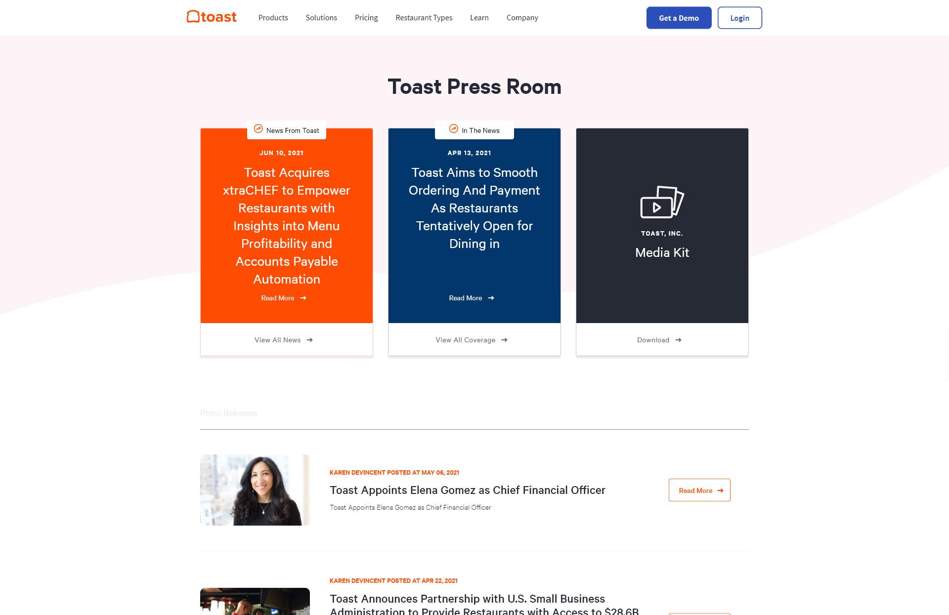
When designing your press page, the key to a successful visitor experience lies in creating a seamless user journey. A well-structured page not only showcases your brand but also makes it easy for journalists and media professionals to find the information they’re looking for. Here are several strategies to achieve this:
- Clear Navigation: Ensure that your press page features a straightforward layout. Use a clean menu structure that allows users to quickly find press releases, media kits, and contact information.
- Visual Appeal: A visually engaging press page can capture attention and convey professionalism. Utilize high-quality images, a consistent color scheme, and easy-to-read fonts that align with your brand identity.
- Search Functionality: Incorporate a search bar that allows visitors to easily sift through past press releases or media assets. This feature can significantly enhance user experience, especially for those seeking specific information.
- Accessible Media Kits: Make your media kits easily downloadable. Use clear call-to-action buttons that stand out on the page, guiding users to the resources they need without hassle.
Another important aspect is ensuring that your page is mobile-responsive. Many journalists will access your content on mobile devices, so your press page must adapt gracefully to various screen sizes. Test your layout across different devices to guarantee that all elements are functional and visually pleasing.
Additionally, consider offering a media contact form directly on the page. This not only streamlines inquiries but also demonstrates that you are open and accessible. Ensure that the form is simple to fill out, requiring only essential information to minimize barriers to engagement.
| Element | Benefit |
|---|---|
| Clear Navigation | Helps users find information quickly |
| Visual Appeal | Enhances brand image and keeps users engaged |
| Search Functionality | Facilitates easy access to past content |
| Mobile Responsiveness | Ensures usability across devices |
| Media Contact Form | Encourages direct communication |
don’t overlook the importance of social proof. Adding logos of media outlets that have featured your brand or testimonials from journalists can enhance credibility. This helps build trust and encourages new visitors to engage with your content.
Leveraging SEO Strategies for Maximum Visibility
To truly maximize your visibility through SEO, it’s essential to examine successful press pages closely. These examples not only highlight what works but also serve as a blueprint for your own strategy. Here’s what you can learn from them:
- Clear Branding: Ensure your press page reflects your brand identity. Use consistent colors, logos, and fonts.
- Media Kit Access: Provide an easy-to-download media kit that includes high-resolution images and key company information. This makes it simple for journalists and bloggers to get what they need without hassle.
- Up-to-Date Content: Regularly refresh your press page with the latest news, press releases, and media mentions to keep it relevant.
Another effective tactic is to implement an organized layout. A structured presentation of your press materials can significantly enhance user experience. Consider using a simple table format:
| Item | Description | Download Link |
|---|---|---|
| Logo | High-resolution PNG and JPEG formats. | Download |
| Company Overview | A brief PDF summarizing our mission and achievements. | Download |
| Recent Press Releases | Access to our latest news and updates. | Download |
In addition to layout and design, consider integrating SEO-friendly keywords throughout your press page. This practice will improve your search rankings and help journalists and potential partners find you more easily. Use tools like Google Keyword Planner to identify relevant terms in your niche.
Lastly, don’t underestimate the power of backlinks. When other reputable sites link to your press page, it signals credibility to search engines. Reach out to bloggers, journalists, and other media outlets to encourage them to link back to your press materials. This not only boosts your SEO but also increases traffic to your page.
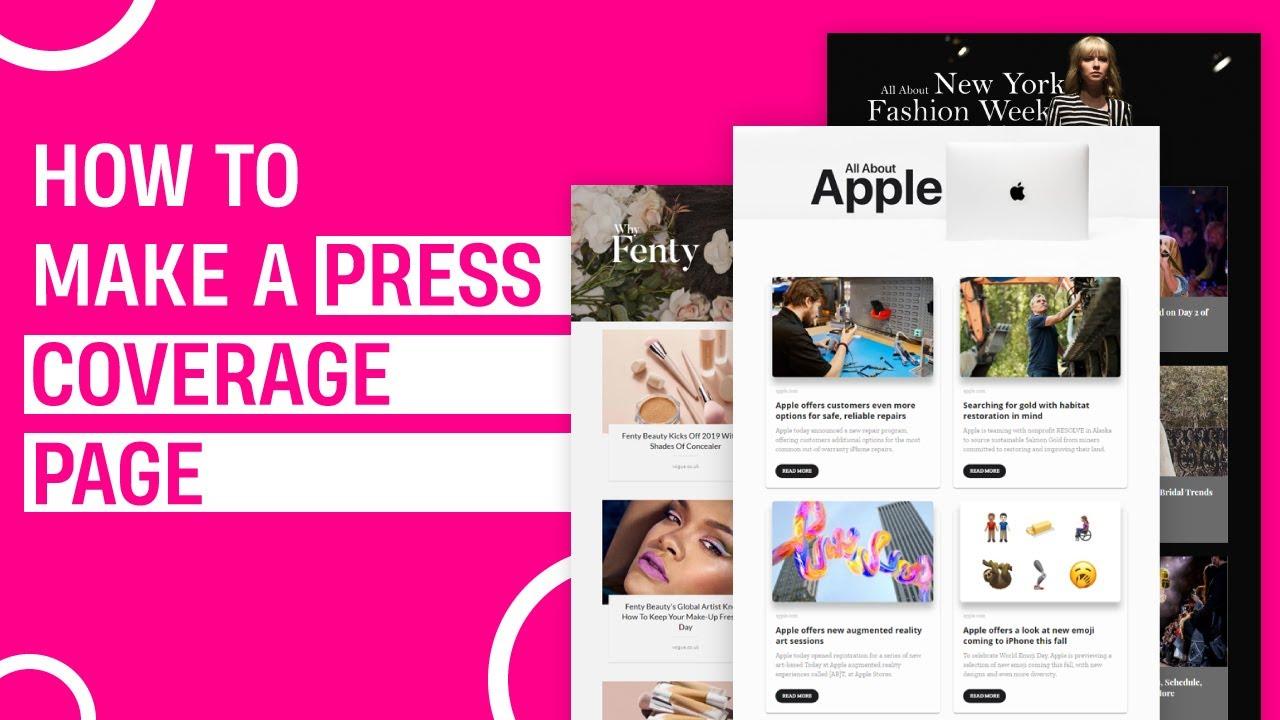
Actionable Takeaways to Enhance Your Own Press Page
Creating an effective press page is essential for building your brand’s credibility and attracting media attention. Here are some actionable takeaways that can elevate your press page, making it a magnet for journalists and influencers alike:
- Compelling Visuals: Use high-quality images and videos that tell your brand story. A visually engaging layout invites media professionals to explore further.
- Media Kit Availability: Include a downloadable media kit that contains essential information such as logos, brand colors, and press releases. This makes it easier for journalists to access everything they need in one click.
- Clear Contact Information: Make sure your press page has a dedicated contact email and phone number. This should be easy to find and clearly visible to encourage outreach.
- Relevant Press Releases: Regularly update your press releases section with recent news. This indicates that your brand is active and always has something new to share.
- Feature Testimonials: Include quotes from reputable sources or satisfied customers. This adds a layer of authenticity and builds trust with journalists.
Additionally, consider implementing a FAQ section tailored for the media. This can preemptively answer common questions and streamline the communication process:
| Question | Answer |
|---|---|
| What is your company’s mission? | Our mission is to provide innovative solutions that enhance everyday life. |
| Who can I contact for interviews? | Please reach out to our PR manager at [email protected]. |
| Where can I find your latest news? | Visit our press release section for the latest updates. |
Remember that your press page reflects your brand’s image. Enhance it with thoughtful details, and it will serve as a powerful tool in your PR arsenal:
- User-Friendly Navigation: Ensure your press page is easy to navigate. Consider a clean layout with clear headers and categories.
- Social Proof: Display logos of media outlets where your brand has been featured. This provides immediate validation of your credibility.
Incorporating these elements will not only improve the functionality of your press page but also make it a go-to resource for media professionals looking to cover your brand. Keep it polished, informative, and engaging to grab their attention!
Frequently Asked Questions (FAQ)
Q&A: 7 Press Page Examples (+ What to Steal from Each)
Q1: What exactly is a press page, and why do I need one?
A1: Great question! A press page, often referred to as a media or press kit page, serves as your brand’s central hub for journalists, bloggers, and anyone interested in covering your story. It’s where they can find all the key information they need about your company, including press releases, high-quality images, and bios. Having a well-crafted press page not only boosts your credibility but also makes it easier for the media to share your story—so yes, you definitely need one!
Q2: What can I learn from the press pages you featured?
A2: Each press page example we highlight offers unique insights and strategies that can enhance your own. From effective layouts and visuals to compelling copy and downloadable resources, there’s a lot to glean. For instance, one page might showcase how to present your brand story effectively, while another might excel in providing easy access to high-resolution images. By studying these examples, you can pick and choose the elements that align with your brand’s identity and goals.
Q3: Can you give me a sneak peek of what to expect in the article?
A3: Absolutely! We’ll dive into seven diverse press pages from various industries, breaking down what makes each one effective. For example, one page stands out for its vibrant design and engaging multimedia content, while another impresses with its straightforward, no-nonsense approach. Each section will highlight key takeaways you can easily adapt for your own press page, ensuring you don’t miss out on valuable insights.
Q4: Are there any common mistakes to avoid when creating my press page?
A4: Definitely! One common pitfall is overloading your page with information. Keep it concise and ensure your key messaging shines through. Another mistake is neglecting mobile optimization—more journalists are using mobile devices, so your press page should look great on all screens. Lastly, don’t forget to regularly update your information! An outdated press page can hurt your credibility and frustrate media contacts.
Q5: How can I make my press page more engaging?
A5: Engagement is key! Incorporate visuals like videos, infographics, and high-quality images to break up text and draw the eye. You could also include testimonials or highlights of your latest achievements to create a compelling narrative. Consider interactive elements like a media calendar or a quick fact section that journalists can easily reference. Remember, the more visually appealing and user-friendly your page is, the more likely it is to capture media attention.
Q6: What’s the best way to promote my press page once it’s live?
A6: Once your press page is polished and ready for action, make sure to shout it from the rooftops! Share it on your social media channels, include it in your email newsletters, and link to it from your website’s footer. You can also reach out to your media contacts directly, letting them know about this valuable resource. And don’t forget to utilize SEO strategies—optimizing your press page with relevant keywords will help drive organic traffic!
Q7: How often should I update my press page?
A7: Keeping your press page fresh is important! Aim to update it at least quarterly or whenever you have significant news to share, like product launches, awards, or new partnerships. Regular updates signal to the media that you’re active and engaged, which can lead to more coverage opportunities. Plus, it gives you the chance to refresh your content and improve your layout based on what’s resonating with your audience!
Ready to transform your press page? Dive into the article to explore those seven examples, and let’s get started on crafting a press page that commands attention!
In Conclusion
As we wrap up our exploration of these seven stellar press page examples, it’s clear that having a well-crafted press page isn’t just a nice-to-have—it’s a crucial component of your brand’s PR strategy. Each of the examples we’ve discussed offers unique insights and elements you can easily adapt to fit your own style and objectives. Whether it’s the compelling visuals, the strategic layout, or the engaging content, there’s something valuable to take from each of them.
So, why not take a moment to reflect on your current press page? Are there elements you can enhance or incorporate from these examples? Remember, your press page is often the first impression you make on journalists and potential partners. Make it count!
Now that you’re armed with inspiration and ideas, it’s time to roll up your sleeves and create a press page that truly represents your brand and makes it easy for the media to tell your story. Happy creating, and we can’t wait to see what you come up with!
