When it comes to hero images, size matters! Choosing the right dimensions can make or break your website’s appeal. From retina displays to mobile views, understanding each size ensures your visuals shine everywhere. Don’t let poor resolution hold you back!
Every Hero Image Size You Need to Know
Introduction:
Hey there, design enthusiasts! If you’ve ever scrolled through a website and been captivated by a stunning hero image, you know just how powerful that first impression can be. It’s not just a pretty picture; it’s the visual handshake that sets the tone for the entire user experience. But here’s the catch: not all hero images are created equal. The right size can make all the difference between a pixelated mess and a breathtaking visual that grabs attention. So, whether you’re revamping your site, launching a new project, or just curious about web design, understanding hero image sizes is key to creating that wow factor. Stick around as we dive into the essential sizes you need to know, tips for optimizing your images, and how to ensure your visuals shine on every device. Trust us, your future visitors will thank you!
Understanding the Importance of Hero Images in Web Design
Hero images are more than just eye candy; they are powerful visual tools that can shape a visitor’s first impression of a website. A well-chosen hero image can convey the essence of a brand, spark interest, and guide users toward desired actions. Here are a few reasons why hero images are essential in web design:
- Visual Storytelling: A striking hero image can communicate your brand’s story at a glance, setting the tone for the entire site.
- Emotional Engagement: Images evoke feelings, and a compelling hero image can create an emotional connection with visitors, making them more likely to stay and explore.
- Enhanced User Experience: When used correctly, hero images improve navigation by providing visual cues and leading users to important content.
When selecting a hero image, size matters immensely. Using a hero image that is too small can diminish its impact, while an overly large image can slow down loading times, negatively affecting user experience and SEO. Understanding the ideal dimensions for different devices ensures that your hero image looks great everywhere. Below is a quick reference table for optimal hero image sizes:
| Device | Recommended Size |
|---|---|
| Desktop | 1920 x 1080 px |
| Tablet | 768 x 1024 px |
| Mobile | 375 x 667 px |
In addition to size, consider the composition and subject of your hero image. A clean, uncluttered image with a focal point can help direct user attention where you want it. If your image features people, their gaze should lead visitors towards important calls to action on the page. This subtle guidance can significantly enhance conversion rates.
Always remember that hero images should align with your brand’s identity. Whether you use high-resolution photographs, illustrative designs, or abstract graphics, the choice must reflect your brand ethos and appeal to your target audience. Consistency in style can also reinforce brand recognition and trust.
A/B testing different hero images can provide valuable insights into what resonates best with your audience. Analyze metrics like click-through rates and engagement times to refine your approach continuously. An effective hero image can be the difference between a visitor bouncing away and becoming a loyal customer.
Common Hero Image Sizes for Different Platforms
When it comes to hero images, size matters. Getting the dimensions right not only enhances the visual appeal but also ensures optimal loading times across different platforms. Here’s a guide to the most common hero image sizes you should consider for various platforms:
Website Hero Images
For website hero images, the ideal dimensions can vary depending on the design and layout. However, a standard size that works well on most screens is:
| Device | Recommended Size |
|---|---|
| Desktop | 1920 x 1080 pixels |
| Tablet | 768 x 1024 pixels |
| Mobile | 640 x 1136 pixels |
Social Media Platforms
Each social media platform has its own set of specifications for hero images that can maximize engagement. Here’s a quick rundown:
- Facebook: 1200 x 630 pixels
- Twitter: 1200 x 675 pixels
- Instagram: 1080 x 566 pixels (landscape)
- Pinterest: 1000 x 1500 pixels
Blog and Article Features
If you’re incorporating hero images into your blog or articles, you want them to be eye-catching yet optimized for readability. Recommended sizes include:
| Platform | Size |
|---|---|
| WordPress | 1200 x 628 pixels |
| Blogger | 800 x 400 pixels |
| Medium | 1400 x 788 pixels |
Additional Tips
Regardless of where you’re using your hero images, here are a few tips to keep in mind:
- Always use high-quality images to maintain professionalism.
- Consider the aspect ratio; a 16:9 ratio is widely accepted.
- Compress images to reduce loading times without sacrificing quality.
By understanding the appropriate sizes for different platforms, you can effectively enhance your content and boost user engagement. Optimize your hero images today, and watch your visuals transform the way users interact with your site!
How to Choose the Right Hero Image Size for Your Website
Choosing the right size for your hero image is crucial to the visual impact and usability of your website. A hero image is often the first thing visitors see, so it needs to make a strong impression. Here are some tips to help you select the optimal size:
- Know the dimensions: Different devices have varying screen sizes, so understanding the standard dimensions is essential. Typically, full-screen hero images range from 1920 x 1080 pixels for desktops to 768 x 1024 pixels for tablets.
- Responsive design: Ensure your hero image is responsive. This means it should adapt to different screen sizes seamlessly. Using CSS techniques like
background-size: cover;can help maintain the image’s aspect ratio while ensuring it covers the entire hero area. - File format matters: Choose the right file format for your hero images. JPEG is great for photographs, while PNG works well for images with transparency. WebP offers excellent compression and quality, making it a good choice for modern websites.
- Impact on loading speed: Large images can slow down your website, affecting user experience and SEO. Aim for a file size under 1 MB without compromising quality. You can use tools like TinyPNG or ImageOptim to compress images efficiently.
Understanding the specific needs of your website will also guide you in selecting the right hero image size. For example, a portfolio site may require larger, more detailed images to showcase work, while a blog may benefit from a more minimal approach.
| Device Type | Recommended Size | Aspect Ratio |
|---|---|---|
| Desktop | 1920 x 1080 px | 16:9 |
| Tablet | 768 x 1024 px | 3:4 |
| Mobile | 375 x 667 px | 9:16 |
Lastly, always test your hero image across multiple devices and browsers. Check how it looks not only in terms of aesthetics but also functionality. A well-optimized hero image can set the tone for your entire site and engage visitors right from the start!
Optimizing Hero Images for Fast Loading Times
When it comes to website performance, optimizing hero images is crucial for maintaining fast loading times. Visitors expect sites to load quickly, and a slow, heavy hero image can lead to high bounce rates. Here are some effective strategies to ensure your hero images are both visually stunning and optimized for speed:
- Choose the Right Format: Different image formats have varying compression abilities. For photographic images, consider using JPEG for its balance between quality and file size. For images with transparency or those needing sharp lines, PNG is ideal. Alternatively, modern formats like WebP can provide even better compression.
- Compress Your Images: Use tools like TinyPNG or ImageOptim to reduce file size without sacrificing quality. Aim for a reduction of at least 50% while maintaining an acceptable level of detail.
- Implement Responsive Images: Use the
srcsetattribute in your image tags to serve different image sizes based on the user’s device. This ensures that mobile users aren’t downloading unnecessarily large files, thereby speeding up loading times. - Lazy Loading: Implement lazy loading to defer the loading of off-screen images until the user scrolls down. This technique not only speeds up initial load times but also saves bandwidth.
Another important aspect is ensuring your images are appropriately sized for their display. Here’s a simple guideline to follow:
| Device Type | Recommended Hero Image Size |
|---|---|
| Desktop | 1920 x 1080 px |
| Tablet | 768 x 1024 px |
| Mobile | 375 x 667 px |
consider utilizing a content delivery network (CDN). A CDN caches your images and serves them from locations closest to the user, significantly reducing load times. This can be particularly beneficial for hero images that are typically large and bandwidth-intensive.
By implementing these strategies, you can create dynamic, visually appealing hero images that enhance your website’s aesthetic while ensuring rapid loading times. This balance is vital for retaining visitors and improving overall user experience.
Best Practices for Responsive Hero Images
Hero images are a powerful way to capture attention and convey your brand’s message. However, to ensure they perform effectively on all devices, it’s crucial to implement best practices that enhance their responsiveness.
Choose the Right Aspect Ratio: The aspect ratio of your hero image should be consistent with the design of your website. A common size is 16:9, but for mobile users, a 4:3 ratio can be more effective. Here’s a quick guide:
| Device Type | Recommended Aspect Ratio | Common Dimensions |
|---|---|---|
| Desktop | 16:9 | 1920 x 1080 px |
| Tablet | 4:3 | 1536 x 2048 px |
| Mobile | 9:16 | 1080 x 1920 px |
Optimize Image Size: Large file sizes can slow down your site, hurting both user experience and SEO. Aim for a balance between quality and load time. Tools like TinyPNG or ImageCompressor can help you reduce file size without sacrificing quality.
Utilize CSS for Scaling: Use CSS properties like object-fit or background-size to control how your hero images scale across different screen sizes. This ensures that the focal point of your image remains visible, no matter the resolution. For example:
background-size: cover;Test on Multiple Devices: Always preview your hero images across various devices and screen sizes. What looks great on a desktop might not translate well to mobile. Make adjustments as necessary to ensure a seamless experience for all users.
Consider Lazy Loading: Implementing lazy loading can enhance page load speeds by loading images only when they are needed. This is particularly useful for hero images that might not be immediately visible on page load. Use the loading="lazy" attribute for your images to achieve this.
By following these best practices, you can create visually striking and responsive hero images that not only attract attention but also improve user engagement across devices. Remember, the goal is to create an image that enhances your website’s storytelling while providing a smooth user experience.
Creating a Cohesive Look with Aspect Ratios
When designing a website, achieving a cohesive look is crucial for user engagement and brand identity. One of the most effective ways to do this is by understanding and utilizing aspect ratios for your hero images. The correct aspect ratio can make all the difference in how your visuals are perceived, creating a harmonious aesthetic that draws visitors in.
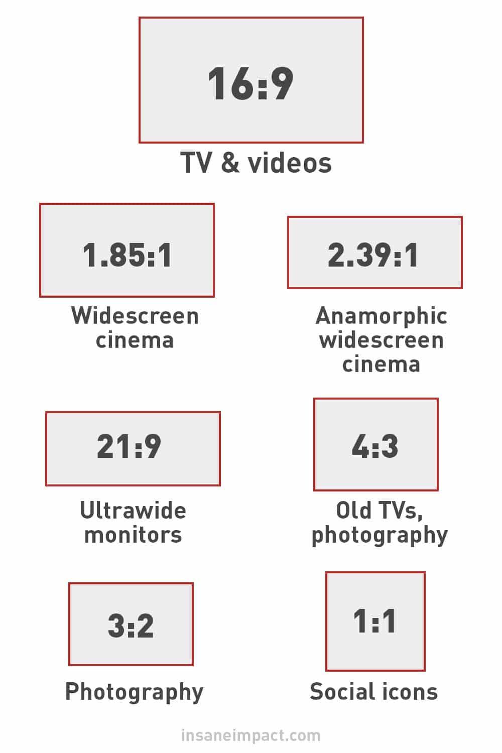
Aspect ratios determine the relationship between the width and height of an image. By maintaining consistent aspect ratios across your hero images, you can ensure that they fit seamlessly within your design framework. Here are a few common aspect ratios to consider:
- 16:9: This is the standard ratio for widescreen displays, making it ideal for video backgrounds or large banners.
- 4:3: Often used for traditional photography, this ratio offers a classic feel and works well for portfolio showcases.
- 1:1: Perfect for social media platforms and product images, this square ratio is versatile and modern.
- 2:1: A panoramic option that can create stunning visuals, especially for landscapes or wide scenes.
Utilizing a consistent aspect ratio helps to create a visual rhythm across your site. For instance, if all your hero images follow a 16:9 aspect ratio, they will align neatly across different pages, providing a uniform experience. This attention to detail enhances the overall professionalism of your website and keeps users focused on your content rather than being distracted by inconsistencies.
Moreover, the right aspect ratio can significantly improve the responsiveness of your site. As users switch between devices, maintaining the same ratios ensures that images resize properly, preserving their visual impact. This is particularly vital in today’s mobile-first world, where users expect a seamless experience regardless of the screen size.
| Aspect Ratio | Best For | Recommended Use |
|---|---|---|
| 16:9 | Videos, Banners | Hero sections, Headings |
| 4:3 | Photography, Portfolios | Image Galleries |
| 1:1 | Social Media, Products | Grid Layouts |
| 2:1 | Landscapes, Panoramas | Hero Images |
Incorporating a cohesive approach to aspect ratios not only enhances aesthetics but also bolsters brand messaging. When visitors see images that are framed similarly, they subconsciously link that consistency to reliability and quality. This small detail can significantly increase trust and engagement, ultimately leading to better conversion rates.
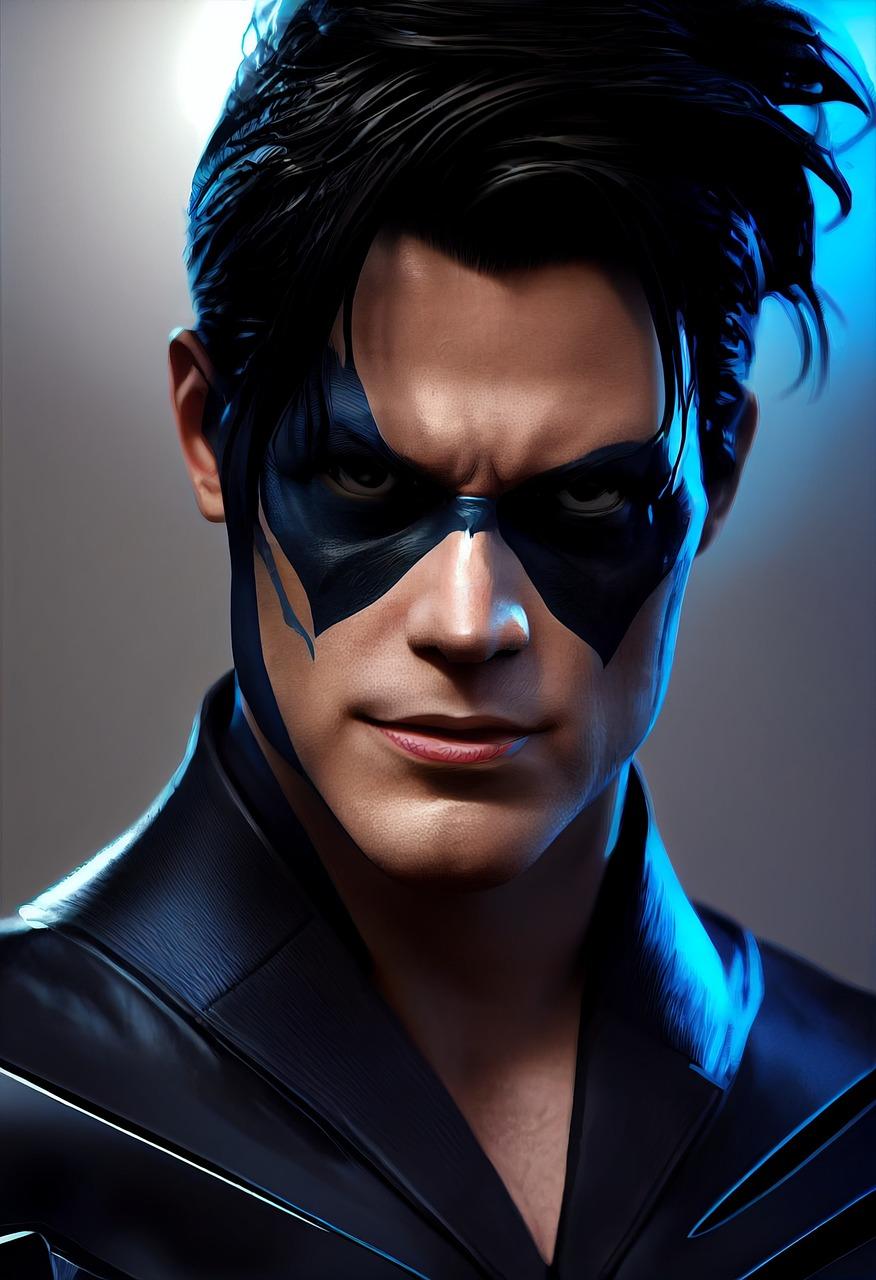
Tips for Enhancing Visual Appeal with Hero Images
When it comes to capturing attention on your website, hero images play a pivotal role. They serve as the visual anchor that draws visitors in, making it crucial to ensure they are both striking and effective. Here are some tips to enhance the visual appeal of your hero images, ensuring they resonate with your audience.
Choose High-Quality Images: The first step is selecting images that are not only relevant to your content but also high in quality. Blurry or pixelated images can detract from your message and give a negative impression. Consider using professional photography or high-resolution stock images that reflect your brand’s identity.
Optimize Image Size: While it’s essential to use high-quality images, remember to optimize them for web use. Large file sizes can slow down your website’s loading speed, which can lead to higher bounce rates. Use tools like TinyPNG or Adobe Photoshop to compress images without losing quality.
Incorporate Text Overlays: Adding text overlays can enhance the narrative of your hero images. Use clear, bold fonts that stand out against the background, ensuring readability. Pairing compelling copy with your visuals can significantly increase engagement rates. Consider using contrasting colors to make the text pop.
Maintain Consistency: Consistency in style, color, and tone across your hero images helps in reinforcing your brand identity. Create a cohesive look by using a preset color palette or style guide that aligns with your overall design. This consistency not only strengthens brand recognition but also creates a seamless user experience.
Utilize Responsive Design: With the variety of devices used to access websites, ensure your hero images are responsive. They should look great on desktops, tablets, and smartphones. Test your images on different screen sizes to confirm they adjust properly without losing their impact.
Experiment with Layout and Composition: The layout and composition of your hero images can drastically influence how they are perceived. Use the rule of thirds to create balance, and consider incorporating negative space to draw focus to your main subject. Don’t hesitate to experiment with different arrangements to find what works best for your message.
| Tip | Description |
|---|---|
| High-Quality Images | Use professional or high-resolution stock images. |
| Optimize Size | Compress images to improve loading speed. |
| Text Overlays | Implement clear, bold text to enhance the visual narrative. |
| Consistency | Align images with your brand’s color palette and style. |
| Responsive Design | Ensure images adapt to various screen sizes. |
| Layout & Composition | Use the rule of thirds for balance and focus. |
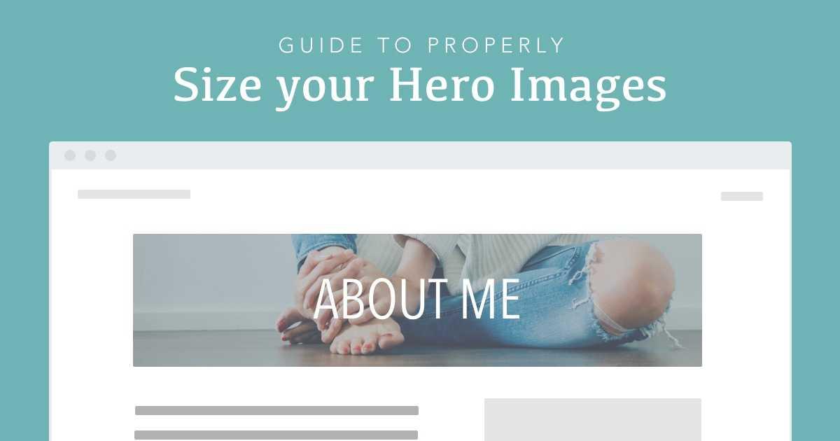
Tools and Resources for Sizing Your Hero Images
When it comes to optimizing the visual impact of your website, selecting the right is crucial. The perfect hero image not only enhances your site’s aesthetics but also drives user engagement. Here are some must-have tools to help you achieve that:
- Adobe Photoshop: A classic choice for image editing, Photoshop allows for precise control over image size, resolution, and formatting. You can create stunning hero images while ensuring they are perfectly sized for your web layout.
- Canva: If you’re looking for something more user-friendly, Canva provides an intuitive platform with customizable templates specifically designed for hero images. Plus, its drag-and-drop features make resizing images a breeze.
- Figma: Great for collaboration, Figma lets you design and prototype your hero images in real-time with team members. The platform supports various dimensions, making it easy to create responsive designs.
- Image Resizer Tools: Websites like TinyPNG and ImageResize.org help you quickly resize and compress images without compromising quality. These tools are essential for ensuring fast loading times.
To better understand the dimensions needed for various platforms, consider the following table outlining standard hero image sizes:
| Platform | Recommended Size | Aspect Ratio |
|---|---|---|
| Website Landing Page | 1920 x 1080 px | 16:9 |
| Facebook Cover Photo | 820 x 312 px | 2.63:1 |
| Twitter Header Image | 1500 x 500 px | 3:1 |
| Instagram Post | 1080 x 1080 px | 1:1 |
Additionally, utilizing stock image websites can save you time and provide high-quality visuals. Platforms like Unsplash and Pexels offer a vast library of stunning hero images that are free to use and can be resized to fit your needs. Just ensure you check the licensing agreements before use.
Lastly, don’t overlook the importance of testing your hero images. Tools like Google PageSpeed Insights and GTMetrix help analyze the impact of your images on your site’s loading speed, allowing you to make necessary adjustments for optimal performance.
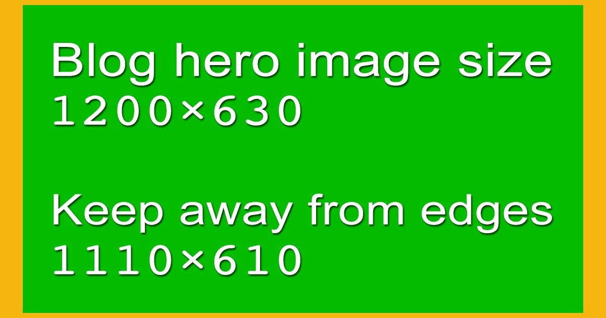
Avoiding Common Mistakes with Hero Image Sizes
When it comes to hero images, size matters. A well-optimized hero image can enhance your website’s aesthetics and performance, while the wrong size can lead to a host of problems. Here are some common mistakes to avoid:
- Neglecting Responsive Design: Failing to consider how your hero image will look on different devices can ruin user experience. Always test your images on mobile, tablet, and desktop to ensure they adapt well.
- Using Large File Sizes: High-resolution images are great, but oversized files can slow down your site. Aim for a balance between quality and performance; compress images without sacrificing too much detail.
- Ignoring Aspect Ratios: Using the wrong aspect ratio can distort your images, making them look unprofessional. Stick to common ratios like 16:9 or 4:3 for best results.
Another common mistake is keeping the same size for every hero image across your website. Consider the context and content of each page:
| Page Type | Recommended Size |
|---|---|
| Landing Page | 1920 x 1080 pixels |
| Blog Post | 1200 x 675 pixels |
| Portfolio | 1500 x 1000 pixels |
Lastly, always pay attention to file formats. JPEGs are often ideal for photographs, while PNGs work well for images with transparency. By choosing the right format, you can maintain quality and reduce file size further:
- JPEG: Best for colorful images, offering good compression.
- PNG: Great for graphics and images needing transparency.
- WebP: A newer format that provides superior compression while maintaining quality.
By avoiding these common pitfalls, you can make sure your hero images not only look great but also contribute positively to your website’s overall performance. Remember, the goal is to engage your visitors effectively while ensuring a seamless experience across all devices.
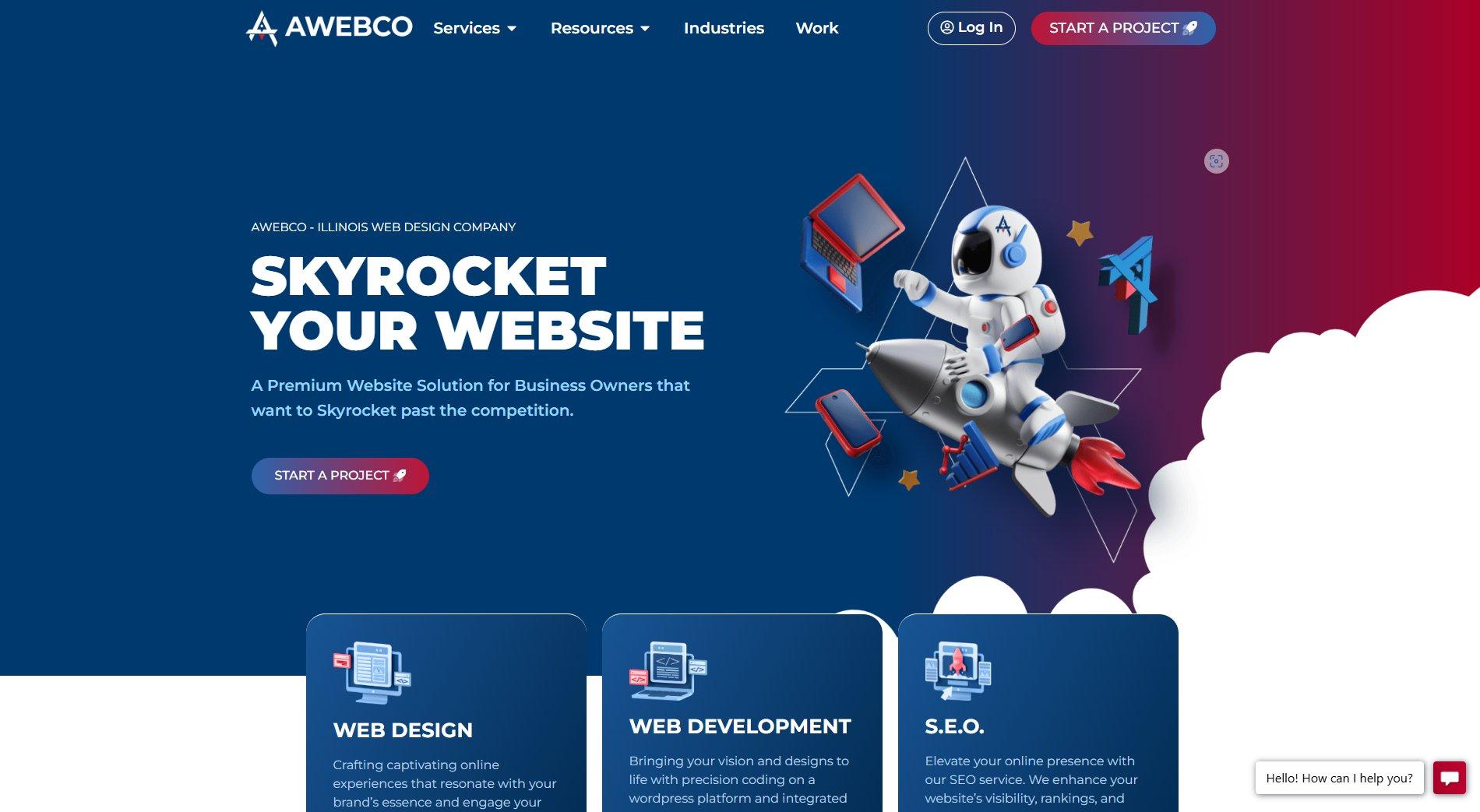
Future Trends in Hero Image Design and Sizing
As we look ahead, the landscape of hero image design is evolving rapidly, influenced by both technological advancements and shifting user preferences. Designers are now embracing a more dynamic approach, integrating multimedia elements to create immersive experiences that captivate users’ attention. The focus is not just on aesthetics but also on functionality and user engagement.
One of the most significant trends is the adoption of responsive design. With the increasing variety of devices accessing websites—from smartphones to large monitors—it’s crucial for hero images to adapt seamlessly. This means using scalable vector graphics (SVGs) for crisp visuals that adjust without losing quality, alongside CSS techniques that ensure images fit perfectly in any screen size.
Another trend gaining traction is the use of video backgrounds. Incorporating short looping videos as hero images can significantly enhance storytelling and emotional engagement. This approach allows brands to convey their message more effectively, drawing users in with captivating movement and sound. However, it’s vital to strike a balance; videos should be optimized for loading speed to avoid compromising user experience.
In terms of sizing, there’s a shift towards experimenting with asymmetrical layouts. Breaking the traditional grid format can create a more dynamic and visually interesting hero section. Designers are increasingly using oversized elements, such as large typography or full-screen images, to create a bold statement, allowing brands to stand out in a crowded digital landscape.
Moreover, the call to action (CTA) is becoming more integrated with the hero image itself. Using contrasting colors and clever positioning, CTAs are being designed to blend in yet stand out, ensuring that the user knows where to click without feeling overwhelmed. This subtle integration encourages interaction right from the moment users land on a page.
| Trend | Description |
|---|---|
| Responsive Design | Images that adapt to any screen size for seamless viewing. |
| Video Backgrounds | Short, engaging videos that enhance storytelling. |
| Asymmetrical Layouts | Breaking the grid for a more dynamic visual impact. |
| Integrated CTAs | CTAs that blend with images for seamless user interaction. |
Lastly, personalization is key. With advancements in data analytics, websites can now tailor hero images based on user behavior and preferences. This not only improves engagement but also enhances the overall user experience, making visitors feel valued and understood. The future of hero image design is all about creating a connection between the brand and the user, and personalization is at the forefront of that journey.
Frequently Asked Questions (FAQ)
Q&A: Every Hero Image Size You Need to Know
Q1: What exactly is a hero image, and why is it important?
A: Great question! A hero image is typically the large, eye-catching image located at the top of a webpage. Think of it as the first impression visitors get when they land on your site. It sets the tone and grabs attention, helping to convey your brand’s message. A well-chosen hero image can boost engagement, lower bounce rates, and make your site visually appealing. So, it’s not just decorative; it plays a crucial role in your website’s effectiveness!
Q2: Are there specific sizes I should be aware of for hero images?
A: Absolutely! The right size depends on where and how you use the image. For full-width hero images on desktops, 1920×1080 pixels is a popular choice. For mobile devices, opting for 720×1280 pixels works wonders. It’s important to ensure that your images retain clarity and don’t slow down your site’s loading speed. Remember, a fast site is a happy site!
Q3: What about aspect ratios? Are they important?
A: Yes! The aspect ratio is crucial for maintaining the visual integrity of your images across different devices. A common aspect ratio for hero images is 16:9, but some websites might prefer 21:9 for a more cinematic look. The key is to ensure your image looks good on both desktop and mobile views. Test it out to see how it displays in various formats!
Q4: How do I ensure that my hero image looks good on all devices?
A: This is where responsive design comes into play! Using CSS techniques like media queries, you can adjust the size and cropping of your hero image based on the viewer’s screen size. Additionally, consider using high-quality images that are optimized for both desktop and mobile to maintain visual appeal. Remember, a lucky visitor is a happy visitor!
Q5: Should I use different hero images for different pages?
A: Definitely! Using tailored hero images for specific pages can enhance the user experience. For instance, the hero image on your homepage could be broad and brand-focused, while a product page can feature a more specific image highlighting that product. It’s all about creating a narrative and guiding your visitors along their journey.
Q6: Any tips for choosing the right hero image?
A: Absolutely! Here are a few tips:
- Align with Your Brand: Make sure the image reflects your brand’s identity and message.
- High Quality: Always opt for high-resolution images to avoid pixelation.
- Emotional Connection: Choose images that evoke emotions or tell a story relevant to your audience.
- Keep It Simple: Don’t overcrowd the image with too much text or elements. Let it breathe!
Choose wisely, and it could be the difference between a visitor scrolling away or engaging with your content!
Q7: What tools can I use to ensure my hero images are the right size?
A: There are several tools available! Online platforms like Canva or Adobe Express are fantastic for resizing images quickly. For optimizing images, tools like TinyPNG or ImageOptim can help reduce file size without sacrificing quality. And don’t forget to check out your website’s content management system (CMS) for built-in image resizing options!
Q8: why should I care about hero image sizes?
A: Because the right hero image size can significantly affect your site’s performance and user experience! A well-optimized hero image boosts loading times, enhances aesthetics, and can lead to higher conversion rates. So, investing a little time in understanding and implementing the right sizes will pay off in the long run. After all, first impressions matter!
Conclusion: Ready to revamp your hero images? By understanding the right sizes, aspect ratios, and optimization techniques, you can create a stunning visual impact that resonates with your audience. Don’t underestimate the power of a great hero image—your website’s success could hinge on it!
Closing Remarks
Wrapping It Up: The Power of the Perfect Hero Image Size
And there you have it! The world of hero images is vast, but understanding the right sizes is your secret weapon for creating visually stunning and effective web pages. Whether you’re designing a sleek portfolio, an engaging blog, or a dynamic e-commerce site, keeping these image dimensions in mind can significantly enhance your user experience and leave a lasting impression on your visitors.
Remember, the right hero image isn’t just about aesthetics; it’s about conveying your message effectively and ensuring your content stands out in a crowded digital landscape. So, take the time to experiment with different sizes and styles. Your images are often the first thing people notice, so make them count!
Feeling inspired? Go ahead and apply what you’ve learned. Your website deserves that wow factor, and with the right hero image sizes in your toolkit, you’re well on your way to creating something truly remarkable. Happy designing!

![[New Update] Eduma Revolution Slider Removed](https://webhost.review/wp-content/uploads/2026/04/10832-new-update-eduma-revolution-slider-removed.jpg)
