Are you ready to elevate your website’s user experience? Discover 10 essential navigation design tips that will guide your visitors effortlessly through your site. Plus, steer clear of 5 common pitfalls that could send them packing! Let’s dive in!
10 Required Website Navigation Design Tips + 5 to Avoid
Introduction
Navigating a website should be as easy as a Sunday stroll in the park—smooth, intuitive, and enjoyable. But all too often, visitors find themselves lost in a maze of menus, links, and clutter, leading to frustration and, ultimately, a quick departure. If you’re looking to create a user-friendly experience that keeps your audience engaged and coming back for more, you’re in the right place! In this article, we’ll explore 10 essential website navigation design tips that can make a world of difference for your users. Plus, we’ll highlight 5 common pitfalls to avoid at all costs. So, whether you’re redesigning your current site or starting fresh, let’s dive into the must-know strategies that will not only enhance usability but also boost your site’s success. Ready to transform your website into a navigational gem? Let’s get started!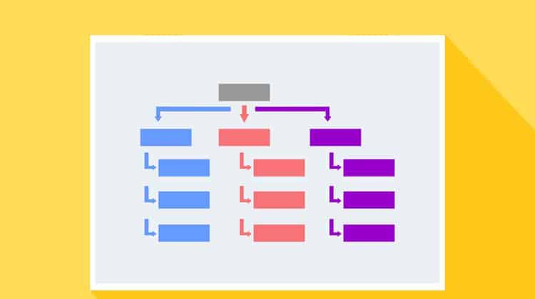
Essential Principles for User-Friendly Navigation
Creating a user-friendly navigation system is crucial for enhancing the overall user experience on your website. A well-structured navigation helps visitors find what they need quickly, leading to longer visits and increased conversions. Here are some essential principles to keep in mind:
- Simplicity is Key: Keep your navigation menu simple and uncluttered. A clean design helps users focus on their choices without feeling overwhelmed.
- Logical Hierarchy: Organize your content into clear categories and subcategories. This logical structure allows users to anticipate where to find specific information.
- Consistent Layout: Use consistent navigation elements throughout your site. Users should recognize the navigation system on every page, which builds familiarity and trust.
- Responsive Design: Ensure that your navigation adapts seamlessly across devices. A mobile-friendly design caters to the growing number of users accessing websites via smartphones and tablets.
- Descriptive Labels: Use clear and descriptive labels for your navigation links. Avoid jargon and opt for terms that users will easily understand.
Another crucial aspect of user-friendly navigation is the use of visual cues. Icons and graphics can guide users through the navigation process and can be especially effective when paired with text labels.
| Visual Cues | Benefits |
|---|---|
| Icons | Help users identify functions quickly. |
| Hover Effects | Indicate interactive elements, improving engagement. |
| Highlighting Active Links | Show users their current location within the site. |
Moreover, providing a search bar can significantly enhance navigation. This feature allows users to bypass the navigation menu entirely and find what they need in seconds. Make sure the search bar is prominently placed, ideally at the top of the page, so it’s easily accessible.
Lastly, always consider the feedback from your users. Implementing user testing can reveal where visitors struggle and help you refine the navigation system accordingly. By continuously improving based on user behavior, you ensure that your navigation remains effective and user-friendly.
Designing for Mobile: Making Your Navigation Responsive
The Power of Simplicity in Navigation Menus
When it comes to designing navigation menus, simplicity reigns supreme. A clean, straightforward menu structure allows users to seamlessly explore your website without feeling overwhelmed. Consider the cognitive load you place on your visitors; the less they have to think about where to click next, the more likely they are to stay engaged. A simple menu not only enhances user experience but also boosts your site’s overall usability.
Here are some key components of effective navigation simplicity:
- Limit Menu Items: Aim for no more than seven primary options to avoid clutter. This helps users quickly identify the information they need.
- Use Clear Labels: Choose intuitive terms for menu items that accurately describe their content. Avoid jargon or complex phrases that may confuse your audience.
- Prioritize Content: Place your most important links at the forefront. This allows users to access key pages effortlessly, enhancing their journey through your site.
Another essential aspect of minimalist navigation is the use of white space. Generous spacing between menu items not only improves readability but also creates a more aesthetically pleasing layout. When users can easily distinguish between links, they are less likely to misclick and can navigate with confidence.
Incorporating a search bar within your navigation can also simplify the user experience. This allows visitors to bypass the menu entirely if they’re looking for something specific, catering to users who may prefer a more direct approach. By providing this option, you confront the needs of diverse user behaviors and preferences.
Lastly, consider the mobile experience. With a significant portion of web traffic coming from mobile devices, ensuring your navigation is simple and efficient on smaller screens is crucial. Responsive design, with collapsible menus, can maintain clarity without sacrificing functionality.
| Menu Design Element | Impact on User Experience |
|---|---|
| Limit Menu Items | Reduces overwhelm, improves decision-making |
| Clear Labels | Enhances understanding, increases click-through rates |
| White Space | Improves readability, creates aesthetic appeal |
| Search Functionality | Facilitates quick access to desired content |
| Mobile Responsiveness | Ensures usability across devices, retains audience |
By embracing the power of simplicity in your navigation design, you can create a more enjoyable and efficient browsing experience for your users. Remember, the goal is to guide your visitors effortlessly through your content, leading them to discover and engage with what matters most on your site.
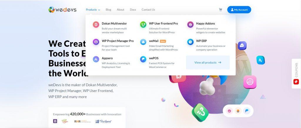
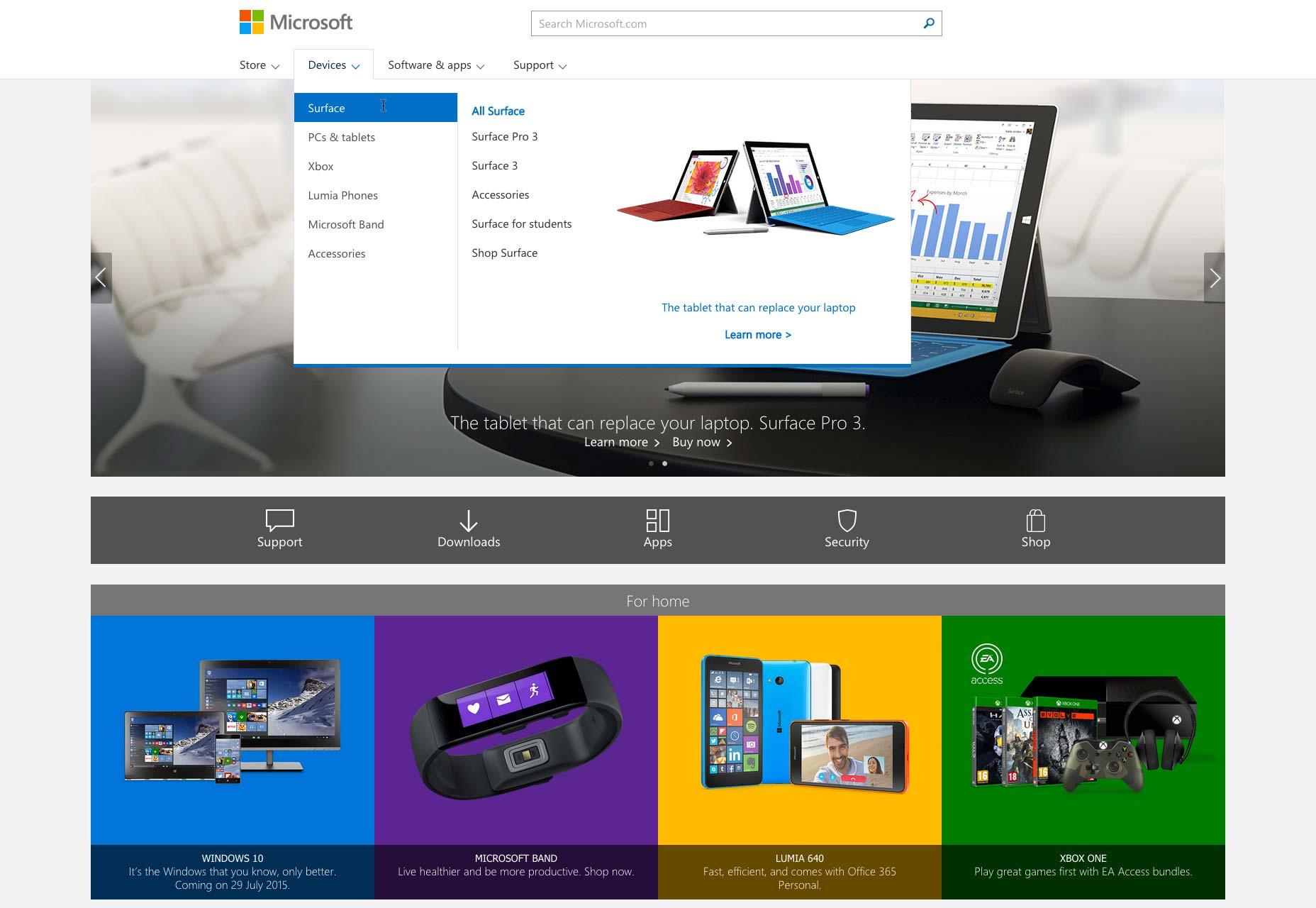
Creating Intuitive Paths: How to Structure Your Navigation
Designing an effective navigation system is all about creating intuitive paths that guide your visitors seamlessly through your site. The goal is to make it as easy as possible for users to find the information they need without confusion or frustration. Here are some essential aspects to consider:
- Simplicity is Key: Keep your navigation options concise. Too many choices can overwhelm visitors, leading to decision fatigue. Aim for a clean, straightforward menu that highlights the most important sections.
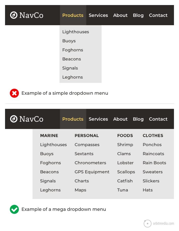
- Logical Grouping: Organize your navigation items in a way that makes sense. Group related items together so users can intuitively find what they’re looking for. For example, if you have a blog, consider categories like ‘Travel’, ‘Food’, and ‘Lifestyle’ under a single ‘Blog’ section.
- Prioritize Important Pages: Place the most critical pages in prominent positions within the navigation bar. This might include your ‘Home’, ‘About Us’, or ‘Contact’ pages. Consider the user journey and highlight the paths you want them to take.
- Utilize Breadcrumbs: Breadcrumb navigation helps users keep track of their location within your site. This is especially useful for larger websites, as it allows visitors to backtrack easily without losing their place.
In addition to these strategies, visual hierarchy plays a crucial role in navigation design. Use size, color, and spacing to draw attention to the most important links. A larger font or a bolder color can indicate which items are primary actions.
Table Example of Navigation Structure
| Menu Item | Purpose |
|---|---|
| Home | Main landing page for visitors |
| About Us | Information about the company or individual |
| Services | Overview of what is offered |
| Blog | Articles and updates |
| Contact | Ways to reach out |
Lastly, consider mobile optimization when structuring your navigation. With an increasing number of users accessing websites via mobile devices, ensuring that navigation is user-friendly on smaller screens is essential. A collapsible menu or a hamburger icon can save space while still providing access to all necessary links.
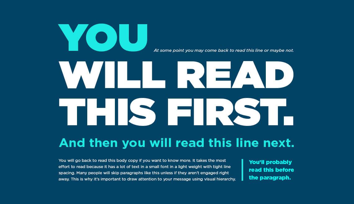
Leveraging Visual Hierarchy for Effective Navigation Design
When it comes to designing effective navigation for your website, visual hierarchy plays a crucial role in guiding users through your content. It helps prioritize information, ensuring that visitors can easily find what they are looking for without feeling overwhelmed or lost. Utilizing elements such as size, color, and placement can significantly enhance the user experience.
A key aspect of visual hierarchy is the use of size and scale. Larger elements naturally draw attention first, making them ideal for primary navigation links. For instance, using a bold font for the main menu items while keeping secondary links smaller and less prominent can clearly communicate their importance. This subtle difference helps users intuitively navigate your site, focusing on what matters most.
Another technique is the strategic application of color and contrast. Bright, contrasting colors can highlight essential buttons or links, guiding the eye where it needs to go. For example, using a vibrant shade for your call-to-action buttons while maintaining a more muted palette for background elements can create a visual path that leads users to take action. Remember, the goal is to make critical elements stand out without creating visual clutter.
Additionally, the placement of navigation elements should follow a logical flow. Users typically expect menu bars to be at the top or side of a page. By positioning primary navigation in these areas, you align with user expectations, which simplifies their experience. Consider adding sticky navigation that remains fixed while users scroll down the page, keeping essential links accessible at all times.
Lastly, incorporating white space around navigation items is often overlooked but essential. It helps to separate elements visually and makes the interface feel less cramped. Proper use of white space can improve readability and ensure that each component stands out, making it easier for users to absorb information without feeling overwhelmed.
| Design Element | Impact on Navigation |
|---|---|
| Size & Scale | Draws attention to key links and features |
| Color & Contrast | Highlights important actions and guides user focus |
| Placement | Aligns with user expectations for intuitive navigation |
| White Space | Enhances readability and reduces clutter |
By leveraging these principles of visual hierarchy, you can create a navigation system that not only looks appealing but also drives user engagement. Ultimately, a well-designed navigation structure will guide users effortlessly, encouraging them to explore your site further and enhancing their overall experience.
The Importance of Consistency Across Your Site
When users visit your website, they’re not just looking for information; they’re also seeking a seamless experience. Consistency across your site plays a pivotal role in achieving that goal. Think of it as the glue that binds all elements together, ensuring that visitors feel at home as they navigate through different pages.
One key aspect of consistency is visual design. This includes using the same color palette, fonts, and button styles throughout your website. When a user sees familiar elements, they’re more likely to feel comfortable and continue exploring. A cohesive design can also help reinforce your brand identity, making it more memorable.
Equally important is maintaining a uniform navigation structure. Whether it’s your main menu, footer links, or sidebar navigation, having the same layout and labeling across all pages reduces confusion. Users should instinctively know where to find information without having to second-guess the location or meaning of links. This predictability encourages deeper engagement.
Another critical area is content tone and voice. If you switch between casual and formal language or vary the writing style across different sections, it can create dissonance for your audience. Strive to keep a consistent tone that reflects your brand’s personality, whether it’s friendly, authoritative, or playful. This continuity fosters trust and keeps users coming back.
| Element | Consistency Benefits |
|---|---|
| Visual Design | Reinforces brand identity, enhances user comfort |
| Navigation Structure | Reduces confusion, encourages engagement |
| Content Tone | Builds trust, keeps users connected |
Moreover, consistent call-to-action (CTA) placements are essential. If CTAs vary in appearance or position, users may overlook them, negatively impacting conversion rates. Regularly analyzing and standardizing your CTAs can guide users effectively toward desired actions, whether that’s signing up for a newsletter or making a purchase.
By prioritizing consistency across your website, you create a user-friendly environment that encourages exploration and interaction. Visitors will spend more time engaging with your content, leading to higher satisfaction rates and ultimately driving conversions. Remember, a consistently designed site isn’t just aesthetically pleasing; it’s a strategic approach that can significantly enhance user experience.
Avoiding Common Pitfalls in Navigation Design
Why Overcomplicating Your Navigation Can Drive Users Away
When users land on your website, they want to find what they’re looking for quickly and effortlessly. If your navigation is cluttered or overly complex, it can lead to frustration, resulting in visitors abandoning your site altogether. A streamlined navigation system not only enhances the user experience but also encourages longer visits and higher engagement rates.
Simplicity is Key: Users appreciate a clean and straightforward navigation structure. Instead of overwhelming them with a myriad of options, focus on the essentials. Consider these tips:
- Limit the number of menu items to avoid confusion.
- Use clear, concise labels that accurately describe the content.
- Organize related items logically to guide users intuitively.
Visual Hierarchy Matters: Creating a visual hierarchy can effectively guide users through your navigation. Use design elements such as size, color, and spacing to highlight the most important sections. Consider employing a WordPress-style table layout to illustrate this concept:
| Element | Purpose |
|---|---|
| Font Size | Make top-level categories larger to stand out. |
| Color Contrast | Use bold colors for primary navigation links. |
| Spacing | Ensure adequate space between items to avoid clutter. |
Avoid Industry Jargon: While it might be tempting to use technical terms or industry-specific language, many users may not understand them. Keep your navigation friendly and accessible. When users encounter terms they don’t recognize, they may feel lost or alienated, pushing them away from your website.
Mobile Optimization is Crucial: With an increasing number of users accessing websites via mobile devices, navigation should be responsive and easy to use on smaller screens. Dropdown menus, sidebars, and buttons should be designed for touch, allowing users to navigate your site with ease.
a well-structured navigation system is pivotal in retaining visitors and ensuring a positive user experience. By keeping things simple, visually appealing, and user-friendly, you can create an inviting atmosphere that encourages exploration rather than frustration.
Balancing Aesthetics and Functionality in Navigation
When designing website navigation, it’s crucial to strike the right balance between how things look and how well they work. A beautiful design can catch the eye, but if it doesn’t guide users effectively, it can lead to frustration and confusion. Navigation should be intuitive, making it easy for visitors to find what they need while still being visually appealing.
Consider the following principles to ensure your navigation is both aesthetic and functional:
- Simplicity is Key: Avoid overcomplicating the navigation menu. A simple, clean design helps users focus on the essential elements without getting distracted.
- Consistent Style: Use a consistent color scheme and font style throughout the navigation elements to create a cohesive look. This helps reinforce brand identity.
- Clear Labels: Navigation labels should be descriptive and easy to understand. This allows users to quickly grasp where each link will take them.
- Responsive Design: Ensure your navigation adapts beautifully to different screen sizes. A mobile-friendly menu enhances usability across devices.
- Visual Cues: Use visual indicators, such as hover effects or icons, to guide users and provide feedback as they navigate. This small touch can significantly enhance user experience.
However, while aesthetics are important, functionality should never take a backseat. Here are a few common pitfalls to avoid:
- Overly Complex Menus: Avoid dropdown menus with too many layers. If users have to think too hard, they’re likely to abandon the site.
- Hidden Navigation: Ensure your navigation is visible. Don’t hide it behind icons or buttons that require extra clicks to access.
- Unlabeled Links: Links should be clearly labeled; using vague terms can leave users guessing and frustrated.
- Ignoring Accessibility: Design with all users in mind, including those with disabilities. Ensure that navigation is keyboard-friendly and screen-reader compatible.
By adhering to these principles and avoiding common mistakes, you can create a navigational experience that not only looks good but also works seamlessly. a well-balanced approach will lead to higher user satisfaction and increased engagement.
Testing and Iterating: The Key to Perfecting Your Site Navigation
To truly enhance your website navigation, an unwavering commitment to testing and iterating is essential. Begin by gathering user feedback, whether through surveys or usability tests, to gain insights into how visitors interact with your site. Understanding their navigation patterns will help you identify areas that need refinement. Don’t be afraid to ask open-ended questions that encourage users to share their experiences, such as:
- What did you find most confusing about our navigation?
- Were you able to find what you were looking for easily?
- Are there any additional features you would love to see?
Once you’ve collected this information, analyze it to pinpoint common pain points. A/B testing can be a game-changer here. By comparing different versions of your navigation—like button placements, menu structures, or even color schemes—you can see which options resonate best with your audience. This iterative process allows you to make data-driven decisions rather than relying solely on intuition.
Implementing changes is just the beginning. Make sure to monitor how these adjustments impact user behavior. Use tools like Google Analytics to track metrics such as bounce rates and time spent on pages. If a new navigation layout leads to a drop in engagement, be prepared to pivot and try a different approach. Remember, navigation design is not a one-time task; it’s an ongoing journey.
| Test Component | Objective | Metric to Measure |
|---|---|---|
| Menu Structure | Improve accessibility | Click-through rates |
| Button Colors | Enhance visibility | Conversion rates |
| Search Functionality | Streamline content discovery | Search completion rates |
Involve your team in the testing process. Diverse perspectives can uncover blind spots that you might miss. Hold regular design sprints where team members can brainstorm and prototype new navigation concepts. This collaborative approach not only enriches your design but fosters a culture of innovation.
Ultimately, the goal is to create a navigation experience that feels intuitive and effortless. By continuously testing and iterating, you can ensure that your site evolves alongside your users’ needs, leading to a more satisfying and engaging experience. Don’t settle for “good enough”—strive for excellence through constant refinement.
Frequently Asked Questions (FAQ)
Q&A: 10 Required Website Navigation Design Tips + 5 to Avoid
Q: Why is website navigation so important?
A: Great question! Website navigation acts as your site’s roadmap. If users can’t find what they’re looking for quickly, they’ll likely bounce. Effective navigation enhances user experience, reduces bounce rates, and can even boost your SEO. It’s crucial for guiding visitors to the information or products that will keep them engaged.
Q: Can you share a couple of essential navigation tips?
A: Absolutely! Here are two tips to get you started:
- Keep It Simple: Use clear, concise labels for your navigation items. Avoid jargon—users should know exactly what each link will lead them to.
- Prioritize Important Pages: Think about what your visitors are most interested in. Place those links prominently so they’re easy to find.
Q: What about mobile navigation? Is it different?
A: Yes, mobile navigation requires special attention! With more people browsing on their phones, it’s vital to have a responsive design. Consider using a “hamburger” menu for compact navigation. Ensure that touch targets are large enough for easy clicking. The goal is to make navigation seamless, regardless of the device.
Q: I’ve heard about drop-down menus. Are they a good idea?
A: Drop-down menus can be effective but use them wisely! They can organize content without cluttering your main navigation. However, too many nested options can overwhelm users. Stick to a few tiers and make sure everything is easy to access.
Q: What are some common navigation mistakes to avoid?
A: Here are a few pitfalls to steer clear of:
- Overloading with Links: Too many options can confuse users. Stick to the essentials.
- Inconsistent Navigation: If your navigation changes from page to page, it can disorient visitors. Keep it consistent across your site.
Q: How do I measure if my navigation is effective?
A: Great question! You can use tools like Google Analytics to track user behavior on your site. Look for metrics such as bounce rates, time on page, and page views. If users are navigating easily, you’ll likely see higher engagement and lower bounce rates.
Q: Any final thoughts on website navigation design?
A: Definitely! Think of your website navigation as the handshake between you and your visitors. A warm, welcoming navigation experience can make all the difference in converting visitors into customers. Keep iterating based on user feedback and analytics, and you’ll create a navigation system that truly works for you!
Feel free to dive deeper, and remember: a well-designed navigation can elevate your website from good to great! Happy designing!
Future Outlook
As we wrap up this deep dive into website navigation design, it’s clear that a well-structured navigation system is crucial for creating an enjoyable user experience. The 10 tips we discussed are not just suggestions; they’re essential building blocks for a website that not only attracts visitors but keeps them engaged. Remember, your website is often the first point of contact for potential customers—so making navigation intuitive can significantly impact their perception of your brand.
But don’t forget about the pitfalls! The five navigation blunders we highlighted can derail even the most beautifully designed sites. Avoiding these common mistakes will not only enhance usability but also foster trust and credibility with your audience.
So, take a moment to assess your current navigation setup. Implementing these tips and steering clear of the traps can set you on the path to creating a seamless browsing experience. Your users will thank you, and you might just find your conversion rates soaring!
Happy designing, and here’s to making your website easy to navigate and a joy to explore! If you have any thoughts or questions, feel free to drop a comment below. We’d love to hear from you!


New Providers
Enjoy The Speed Of Downloading & Uploading With 1GBPS Port
Affordable Dedicated Servers & Colocation Services. Services: Dedicated Servers Colocation Private Cabinet Colocation DDoS Protection
Up to 85% off hosting + website builder

Latest News
- How to update WordPress safelyJune 12, 2026 13
- 24 Best Free Feminine WordPress Themes & Templates 2024June 12, 2026 16
- User Experience Design Basics: A Complete GuideJune 11, 2026 25
- 45 Popular Lifestyle Blog Examples in 2023 + How to Build OneJune 11, 2026 20
- 15 Best WordPress Animation Plugins for 2024June 11, 2026 27


We specialize in providing Web hosting reviews. Where you can search for potential hosts.