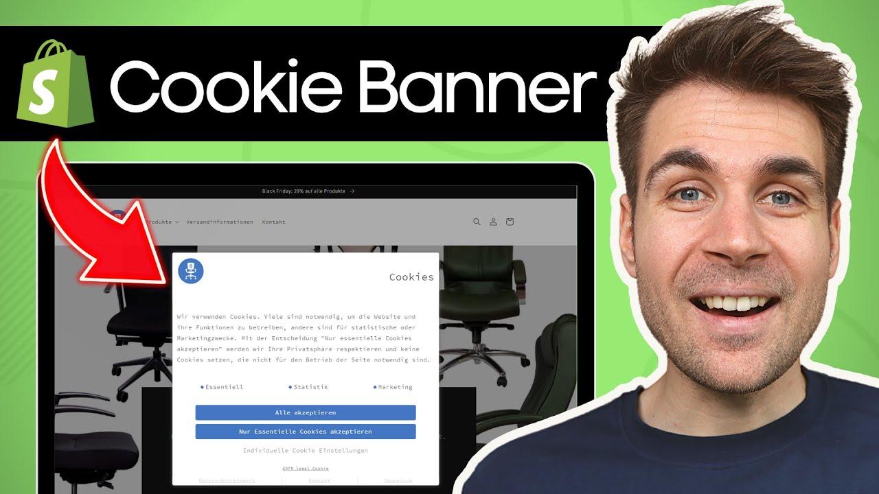
When crafting your cookie banner, less is more! Keep it simple and friendly: “We use cookies to enhance your experience. By continuing to browse, you agree to our use of cookies. Learn more!” This way, you inform without overwhelming.
What to Put On A Cookie Banner So Visitors Aren’t Annoyed
What to Put On A Cookie Banner So Visitors Aren’t Annoyed
Let’s face it: cookie banners can feel like the digital equivalent of someone interrupting your favorite movie with a sales pitch. You’re cozy, engaged, and then—bam!—a pop-up demands your attention, often leaving you feeling more frustrated than informed. But here’s the good news: it doesn’t have to be that way! Crafting a cookie banner that respects your visitors while still fulfilling legal requirements can enhance their experience rather than detract from it. In this article, we’ll explore practical tips and best practices for designing a cookie banner that’s not only compliant but also friendly and engaging. Say goodbye to the dreaded “annoying cookie banner” and hello to a smooth, respectful browsing experience! Let’s dive in.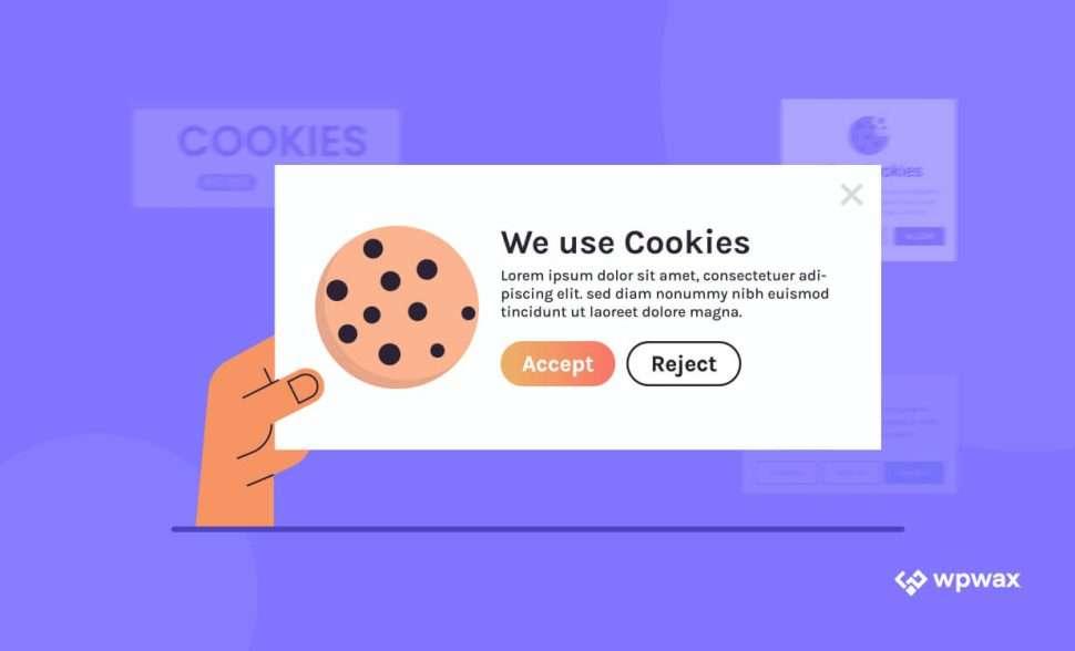
Understanding the Purpose of Cookie Banners for User Trust
Cookie banners may seem like a nuisance, but they serve a significant purpose in the digital landscape. By informing users about cookie usage, businesses build trust and transparency, which are fundamental in today’s privacy-conscious environment. When users see a cookie banner, they should feel reassured rather than overwhelmed.
To enhance user experience and minimize annoyance, a well-crafted cookie banner should include:
- Clear Language: Use simple language that explains what cookies are and how they benefit the user.
- Option to Accept or Decline: Provide users with straightforward choices, allowing them to opt-in or out without hassle.
- Link to Privacy Policy: Include a direct link to your privacy policy for users who want to delve deeper into your data handling practices.
- Customization Options: Allow users to customize their cookie preferences, highlighting that their control is respected.
Consider the layout as well. A visually appealing cookie banner that doesn’t obstruct key content can greatly enhance user perception. A minimalist design with a clear call-to-action often works best. Here’s an example of a simple cookie banner layout:
| Element | Description |
|---|---|
| Message | “We use cookies to enhance your experience. By continuing to visit this site, you agree to our use of cookies.” |
| Buttons | Accept | Customize |
| Privacy Link | Learn more |
Another important aspect is timing. Displaying the cookie banner after a few seconds of user engagement can make it feel less intrusive. This way, users have already had a chance to appreciate your content before being prompted about cookies. Remember, it’s all about making the experience as seamless as possible.
Lastly, don’t forget to acknowledge user feedback. If visitors express annoyance over your cookie banner, take that as a cue to refine your approach. Listening to your users not only enhances their experience but also fosters a stronger, more trusting relationship.
Crafting a Clear and Friendly Message for Your Visitors
When it comes to cookie banners, clarity and friendliness are key. You want to inform your visitors about cookie usage without overwhelming them or making them feel like they’re being bombarded with information. Here are some essential elements you should consider:
- Simple Language: Use straightforward language that everyone can understand. Avoid jargon or overly technical terms to ensure your message is accessible to all.
- Friendly Tone: Draft your message in a warm and welcoming tone. This helps create a positive first impression and encourages users to engage with your site.
- Clear Purpose: Let visitors know why cookies are being used. A brief explanation about how cookies enhance their browsing experience can go a long way.
- Easy Opt-Out Option: Always provide an easy way for users to manage their cookie preferences. This not only builds trust but also respects their choices.
Consider this example of a cookie banner message that incorporates these elements:
| Cookie Banner Example |
|---|
| We use cookies! They help us improve your experience on our site. By continuing to browse, you agree to our use of cookies. Learn more or manage your preferences. |
Another essential aspect is the design of the banner itself. It should be visually appealing and not intrusive. Choose colors that align with your brand while keeping the text easy to read. Incorporating a call-to-action button that stands out can also guide users effectively.
Lastly, consider the placement of your cookie banner. A sticky banner at the bottom of the screen allows users to access important information without obstructing their view of your content. This subtle approach is less likely to annoy your visitors while still fulfilling legal requirements.
Highlighting the Benefits of Cookies Without the Jargon
When it comes to cookies on your website, it’s all about making life easier and more enjoyable for your visitors. Think of cookies as little helpers that enhance the online experience. Here’s how:
- Personalized Experience: Cookies remember your visitors’ preferences, allowing them to pick up right where they left off. Imagine returning to a site that recalls your favorite items or settings!
- Faster Loading Times: By storing information, cookies reduce the need for your visitors to input the same data repeatedly, speeding up their interactions.
- Improved Functionality: Certain cookies enable features like live chats and shopping carts, making browsing smooth and hassle-free.
- Targeted Content: Cookies help tailor content to user interests, which means your visitors are more likely to see products and information that resonate with them.
It’s important to communicate these benefits clearly on your cookie banner. Instead of using technical terms, focus on how cookies can make their experience better:
| Feature | Benefit |
|---|---|
| Remember Preferences | Less hassle with re-entering information |
| Speed Up Navigation | Quick access to favorite sections |
| Enhanced Functionality | Easier interactions with tools and services |
| Tailored Recommendations | More relevant content and offers |
By highlighting these straightforward advantages, you’ll show visitors that cookies are not just a technical necessity but actually a valuable part of their browsing journey. Keeping the message simple and clear can transform a potentially annoying banner into a friendly reminder that enhances their experience.
Ultimately, the key is to strike a balance between compliance and user experience. Make it easy for visitors to say “yes” to cookies by emphasizing how they contribute to a more enjoyable, efficient, and personalized visit. This way, you not only gain their trust but also their appreciation.
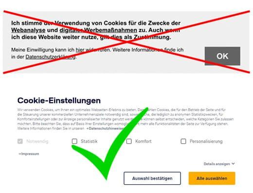
Making Consent Easy: The Importance of Simple Choices
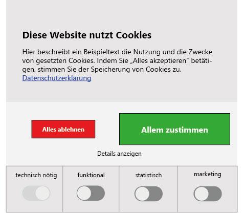
When it comes to cookie banners, simplicity is key. Visitors are often put off by lengthy legal jargon and overwhelming choices. Instead, focus on offering clear options that make it easy for users to understand their choices regarding cookies. Here’s how to structure your cookie consent message effectively:
- Be Concise: Use straightforward language that gets straight to the point. Instead of lengthy explanations, a simple statement like “We use cookies to enhance your experience” can suffice.
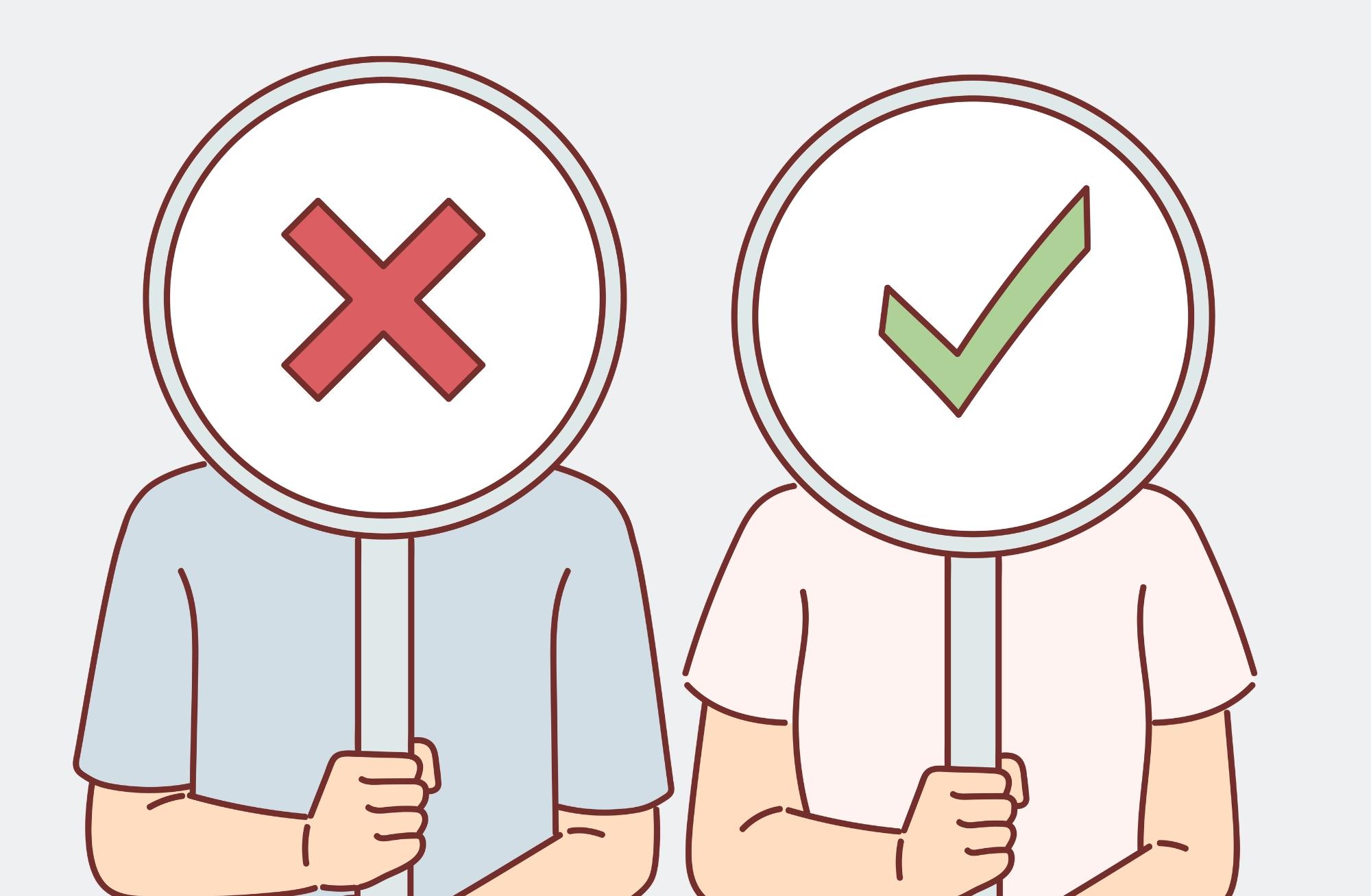
- Offer Clear Options: Provide a few simple choices, such as “Accept All Cookies,” “Only Necessary Cookies,” or “Customize Settings.” This empowers users to make decisions based on their preferences.
- Use Visuals: Icons or color coding can help convey information at a glance. Consider using a checkmark for “accept” options and a cross for “decline” to make it visually intuitive.
Another vital aspect is transparency. Clearly explain what types of cookies you use and why. A brief description can go a long way in building trust between your website and its visitors. Here’s a potential layout:
| Type of Cookie | Purpose |
|---|---|
| Essential Cookies | Required for basic functionality |
| Analytical Cookies | Help us improve our site by tracking usage |
| Marketing Cookies | Used for personalized advertising |
Lastly, make it easy for users to change their preferences later on. A simple link or button that says “Manage Cookies” can enhance user satisfaction and demonstrate that you value their preferences. This also encourages users to engage with your content without the fear of being tracked unnecessarily.
Incorporating these elements into your cookie banner can significantly improve the user experience. By keeping consent simple, you not only comply with regulations but also foster a more positive relationship with your users.
Engaging Design: How a Visually Appealing Banner Enhances User Experience
When visitors land on your website, the first thing that catches their eye is often the cookie banner. If designed thoughtfully, it can actually enhance the user experience rather than detract from it. A visually appealing banner not only grabs attention but can also communicate your brand’s tone and values effectively.
To create a banner that resonates with visitors, consider the following elements:
- Color Scheme: Use colors that align with your brand identity while ensuring high contrast for readability.
- Typography: Choose fonts that are legible and match the style of your site—this helps reinforce your brand’s personality.
- Visuals: Incorporate icons or images that relate to cookies or privacy, which can make the banner more engaging.
- Positioning: A top or bottom placement is usually less intrusive than a pop-up, allowing users to focus on your content while being informed.
Moreover, the wording on your banner plays a crucial role in how users perceive it. Ensure the message is clear and concise. Here’s a quick overview of what language to use:
| Banner Element | Recommended Language |
|---|---|
| Headline | “We value your privacy!” |
| Body Text | “Our website uses cookies to enhance your experience.” |
| Call to Action | “Learn more” |
In addition to aesthetics and messaging, functionality is key. Make sure your cookie banner has clear options for users. Allow them to:
- Acknowledge: An easy ‘Accept’ button ensures a smooth experience.
- Customize: Give users a chance to manage their preferences directly from the banner.
- Dismiss: An unobtrusive ‘X’ or ‘Decline’ option respects user autonomy.
consider implementing subtle animations or transitions when the banner appears. This can draw attention without being too overpowering. A well-crafted banner that combines design, language, and functionality creates a seamless experience that not only informs users but also builds trust—ultimately leading to higher engagement and satisfaction.
Balancing Transparency and User Experience: What to Disclose
When it comes to cookie banners, striking the right balance between transparency and user experience is crucial. Visitors want to feel informed without being overwhelmed. Therefore, the key is to provide clear, concise information that meets legal requirements while keeping the visitor’s journey as smooth as possible.
Essential Information to Include:
- Types of Cookies Used: Specify whether you use essential, performance, functional, or targeting cookies. This helps users understand what they are consenting to.
- Purpose of Each Cookie: Briefly describe why each type of cookie is used. For example, “Performance cookies help us improve our website’s performance by analyzing user behavior.”
- Data Sharing Practices: Clearly state if and with whom user data is shared. This builds trust and transparency.
- User Control Options: Inform visitors about how they can manage their cookie preferences, including opt-out options.
Another effective approach is using a layered consent model. This method allows users to click through to get more detailed information. The initial banner can be kept simple, offering a basic summary, while additional layers provide more granular details. This layered approach caters to both users who appreciate simplicity and those who seek comprehensive information.
| Cookie Type | Purpose | Duration |
|---|---|---|
| Essential | Necessary for website functionality | Session Duration |
| Performance | Improve website performance | 2 Years |
| Functional | Enhance user experience | 1 Year |
| Targeting | Personalized advertising | 6 Months |
consider the design of your cookie banner. A visually appealing, non-intrusive banner can significantly enhance user experience. Use colors and fonts that align with your brand while ensuring readability. Avoid using aggressive language that may irritate users; instead, opt for friendly, approachable communication that invites them to engage with your privacy practices.
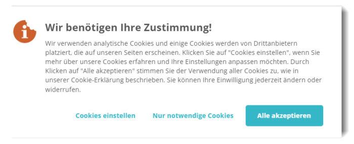
Offering an Opt-Out Option to Respect User Preferences
In today’s digital landscape, respecting user preferences is paramount. By providing an opt-out option in your cookie banner, you’re not just complying with regulations like GDPR; you’re also fostering trust with your audience. Users appreciate transparency and the ability to control their data. Here’s how you can effectively implement this option.
First, clearly present the opt-out option right in the cookie banner. This can be done by including a simple checkbox that allows users to decline non-essential cookies. When users feel empowered to make choices, they’re more likely to engage positively with your site.
- Simple Language: Avoid jargon. Use phrases like “I don’t want cookies that track my browsing” instead of complicated legal terms.
- Visibility: Make the opt-out option prominent so users can find it without hassle.
- Immediate Feedback: Provide instant confirmation when users opt out, reinforcing their decision.
Another effective strategy is to create a dedicated cookie preferences page. Link this from your cookie banner, enabling users to delve deeper into what each type of cookie does and the implications of opting in or out. This approach not only informs users but also demonstrates your commitment to transparency.
| Type of Cookie | Purpose | Opt-Out Option |
|---|---|---|
| Essential Cookies | Necessary for website functionality | No |
| Performance Cookies | Analyze site usage | Opt-Out Here |
| Targeting Cookies | Personalized advertising | Opt-Out Here |
don’t forget to periodically review and update your cookie policies. As privacy regulations evolve and user expectations change, being adaptable will keep your brand ahead of the curve. Informing users of updates through your banner will further establish your credibility and commitment to data protection.
Testing and Iterating Your Cookie Banner for Optimal Performance
To ensure your cookie banner doesn’t just blend into the background, effective testing and iteration are paramount. By implementing a structured approach, you can fine-tune your cookie consent strategy to enhance user experience while remaining compliant. Here’s how to get started:
Utilize A/B Testing: Experimentation is key. Launch different versions of your cookie banner with slight variations. Consider testing elements such as:
- Text Content: Try variations in the wording of your consent message.
- Design: Change colors, fonts, and button styles.
- Placement: Position the banner at the top, bottom, or as a pop-up.
Monitor how these changes affect user interaction. Are visitors more likely to accept cookies with a playful message versus a formal one? Tracking these metrics will offer invaluable insights into user preferences.
Gather Feedback: Direct feedback from users can highlight specific pain points. Integrate quick surveys or feedback forms within your site. Ask questions like:
- Was the cookie banner clear and easy to understand?
- Did you feel pressured to accept cookies?
Analyzing responses can help you pinpoint elements that may be causing annoyance or confusion, allowing you to address them promptly.
Implementing Changes: Based on the data gathered, prioritize changes that could lead to improved acceptance rates without sacrificing transparency. For example, if users prefer a simpler design, consider streamlining your cookie banner while still providing essential information.
Measure Success: After making adjustments, continuously measure the effectiveness of your updated cookie banner. Look for an increase in acceptance rates and a decrease in bounce rates. A successful cookie banner should not only enhance compliance but also keep users engaged with your content.
| Version | Acceptance Rate | User Feedback Score |
|---|---|---|
| Version A | 65% | 4.2/5 |
| Version B | 78% | 4.7/5 |
| Version C | 82% | 4.9/5 |
By actively testing and iterating your cookie banner, you not only enhance user experience but also foster trust. A well-structured approach to your cookie consent strategy will keep visitors happy while ensuring full compliance.
Educating Users: Providing Resources for Informed Consent
To create a positive user experience on your website, it is crucial to provide clear and concise information regarding cookie usage. Users often feel overwhelmed by cookie banners that are either too vague or excessively technical. Instead, consider incorporating the following elements to strike a balance between compliance and user satisfaction:
- Clear Language: Use simple, everyday terms to describe what cookies are and why they’re used. Avoid jargon that can alienate users.
- User Benefits: Highlight how cookies enhance their browsing experience. For example, mention features like personalized content or faster page loading times.
- Options for Control: Provide users with straightforward choices. Make it easy for them to accept, reject, or customize their cookie preferences.
Additionally, you might want to include a link to a dedicated cookie policy that dives deeper into specifics without cluttering the initial banner. This policy can include:
- Types of Cookies: A brief explanation of first-party versus third-party cookies.
- Retention Period: Clarify how long cookies will remain on the user’s device.
- Data Usage: Clearly state how you will use the data collected through cookies.
| Cookie Type | Purpose |
|---|---|
| Essential Cookies | Necessary for website functionality (e.g., login, shopping cart). |
| Performance Cookies | Help us understand how users interact with our site. |
| Targeting Cookies | Used for advertising and tracking user preferences. |
keep your cookie banner visually appealing but unobtrusive. A minimalist design can go a long way in keeping the user’s focus on your content rather than the banner itself. Consider using colors and fonts that align with your brand while ensuring legibility.
the key to an effective cookie banner lies in transparency and user empowerment. By educating visitors about cookies in a straightforward manner, you not only comply with regulations but also foster trust and enhance their overall experience on your website.
Staying Compliant: Navigating Legal Requirements with Care
When it comes to cookie banners, striking the right balance between compliance and user experience is crucial. Visitors want to feel respected, not bombarded with legal jargon. Here’s how to make your cookie banner informative yet friendly:
- Clear Language: Use simple, everyday language that everyone can understand. Avoid legalese and complex terminology. For example, instead of saying, “We utilize cookies to enhance your user experience,” try “We use cookies to make your visit better!”
- Purpose of Cookies: Clearly explain why you are using cookies. Visitors appreciate transparency, so let them know if it’s for analytics, personalization, or marketing purposes. A brief description helps demystify the cookie usage.
- Customization Options: Give users the ability to customize their cookie preferences. Allow them to choose which types of cookies they want to accept, such as essential, performance, or targeting.
- One-Click Acceptance: Make it easy for visitors to accept cookies with a prominent button. A simple “Accept All Cookies” option can streamline the process and reduce frustration.
Additionally, consider employing a concise table to present cookie categories and their purposes. This not only organizes the information but also enhances clarity:
| Cookie Type | Purpose |
|---|---|
| Essential | Necessary for website functionality |
| Performance | Helps us analyze site performance |
| Targeting | Personalizes ads based on your interests |
it’s vital to remind users that they can change their cookie settings later. Including a link to the cookie settings in your site’s footer ensures ongoing transparency and control. This not only builds trust but also shows that you value their experience beyond the initial visit.
By focusing on clarity, user control, and transparency, you can craft a cookie banner that meets legal requirements while keeping visitors engaged and satisfied, creating a welcoming online environment.
Frequently Asked Questions (FAQ)
Q&A: What to Put On A Cookie Banner So Visitors Aren’t Annoyed
Q: What’s the purpose of a cookie banner?
A: Great question! A cookie banner is essential for informing visitors about the use of cookies on your website. It helps comply with privacy regulations, like the GDPR or CCPA, while also making your visitors feel respected and informed about their data.
Q: What should I include on the cookie banner?
A: Keep it simple and transparent! Start with a brief statement about why you use cookies, such as enhancing user experience or analyzing site traffic. Then, include options for users: a clear “Accept” button, a “Decline” option, and a link to your cookie policy for more details. This way, visitors feel they have control over their data.
Q: How do I make my cookie banner less annoying?
A: Personalization is key! Use friendly, conversational language that reflects your brand’s tone. Instead of “We use cookies,” try something like, “We use cookies to make your experience even better!” This approach feels more like a friendly nudge than a demand.
Q: Should I give users the option to manage cookie preferences?
A: Absolutely! Providing an option for users to customize their cookie preferences can greatly enhance their experience. Consider adding a “Manage Preferences” link, allowing users to choose which cookies they want to accept. This empowers them and shows that you care about their choices.
Q: How can I encourage visitors to accept cookies without being pushy?
A: Focus on the benefits! You might say something like, “Accepting cookies helps us bring you personalized content and recommendations.” Highlighting the positive aspects makes accepting cookies feel like a win-win rather than a compromise.
Q: What’s the best way to position my cookie banner?
A: For optimal visibility without being intrusive, position your cookie banner at the bottom or top of your webpage. A subtle design that blends with your site colors can keep it aesthetically pleasing while still catching the visitor’s attention.
Q: How often should I show the cookie banner?
A: Once is usually enough! Once a visitor makes their choice, remember it for future visits. Repeatedly showing the banner can be frustrating and lead to a negative experience. If they decline, respect that choice!
Q: Can I add humor to my cookie banner?
A: If it fits your brand’s voice, go for it! Humor can lighten the mood and make the experience more enjoyable. Just make sure it doesn’t distract from the important message you’re conveying about privacy and consent.
Q: What are some common mistakes to avoid with cookie banners?
A: Avoid jargon and legalese—keep it straightforward! Also, don’t make the “Accept” button more prominent than the “Decline” option; that can come across as manipulative. Lastly, ensure the banner is mobile-friendly; it should look good and be easy to interact with on any device!
Q: What’s the takeaway for creating an effective cookie banner?
A: Put yourself in your visitors’ shoes. Be clear, concise, and respectful in your messaging. Focus on building trust by being transparent about data usage. A well-crafted cookie banner can enhance user experience while keeping you compliant with regulations—everyone wins!
Future Outlook
creating a cookie banner that resonates with your visitors while staying compliant with regulations doesn’t have to be a daunting task. By being transparent, friendly, and inviting, you can turn what often feels like a nuisance into a positive part of the user experience. Remember, it’s all about striking the right balance—informing your visitors without overwhelming them.
So next time you’re crafting your cookie banner, think beyond the standard cookie-cutter phrases. Use engaging language, provide clear options, and perhaps even a sprinkle of humor to make the experience enjoyable. After all, your visitors are more likely to engage with your site when they feel respected and informed.
Ready to give your cookie banner a makeover? With a thoughtful approach, you can ensure that it’s not just a box to check off, but a way to enhance your visitors’ experience. Happy cookie crafting! 🍪✨
New Providers
Enjoy The Speed Of Downloading & Uploading With 1GBPS Port
Affordable Dedicated Servers & Colocation Services. Services: Dedicated Servers Colocation Private Cabinet Colocation DDoS Protection
Up to 85% off hosting + website builder
Latest News
- Selling Digital Products Online: 5 Steps That WorkJuly 27, 2026 10
- How to Create an Art Portfolio That Gets You HiredJuly 27, 2026 12
- Best WordPress Calendar Plugin: Top 8 Picks for Events and BookingsJuly 27, 2026 13
- How to Create an Online Survey in WordPress? (Easy Guide)July 27, 2026 12
- Elementor Cloud Review 2023 – Is It Worth it? (Complete Review)July 27, 2026 12


We specialize in providing Web hosting reviews. Where you can search for potential hosts.