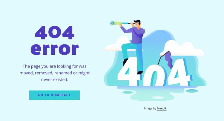
Ever stumbled upon a 404 page and felt lost? You’re not alone! But some brands turn this frustration into an opportunity. Discover the 7 best 404 page examples that not only entertain but also guide users back on track with clever design and witty messaging!
7 Best 404 Page Examples and Every Best Practice They Use
Introduction
We’ve all been there: you click on a link, and instead of the content you were eagerly anticipating, you land on the dreaded 404 error page. It’s frustrating, right? But what if I told you that a 404 page doesn’t have to be just a dead end? In fact, it can be a golden opportunity for creativity, engagement, and even conversion!
In this article, we’re diving into the 7 best 404 page examples that turn a frustrating moment into a delightful experience. These pages don’t just inform users that something went wrong; they embrace the mishap with humor, style, and clever design. We’ll break down the best practices behind each example so you can learn how to transform your own 404 page into a powerful tool that enhances user experience. Ready to discover how you can turn those user frowns upside down? Let’s get started!
Understanding the Importance of a Great 404 Page
When users land on a 404 page, it often feels like hitting a brick wall. But instead of leaving them frustrated, a well-crafted 404 page can transform a negative experience into a positive one. The importance of a great 404 page lies in its ability to maintain user engagement and guide visitors toward their desired content, even when they encounter an error.
A great 404 page serves multiple purposes:
- Redirecting Users: It can provide immediate links to popular or related pages, helping users find what they’re looking for without having to hit the back button.
- Brand Personality: This is an opportunity to showcase your brand’s voice and creativity. A little humor or a clever design can leave a lasting impression, even in an unexpected situation.
- User Retention: Instead of losing a potential customer, an engaging 404 page can encourage visitors to stay and explore other areas of the site.
Incorporating elements like a search bar, a site map, or even a chatbot can significantly enhance the effectiveness of a 404 page. By addressing users’ needs directly, you increase the chances of them remaining on your site rather than bouncing away. Here’s a quick look at some features that can elevate your 404 page:
| Feature | Description |
|---|---|
| Search Bar | Allows users to quickly search for the content they were looking for. |
| Suggested Links | Provides direct links to popular or relevant pages on your site. |
| Contact Information | Gives users a way to reach out if they need further assistance. |
| Visual Elements | Engaging graphics or animations to make the page more visually appealing. |
Lastly, a great 404 page can be a critical part of your site’s SEO strategy. By reducing bounce rates and encouraging further exploration, you signal to search engines that your site is a valuable resource, which can positively impact your rankings. So, don’t overlook this page; instead, see it as a unique opportunity to connect with your audience in a memorable way.
Top Characteristics of an Effective 404 Page Design
An effective 404 page is more than just a placeholder; it’s an opportunity to engage users and guide them back to the content they seek. Here are some essential characteristics that can make your 404 page stand out:
- Clear Messaging: Make sure the message is straightforward. Users should immediately understand that the page they are looking for cannot be found.
- Visual Appeal: Use design elements that are consistent with the rest of your website. This includes colors, fonts, and imagery that reflect your brand identity.
- Helpful Navigation: Provide links to popular pages, the homepage, or a search bar. This helps users quickly find what they need without feeling lost.
- Humor and Personality: Inject some humor or a friendly tone to lighten the mood. A well-crafted message can turn frustration into a smile.
- Responsive Design: Ensure the page looks good on all devices. A responsive layout helps maintain user engagement regardless of the screen size.
Additionally, consider incorporating a search bar prominently on your 404 page. This element can significantly reduce bounce rates by allowing users to find what they were searching for without having to navigate away from the error page. A well-positioned search function can transform a frustrating experience into a seamless one.
Another key aspect is the use of engaging visuals. Whether it’s a quirky illustration or a striking image, incorporating graphical elements can capture attention and create a memorable experience. Here’s a simple table that outlines some effective visual strategies:
| Visual Element | Purpose |
|---|---|
| Illustrations | Add a touch of creativity and personality. |
| Icons | Guide users towards navigation options. |
| Background Images | Create a visually appealing context. |
Lastly, don’t underestimate the power of a call-to-action (CTA). Encourage users to explore other parts of your site with compelling CTAs that resonate with their initial intent. Phrases like “Return to the homepage” or “Check out our latest articles” can prompt users to continue their journey instead of leaving your site in frustration.

How Humor Can Turn a Frustrating Experience into a Delightful One
Ever stumbled upon a 404 error page and felt that twinge of frustration? You’re not alone! The infamous “Page Not Found” can be a real downer. However, some brands have turned this negative experience into a delightful one by incorporating humor and creativity, transforming an inconvenience into an enjoyable moment.
Humor has a unique ability to diffuse frustration. When faced with a 404 error, a clever joke or a witty remark can lighten the mood. For instance, a site that greets you with a playful “Oops! Looks like you’ve wandered off the beaten path” creates a sense of ease. Instead of feeling annoyed, users might chuckle and appreciate the light-hearted approach.
Here are a few ways businesses cleverly use humor on their 404 pages:
- Playful Illustrations: Unique and funny graphics can visually engage users. Imagine a cartoon character looking confused, with a thought bubble saying, “Where did you go?”
- Witty Copy: A strong sense of humor in the text, like “You’re not lost; you’re just on a little adventure,” keeps users smiling while they figure out their next move.
- Interactive Elements: Some pages invite users to play a simple game or solve a riddle, making their experience memorable while they wait to find what they were looking for.
Furthermore, humor doesn’t just entertain; it builds brand personality. A playful 404 page reflects a company’s culture and values, inviting users to connect on a more personal level. This connection can lead to increased customer loyalty, turning a potentially frustrating moment into an opportunity for engagement.
To illustrate the impact of humor on user experience, let’s take a look at some brands that have nailed their 404 pages:
| Brand | 404 Page Feature | Impact |
|---|---|---|
| Funny Or Die | Humorous video clips | Instant laughter |
| Mailchimp | Creative illustrations with puns | Memorable brand identity |
| Disney | Playful characters saying “Oops!” | Emotional connection |
In essence, what could have been a frustrating experience is transformed into a delightful interaction. By leveraging humor and creativity, brands not only mitigate frustration but also leave a lasting positive impression. So, next time you hit a 404 page, take a moment to appreciate the creativity that’s turned a mishap into a moment of joy.
Incorporating Brand Identity into Your 404 Page
When users land on a 404 page, it’s not just a missed opportunity; it’s a chance to showcase your brand’s personality. An effective 404 page can turn a frustrating experience into a delightful one by incorporating elements that reflect your brand identity. Here are some key strategies to make your 404 page not only informative but also a true representation of your brand.
- Consistent Visual Elements: Use your brand’s color palette, typography, and logo on the 404 page. This visual consistency helps users feel grounded and reassured, even when they hit a snag.
- Brand Voice: Maintain your brand’s tone of voice. Whether it’s playful, professional, or quirky, the language used should resonate with your audience and align with your overall messaging.
- Creative Imagery: Incorporate custom illustrations or graphics that relate to your brand. This not only adds a unique touch but also keeps the page engaging and on-brand.
Moreover, a well-crafted 404 page can guide users back into the fold. Instead of simply stating “Page Not Found,” consider adding interactive elements that embody your brand’s ethos:
- Helpful Links: Include links to popular pages, recent blog posts, or the home page. This not only aids navigation but also encourages users to explore more of what your brand has to offer.
- Search Functionality: Empower users by adding a search bar to help them find what they were looking for. This demonstrates that you value their time and want to assist them in their journey.
Don’t shy away from humor or wit if that’s part of your brand’s persona. A light-hearted message can make users smile, turning their moment of frustration into a memorable encounter. Think of creative taglines or playful animations that capture your brand’s essence—this can leave a lasting impression.
Lastly, consider adding social proof or testimonials on your 404 page. Displaying snippets of positive customer feedback can reassure users that they’re in the right place, even if they’ve hit a bump along the road. This reinforces trust and encourages them to continue exploring your site.

Guiding Users Back to Relevant Content with Smart Navigation
When a user lands on a 404 page, it can feel like they’ve hit a dead end. However, the real opportunity lies in guiding them back to the paths that matter. Smart navigation can transform a frustrating experience into a seamless one. By implementing strategic elements on your 404 page, you can help users regain their sense of direction and encourage them to continue exploring your site.
Here are some effective tactics to enhance navigation on your 404 page:
- Search Bar: Include a prominent search bar that allows users to quickly find what they were looking for. Make it visible and user-friendly.
- Suggested Links: Offer a curated list of links to popular or relevant content. This helps users discover other valuable resources on your site.
- Homepage Link: Always provide a clear pathway back to the homepage. Users should know they can start fresh without unnecessary clicks.
- Categories or Topics: Display categories or topics that organize your content. This helps users dive into areas of interest without feeling lost.
Moreover, interactive elements can significantly enhance user engagement. Consider the following additions:
| Interactive Element | Benefit |
|---|---|
| Interactive Quiz | Engages users and directs them to tailored content based on their answers. |
| Chatbot Support | Offers real-time assistance, guiding users to relevant sections of the site. |
| Content Recommendations | Utilizes algorithms to suggest articles or products based on user behavior. |
Ultimately, the goal is to create a friendly and inviting atmosphere that reassures users they haven’t stumbled into a void. Instead, they are still on a journey, and you are there to guide them. By implementing smart navigation strategies, you can transform your 404 page from an obstacle into an opportunity for connection and exploration.
Engaging Your Audience with Creative Visuals and Messaging
Creating a memorable 404 page goes beyond just announcing an error; it’s an opportunity to connect with your audience in a unique way. When users stumble upon a missing page, their initial frustration can quickly transform into amusement or curiosity if the visuals and messaging are executed correctly. Below are some strategies to enhance your 404 pages using creative visuals and engaging content:
- Whimsical Illustrations: Use fun, eye-catching graphics that resonate with your brand’s personality. A playful illustration can lighten the mood and encourage users to stay on your site rather than clicking away.
- Conversational Language: Speak directly to your visitors with a friendly tone. Phrasing like, “Oops! Looks like you’ve taken a wrong turn,” can make the experience less frustrating.
- Imagery that Tells a Story: Utilize visuals that capture a narrative. For instance, an image of a lost traveler searching for the right path can metaphorically represent users trying to find their way back to your content.
Additionally, integrating humor into your 404 message can be highly effective. A clever pun or a witty remark can turn a potentially disappointing experience into a delightful one. Consider using a combination of visuals and text that emphasizes your brand’s voice. Here are some ideas:
- Interactive Elements: Adding elements like a mini-game or animations can engage users further. For example, a small puzzle related to your brand can captivate attention and keep users entertained.
- Clear Navigation Options: Provide easy access to the rest of your site. A well-placed button that leads users back to the homepage or popular sections can make a significant difference.
- Encourage Exploration: Suggest related content or popular posts they might enjoy. This not only retains user interest but also enhances their browsing experience.
| Example | Visual Strategy | Messaging Approach |
|---|---|---|
| Airbnb | Whimsical characters | Friendly and approachable |
| GitHub | Illustrative error mascot | Humorous and relatable |
| Netflix | Bold graphics | Conversational with pop culture references |
Ultimately, your 404 page should serve as a bridge, guiding users back to meaningful content while embodying the essence of your brand. By employing creative visuals and engaging messages, you can transform an error into an experience that users will remember and appreciate. So, when designing your 404 pages, think outside the box and let your creativity shine!
Learning from the Best: What Makes These 404 Pages Stand Out
When users land on a 404 page, they are often met with frustration. However, some brands have turned this moment of disappointment into an opportunity to engage and delight their visitors. So, what sets these standout 404 pages apart from the rest? Let’s dive into the key elements that make them memorable.
- Whimsical Design: Many of the best 404 pages feature playful, eye-catching designs that soften the blow of encountering a dead end. These pages often incorporate unique illustrations or animations that reflect the brand’s personality.
- Humor: A touch of humor goes a long way in transforming a negative experience into a positive one. Clever taglines or witty graphics can lighten the mood and encourage users to stay on the site rather than leave.
- Helpful Navigation: Instead of leaving users stranded, great 404 pages include links to popular content or a search bar, guiding visitors back to the main site. This thoughtful navigation keeps users engaged, helping them find what they were looking for in the first place.
- Clear Branding: The best 404 pages maintain consistent branding, featuring the logo and brand colors prominently. This reinforces brand recognition even in a frustrating moment, showcasing a cohesive user experience.
- Social Proof: Some brands incorporate testimonials or user reviews on their 404 pages. This not only distracts from the error but also builds trust and encourages users to explore further.
Let’s take a look at some exemplary 404 pages and the best practices they employ:
| Brand | Key Feature | Unique Element |
|---|---|---|
| Airbnb | Visual Appeal | Stunning photography with a playful message |
| GitHub | Humor | Funny illustrations that resonate with developers |
| LEGO | Interactive Elements | Engaging building blocks to create your own adventure |
| Netflix | Clear Navigation | Suggestions for shows and movies based on user preferences |
By implementing these techniques, brands not only mitigate the impact of a 404 error but also enhance their overall user experience. A well-crafted 404 page can serve as a reminder that while the page may be missing, the brand is still very much present and valuable. The key is to turn a moment of confusion into a delightful encounter, inviting users to stay a little longer and explore.
Testing and Analyzing Your 404 Page for Continuous Improvement
To truly enhance the effectiveness of your 404 page, it’s essential to engage in periodic testing and analyzing. This approach not only helps you identify what’s working but also uncovers areas that need improvement. Here are some strategies to consider:
- A/B Testing: Create two versions of your 404 page and direct equal traffic to each. Monitor which version has a lower bounce rate and higher engagement.
- User Feedback: Implement feedback options on your 404 page. Simple thumbs up/down buttons can provide insight into user satisfaction.
- Analytics Tracking: Utilize tools like Google Analytics to track how users interact with your 404 page. Pay attention to metrics like time spent on the page and click-through rates to other sections of your site.
- Heatmaps: Tools like Hotjar or Crazy Egg can visually show where users are clicking on your 404 page. This data can guide adjustments to layout and content.
It’s also crucial to analyze the data over time. Regularly scheduled reviews can lead to significant insights:
| Metric | Importance | Action |
|---|---|---|
| Bounce Rate | Indicates user dissatisfaction | Revise content or add engaging elements |
| Click-Through Rate | Shows effectiveness of links | Optimize link placements |
| Time on Page | Reflects user engagement | Add more compelling content |
Additionally, consider the context behind 404 errors. Are most of them occurring on specific pages? If so, investigate why users are landing there and whether that content can be improved or redirected. Keeping an eye on trends can lead to proactive adjustments rather than reactive fixes.
The ultimate goal of your 404 page shouldn’t just be to inform users they’ve hit a dead end. Instead, aim to redirect them towards something valuable. By continuously testing and analyzing your 404 page, you’ll not only minimize frustration but also enhance user experience, ultimately driving them back to your core content.
Best Tools and Resources to Create Stunning 404 Pages
Creating a captivating 404 page is not just about aesthetics; it’s about transforming a potential user frustration into an opportunity for engagement. Here are some of the best tools and resources that can help you craft a stunning 404 page that keeps visitors on your site:
- Canva: This graphic design tool offers an array of templates and design elements that make it easy to whip up eye-catching visuals for your 404 page. Whether you want whimsical graphics or sleek modern designs, Canva has you covered.
- Adobe XD: For those who are more design-savvy, Adobe XD allows you to create interactive prototypes that can help you visualize user flows, including how visitors will interact with your 404 page.
- Figma: This collaborative design tool is perfect for teams. You can brainstorm, create, and share your 404 page designs in real-time, ensuring that everyone’s feedback is included in the final product.
- WordPress Plugins: There are several plugins available that can help you customize your 404 page without needing to touch a single line of code. Popular options include 404page and Custom 404 Pro, which allow for easy customization of design and content.
Aside from tools, leveraging the right resources can greatly enhance the quality of your 404 page. Here’s a helpful table that outlines some excellent resources:
| Resource | Type | Description |
|---|---|---|
| Creative Market | Design Assets | A marketplace for high-quality graphic templates, including 404 page designs. |
| Unsplash | Stock Photos | Access to stunning, royalty-free images that can enhance your 404 page’s visual appeal. |
| Google Fonts | Typography | A vast selection of fonts that can help set the tone of your 404 page. |
| CSS Tricks | Web Design Guide | Offers tips and tricks for enhancing your website’s design, including styling your 404 page. |
Lastly, don’t forget about best practices! A successful 404 page should include:
- A clear message: Let visitors know they’ve landed on a 404 page.
- A navigation menu: Help them find their way back to relevant content.
- Search functionality: Provide a search bar to make it easy for users to find what they’re looking for.
- Fun elements: Consider adding humor or creative visuals to lighten the mood.
Utilizing these tools, resources, and best practices will not only improve user experience but can also help in retaining visitors when they face a dead end on your website.
Final Thoughts: Elevating User Experience with a Thoughtful 404 Page
When users land on a 404 page, it’s often a moment of frustration and confusion. However, this is a unique opportunity for brands to turn that negative experience into something positive. A well-designed 404 page not only informs users that the page they’re looking for doesn’t exist but also engages them, encourages exploration, and strengthens brand identity.
To elevate the user experience, consider incorporating these elements into your 404 page:
- Clear Messaging: Use concise language that directly informs users of the error. Humor can help lighten the mood, but clarity is key.
- Branding Elements: Ensure that your brand’s personality shines through—use the same colors, fonts, and tone as the rest of your site.
- Navigation Options: Provide users with links to popular content, the homepage, or a search bar to help them find what they need quickly.
- Visual Appeal: Use eye-catching graphics or animations that align with your brand, making the experience less jarring and more memorable.
- Social Proof: Consider adding testimonials or links to popular articles to encourage users to stay engaged with your content.
Additionally, implementing a search feature on your 404 page can significantly enhance user satisfaction. This allows visitors to quickly search for the content they were expecting, rather than feeling lost. A search bar right on the 404 page can keep users from bouncing away entirely.
| Element | Purpose |
|---|---|
| Clear Error Message | Informs users about the issue |
| Branding Elements | Reinforces brand identity |
| Navigation Options | Guides users to relevant content |
| Search Bar | Helps users find what they need |
don’t underestimate the power of analytics. Track user behavior on your 404 page to identify patterns—what links do users click on? Are they searching for specific content? This information is valuable for enhancing both the 404 experience and overall site navigation, helping to minimize the chances of users encountering this error in the future.
Frequently Asked Questions (FAQ)
Q&A: 7 Best 404 Page Examples and Every Best Practice They Use
Q1: What exactly is a 404 page?
A: Great question! A 404 page appears when a user tries to access a webpage that doesn’t exist. It’s basically a “Oops! We can’t find that page” notification. Instead of leaving users hanging, a well-designed 404 page can turn a frustrating experience into an engaging one.
Q2: Why should I care about my 404 page?
A: Your 404 page is more important than you might think! It’s an opportunity to retain visitors who might otherwise leave your site. A clever and useful 404 page can minimize bounce rates, guide users back to relevant content, and reinforce your brand identity. Plus, it helps improve your overall user experience!
Q3: What makes a 404 page effective?
A: An effective 404 page should be clear and friendly. It should tell users they’ve hit a dead end, but also guide them back to useful content. Key features often include a search bar, links to popular pages, and a touch of humor or personality that reflects your brand.
Q4: Can you share some examples of great 404 pages?
A: Absolutely! Here are a few that stand out:
- The 404 Page from Airbnb: It uses beautiful imagery and offers suggestions for nearby experiences, keeping users engaged.
- GitHub’s 404: It’s simple and features a cheeky illustration of a cat, which lightens the mood.
- Netflix: Their 404 page captures the essence of their brand with a playful design featuring a “This page is like a lost episode” message.
- Blizzard Entertainment: Their page is visually captivating, with a fun illustration that connects to their gaming world.
- MailChimp: They use humor and a cute monkey illustration, making it memorable and delightful.
- Lego: The playful design with Lego blocks invites users to explore other parts of the site.
- Wikihow: This page is practical, offering immediate links to popular articles, making it user-friendly.
Q5: What best practices should I follow when designing my 404 page?
A: Here are some best practices to keep in mind:
- Clarity: Clearly communicate that the page couldn’t be found.
- Branding: Keep your design consistent with your overall branding.
- Navigation options: Provide links to your homepage and popular content.
- Search bar: Offer a search function to help users find what they need.
- Humor and personality: If it fits your brand, a touch of humor can make the experience more enjoyable.
- Mobile-friendly design: Ensure your 404 page looks good on all devices.
- Feedback option: Consider allowing users to report broken links to improve your site.
Q6: How do I know if my 404 page is effective?
A: Monitor analytics like bounce rates and user feedback. If you notice visitors are leaving your site from the 404 page, it might be time to rethink its design and content. Tools like heatmaps can also show you how users interact with the page.
Q7: Can I get creative with my 404 page?
A: Absolutely! Creativity can set your brand apart. Whether it’s through unique illustrations, clever copy, or interactive elements, don’t be afraid to showcase your brand’s personality. Just remember to keep it user-friendly!
Q8: What’s the takeaway from all this?
A: Your 404 page doesn’t have to be a dead end; it can be a gateway to maintaining user engagement and enhancing their experience on your site. By following best practices and drawing inspiration from the best examples out there, you can turn a potential loss into a remarkable opportunity. So, let’s get creative and make that 404 page shine!
Future Outlook
As we wrap up our exploration of the 7 best 404 page examples and the best practices that make them stand out, it’s clear that a well-designed error page can turn a frustrating experience into an opportunity for engagement. Remember, a 404 page doesn’t have to be a dead end; it can be a chance to showcase your brand’s personality, guide users back to valuable content, and even add a touch of humor to their browsing experience.
So, as you think about your own website, take a moment to evaluate your current 404 page. Is it merely a placeholder, or does it reflect your brand’s unique voice and values? By implementing some of the strategies we’ve discussed—from creative copy and eye-catching visuals to clear navigation and helpful links—you can transform your 404 page into a tool that delights and informs.
Don’t let a misstep on your website cost you a potential customer. Instead, embrace the challenge and craft a 404 experience that leaves users with a smile, even when they hit a bump in the road. Let’s turn those errors into opportunities and make every visit to your site memorable—because every click counts!

New Providers
Enjoy The Speed Of Downloading & Uploading With 1GBPS Port
Affordable Dedicated Servers & Colocation Services. Services: Dedicated Servers Colocation Private Cabinet Colocation DDoS Protection
Up to 85% off hosting + website builder

Latest News
- How to Get a Web Address for Free in MinutesJuly 6, 2026 12
- Kinsta WordPress Hosting Review – Is it Worth it? (Full Guide)July 6, 2026 19
- 5 Best Affordable Website Design Packages for Small BusinessJuly 5, 2026 24
- 13 Best AI WordPress Themes for 2023 (Compared)July 4, 2026 26
- 9 Best Productivity Apps to Save 10+ Hours Every WeekJuly 4, 2026 27

We specialize in providing Web hosting reviews. Where you can search for potential hosts.