Looking to spice up your WordPress site with stunning charts? Check out our list of the 11 best chart plugins that make data visualization a breeze! Transform your numbers into eye-catching visuals and engage your audience like never before!
11 Best WordPress Chart Plugins + How to Create Beautiful Charts
Are you tired of dull and uninspiring charts cluttering your WordPress site? You’re not alone! Presenting data in a visually appealing way is crucial for engaging your audience and making your content more digestible. Whether you’re a blogger, a business owner, or a data enthusiast, beautiful charts can transform your information into eye-catching visuals that resonate with your readers.
In this article, we’ll dive into the 11 best WordPress chart plugins that can help you create stunning charts with ease. From simple bar graphs to complex interactive infographics, these tools are designed to elevate your data presentation game. Plus, we’ll guide you through the process of creating beautiful charts, ensuring you can impress your audience with minimal effort. Ready to take your data visualization to the next level? Let’s get started!
Understanding the Importance of Visual Data in WordPress
Visual data plays a crucial role in how we communicate information online, especially on platforms like WordPress. When you present data visually, you transform complex numbers into engaging stories that can be easily understood and remembered. This is where chart plugins come into play, offering an array of tools to create stunning visual representations of your data.
Many users are drawn to visual content because it is easier to digest than blocks of text. Charts and graphs can highlight trends, comparisons, and patterns that might be lost in numerical data. By using chart plugins in WordPress, you enable yourself to:
- Enhance User Experience: Visually appealing charts keep visitors engaged and encourage them to explore more of your content.
- Boost Information Retention: Studies have shown that people retain information better when it is presented visually.
- Facilitate Quick Understanding: A good chart can convey a message in seconds, allowing your audience to grasp key insights at a glance.
Choosing the right chart plugin is essential. Many plugins come with customizable features, allowing you to tailor the appearance of charts to fit your website’s style. This customization can include color schemes, fonts, and even interactive options, which encourage user interaction and can lead to a deeper understanding of the data being presented.
Consider the following factors when selecting a chart plugin:
| Feature | Importance |
|---|---|
| Ease of Use | Users should be able to create charts without extensive training. |
| Customization Options | Flexibility to match brand aesthetics enhances visual appeal. |
| Responsive Design | Charts must look good on all devices, from desktops to smartphones. |
| Data Integration | Ability to pull data from various sources seamlessly. |
When used correctly, visual data can elevate your content from ordinary to extraordinary. By incorporating beautiful charts, you not only convey information but also create a visual journey that can resonate with your audience. Empower your WordPress site to tell a compelling story with data that clicks, attracts, and informs.
Top Features to Look for in WordPress Chart Plugins
- Ease of Use: A user-friendly interface allows even beginners to create and customize charts effortlessly. Look for plugins that offer drag-and-drop functionality or intuitive wizards.
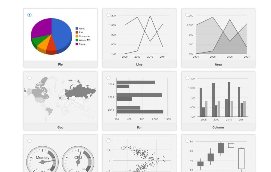
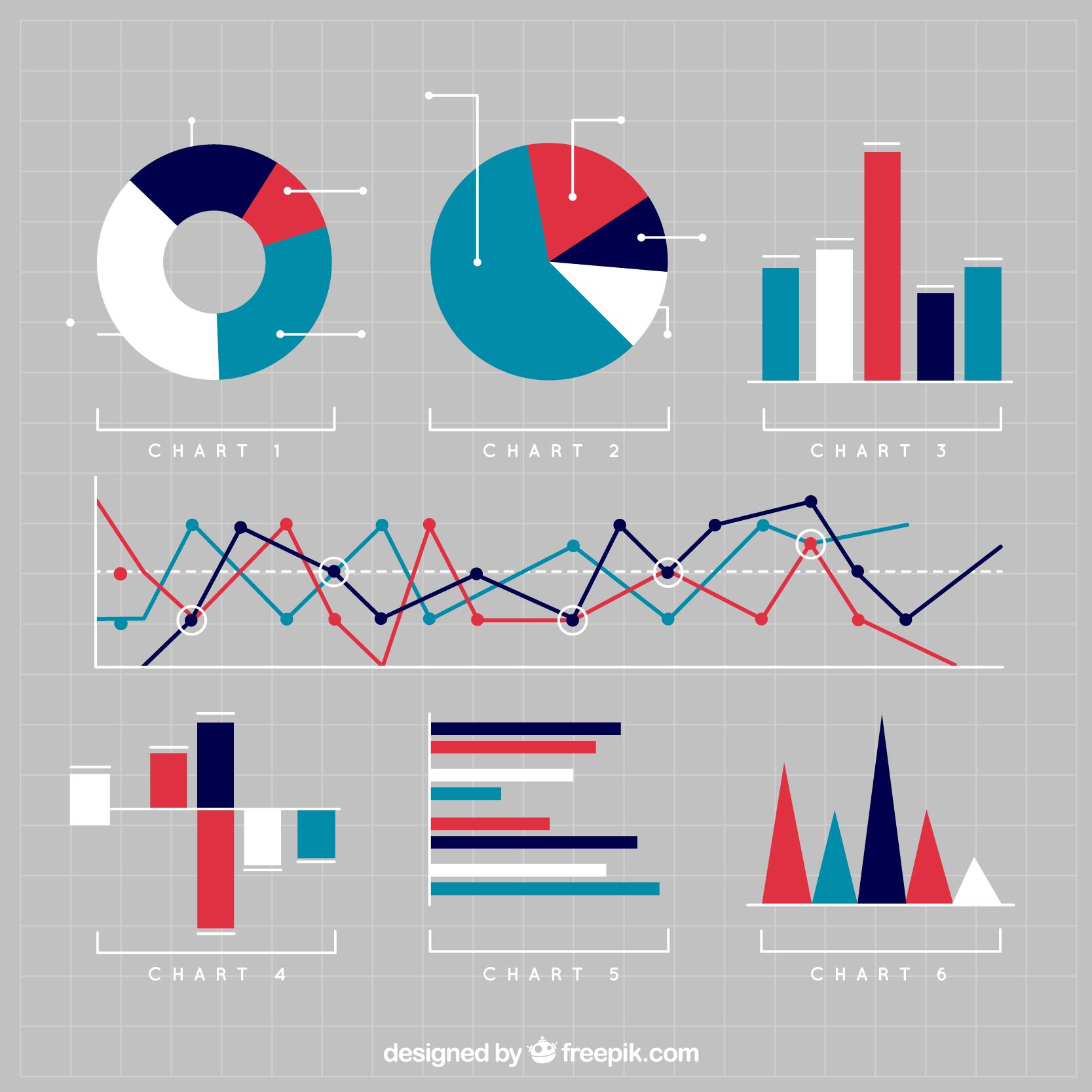
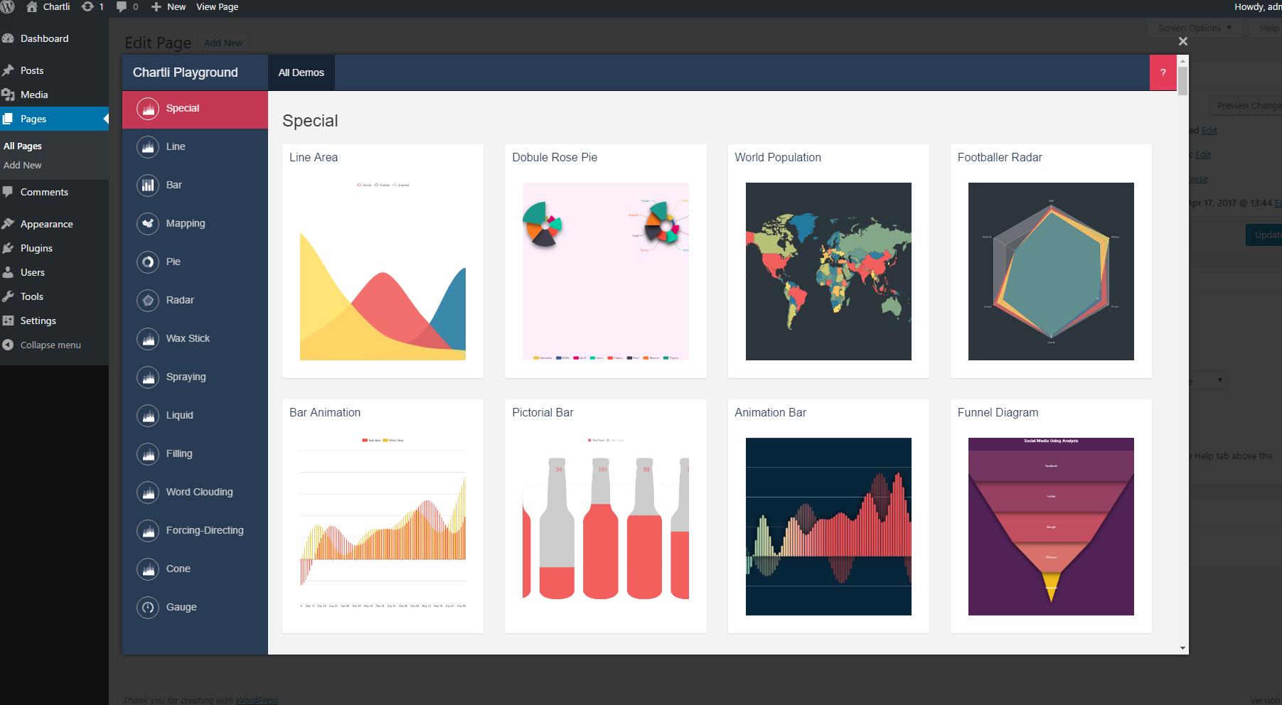
- Variety of Chart Types: The best plugins provide a wide selection of chart types, including line, bar, pie, and scatter charts. This variety lets you choose the most effective way to present your data.
- Responsive Design: Ensure that the charts display well on all devices, including smartphones and tablets. A responsive design adapts to various screen sizes, ensuring accessibility for all users.
- Customization Options: Look for plugins that allow you to personalize your charts with colors, fonts, labels, and legends. The ability to match your site’s branding can significantly enhance your charts’ visual appeal.
- Data Importing Capabilities: A good plugin should support data import from various formats, such as CSV, Excel, or Google Sheets. This feature saves time and ensures accuracy when creating charts.
- Interactive Elements: Interactive charts engage users more effectively. Features like tooltips, zooming, and clickable legends can make your data more compelling and easier to understand.
- Integration with Other Plugins: If you use other plugins for data management or analytics, ensure that the chart plugin integrates smoothly. This can streamline your workflow and enhance functionality.
| Feature | Benefits |
|---|---|
| Ease of Use | Simplifies chart creation for all skill levels. |
| Variety of Chart Types | Allows for versatility in data presentation. |
| Responsive Design | Ensures charts look great on any device. |
| Customization Options | Enhances branding and visual consistency. |
| Data Importing | Facilitates quick and accurate data entry. |
| Interactive Elements | Increases user engagement and understanding. |
| Integration | Improves efficiency and functionality across tools. |
Selecting a WordPress chart plugin with these features will significantly boost your site’s data visualization capabilities. You’ll not only make your data more accessible but also provide a better overall experience for your visitors.
A Deep Dive into the Best Chart Plugins for WordPress
Why You Need Chart Plugins for Your WordPress Site
Visual representation of data is crucial in today’s digital landscape. Whether you’re a blogger, a business owner, or an educator, presenting information in a digestible format can significantly enhance user engagement. This is where chart plugins come into play. They not only make your content more appealing but also allow you to convey complex data in a straightforward manner.
Key Features to Look for in Chart Plugins
When choosing the right chart plugin for your WordPress site, consider the following features:
- User-Friendly Interface: Ensure that the plugin is easy to navigate, even for beginners.
- Customizable Options: Look for plugins that allow you to adjust colors, sizes, and types of charts.
- Responsive Design: Your charts should look great on all devices, from desktops to smartphones.
- Data Import/Export: The ability to import data from CSV or Excel files can save you a lot of time.
- Support and Documentation: Reliable support can be invaluable, especially if you encounter issues.
Comparing the Top Chart Plugins
| Plugin Name | Unique Features | User Rating |
|---|---|---|
| Visualizer | Interactive charts, multiple data sources | 4.8/5 |
| WP Charts and Graphs | Simple design, quick setup | 4.5/5 |
| Chart.js | Highly customizable, open-source | 4.7/5 |
| Data Tables Generator | Combined tables and charts, user-friendly | 4.6/5 |
Steps to Create Stunning Charts
Creating beautiful charts doesn’t need to be a daunting task. Follow these simple steps:
- Install your chosen plugin: Go to the WordPress plugin repository, find your desired chart plugin, and install it.
- Input your data: Most plugins will provide an option to enter data manually or upload a file.
- Customize your chart: Adjust colors, labels, and layout to align with your website’s branding.
- Preview and Insert: Always preview your chart before inserting it into your post or page to ensure it looks as you intended.
Conclusion: Elevate Your Content with Charts
Integrating charts into your WordPress content can drastically improve the way your audience interprets data. With the plethora of chart plugins available, you’re sure to find one that meets your needs. Start exploring these options today, and watch your content engagement soar!
Creating Stunning Charts with WP Chart Plugins Made Easy
With a plethora of options available, here are some essential features to consider when selecting a chart plugin:
- User-Friendly Interface: Choose a plugin that offers an intuitive dashboard, making it easy for anyone, regardless of technical skills, to create stunning charts.
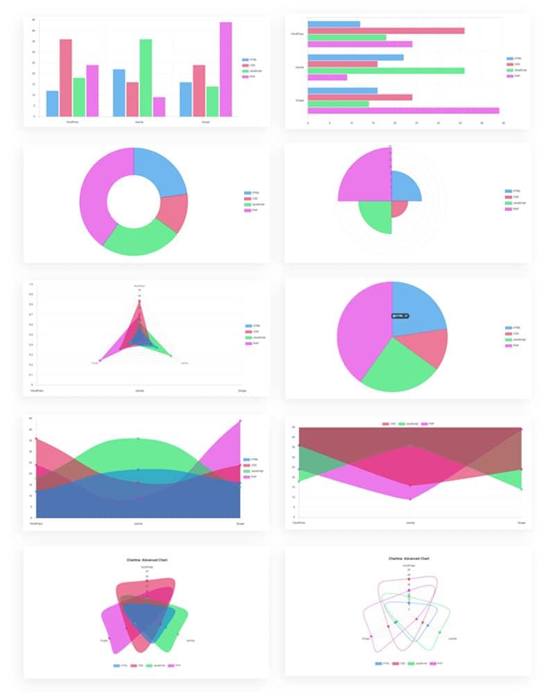
- Variety of Chart Types: Look for plugins that provide a wide range of chart types such as bar, line, pie, and area charts to suit different data presentations.
- Customization Options: The ability to customize colors, fonts, and sizes can make your charts not only informative but visually appealing.
- Responsive Design: Ensure that the charts look great on all devices, from desktops to smartphones, enhancing accessibility and user experience.
- Integration Capabilities: Select plugins that integrate seamlessly with other tools, like Google Sheets or Excel, which can streamline your workflow.
Once you’ve chosen the right plugin, creating beautiful charts becomes a breeze. Most plugins come equipped with simple drag-and-drop features and pre-built templates, allowing you to get started without any complicated setups. Here’s a quick guide to help you get going:
- Select your data source – whether it’s a CSV file, a Google Sheet, or manual entry.
- Choose the type of chart that best represents your data.
- Customize the look and feel to match your site’s aesthetic.
- Preview the chart to ensure it meets your expectations.
- Embed it into your page or post using a shortcode or block editor.
For those who appreciate comparisons, here’s a quick look at some popular plugins and their standout features:
| Plugin Name | Main Feature | Pricing |
|---|---|---|
| Visualizer | Interactive Charts | Free & Premium |
| wpDataTables | Data Tables & Charts | Starting at $49 |
| Chart.js | Lightweight & Flexible | Free |
| ChartBlocks | Online Chart Builder | Free & Premium |
Embrace the power of visuals in your content. Stunning charts not only enhance readability but also make complex data easier to digest, ultimately leading to better audience engagement. Dive into the world of chart plugins and start creating today!
Step-by-Step: How to Install and Set Up Your Chosen Plugin
Installing and setting up a WordPress chart plugin is a straightforward process that can greatly enhance the visual appeal of your website. Follow these simple steps to get started:
- Choose Your Plugin: Begin by selecting one of the top chart plugins that suit your needs. Research and compare features, usability, and compatibility with your theme.
- Install the Plugin: Navigate to your WordPress dashboard, then go to Plugins > Add New. Use the search bar to find your chosen plugin and click Install Now.
- Activate the Plugin: Once installed, click the Activate button to enable the plugin on your site.
After activation, it’s time to configure the plugin settings to ensure it aligns with your website’s design and functionality:
- Access Settings: Most plugins will add a new menu item or sub-menu in your dashboard. Click on it to explore the options available.
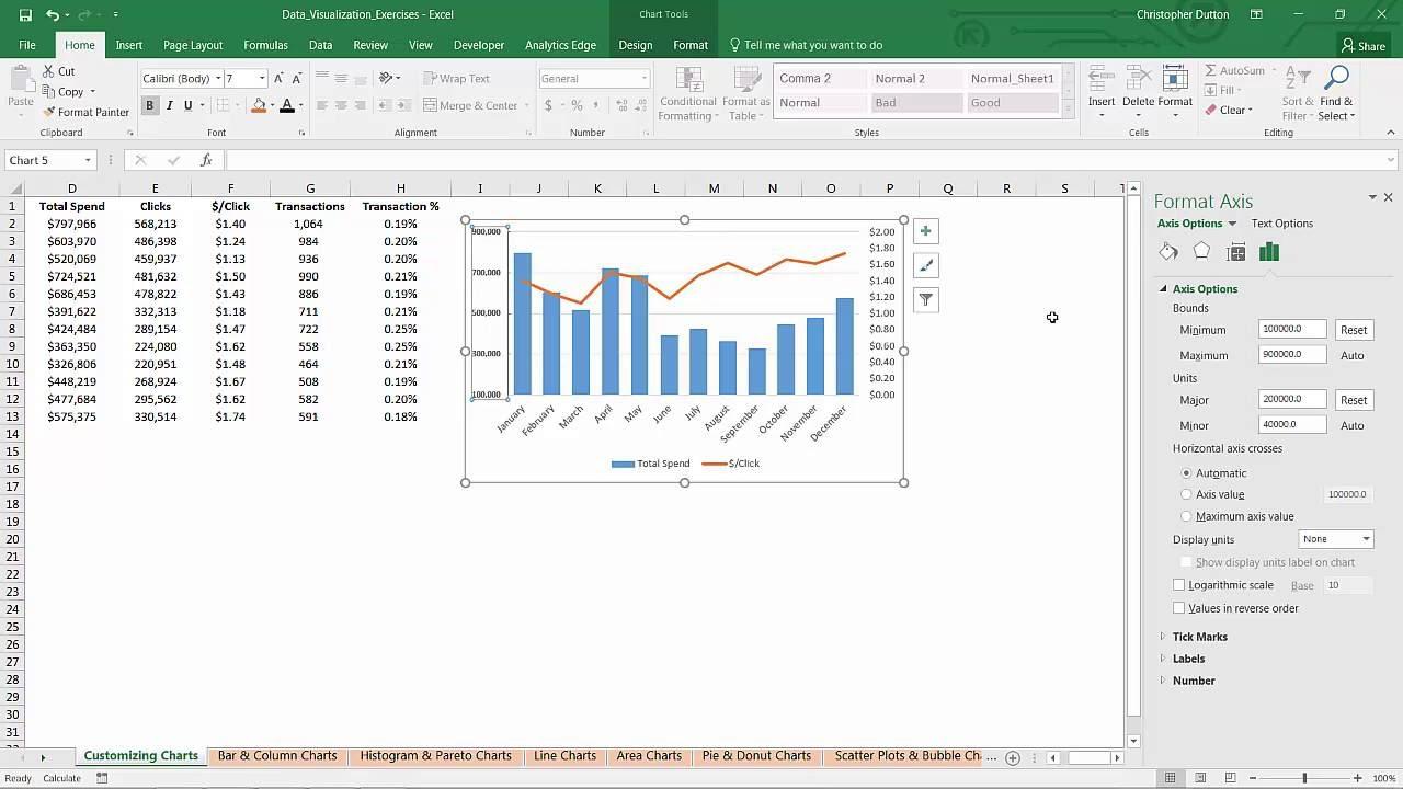
- Customize Appearance: Adjust colors, fonts, and sizes to ensure that the charts match your website’s branding. Look for options like chart type and data source to personalize your charts further.
- Integrate Data: Depending on your plugin, you may need to input data manually or connect to an external database. Ensure your data is clear and well-structured for the best results.
Now that your plugin is set up, it’s time to display your charts:
- Insert Charts into Posts/Pages: Use shortcodes or Gutenberg blocks provided by the plugin to add charts to your content easily. This step often involves selecting the chart you want to display and copying the generated shortcode into the desired location.
- Preview Changes: Always preview your changes to see how the charts look on your site. Ensure they are responsive and visually appealing across different devices.
don’t forget about ongoing optimization:
- Regular Updates: Keep your plugin updated to benefit from the latest features and security patches.
- Gather Feedback: Ask your audience for their thoughts on the charts. User feedback can help you refine your presentation and make data more digestible.
By following these steps, you will be well on your way to creating visually stunning and highly functional charts that engage your audience and enhance your content.
Tips for Customizing Your Charts for Maximum Impact
Creating captivating charts is essential for conveying your data effectively. Here are some key tips to ensure your charts resonate with your audience and leave a lasting impression.
- Choose the Right Chart Type: Not all data is created equal, and neither are charts. Assess your data type—whether it’s categorical, continuous, or time-series—to select the most appropriate chart type. Bar charts are excellent for comparisons, while line charts work wonders for trends over time.
- Utilize Color Wisely: Color can evoke emotions and draw attention. Stick to a cohesive color palette that aligns with your brand. Use contrasting colors for important data points to guide the viewer’s eye, but avoid overwhelming them with too many hues.
- Add Clear Labels and Legends: Ensure that every axis, label, and legend is clearly defined. This helps your audience immediately understand the context without guessing. Use descriptive titles for your charts that encapsulate the essence of the data.
- Incorporate Interactive Elements: With the right WordPress chart plugins, you can make your charts interactive. Features like hover effects or drill-down options can engage users more deeply and encourage exploration of your data.
Consider the layout of your charts as well. A well-structured chart can enhance readability. Here’s a simple example of how to structure your data in a table for clarity:
| Chart Type | Best For | Key Feature |
|---|---|---|
| Bar Chart | Comparative Analysis | Easy to read |
| Line Chart | Trend Over Time | Visualizes change |
| Pie Chart | Proportional Data | Shows composition |
don’t underestimate the power of storytelling. Accompany your charts with brief narratives that explain what the data means. This not only provides context but also captures interest, making your presentation more compelling.
By implementing these strategies, you can transform ordinary charts into powerful visual stories that captivate your audience and elevate the impact of your data presentations.
Integrating Charts into Your WordPress Posts and Pages
Adding charts to your WordPress posts and pages is a fantastic way to present data visually, making it more engaging and easier for your audience to digest. Fortunately, several plugins make this process seamless. With the right tools, you can transform complex datasets into beautiful, interactive charts that enhance your content and keep your readers interested.
Here are a few reasons why integrating charts into your WordPress content is beneficial:
- Improved Understanding: Visual data representation helps readers grasp complex information quickly.
- Increased Engagement: Well-designed charts can capture attention and encourage readers to spend more time on your site.
- Enhanced Credibility: Presenting data in a clear format can increase the trustworthiness of your content.
When choosing a chart plugin, consider factors such as ease of use, customization options, and compatibility with your existing theme. Some popular options include:
- Chart.js: A versatile choice that allows for a wide range of chart types.
- WP Charts: Perfect for users who want straightforward, no-fuss chart embedding.
- Visualizer: Offers stunning, interactive charts and is user-friendly for beginners.
To give you an idea of how these plugins can enhance your content, let’s take a look at a simple comparison chart:
| Plugin | Features | Ease of Use |
|---|---|---|
| Chart.js | Multiple chart types, responsive design | Moderate |
| WP Charts | Basic charts, quick setup | Easy |
| Visualizer | Interactive charts, import/export options | Very Easy |
Once you’ve selected a plugin, creating a chart is typically as simple as entering your data, customizing the look, and embedding it into your post or page. Most plugins offer an intuitive interface that guides you through the process, so you can focus on crafting content that resonates with your audience.
Remember to always test how your charts display across various devices to ensure a consistent experience for all users. With the right approach, integrating charts can significantly elevate your WordPress content, turning ordinary posts into visually appealing masterpieces that stand out in a crowded digital space.
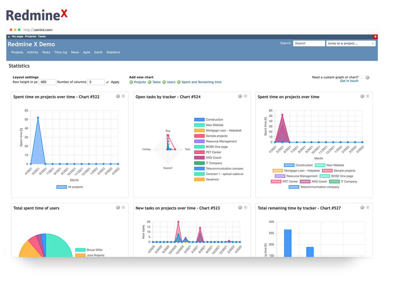
Enhancing User Engagement with Interactive Charts
Interactive charts are a powerful tool for enhancing user engagement on your WordPress site. They transform static data into dynamic visuals that users can explore, making information more accessible and enjoyable. By incorporating interactive elements into your charts, you not only capture attention but also encourage visitors to interact with your content more deeply.
When selecting a chart plugin, look for features that promote user interaction. Many high-quality plugins offer:
- Tooltips: Display additional information when users hover over data points.
- Responsive Design: Ensure charts look great on all devices, from desktops to smartphones.
- Animation Effects: Add visual flair that captivates users as they scroll through your data.
- Customizable Legends: Allow users to filter data based on their interests directly within the chart.
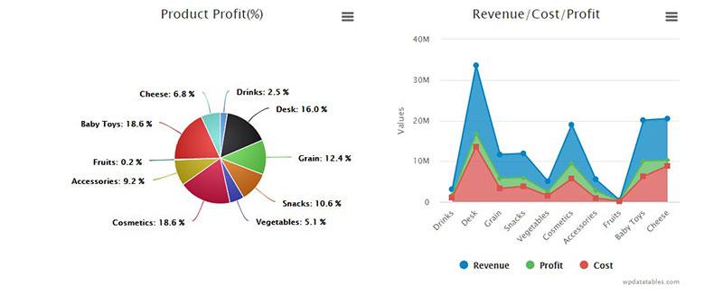
One effective way to implement interactive charts is through the use of drill-down features. This allows users to click on a section of the chart to reveal more detailed information or related data sets. For instance, a pie chart representing sales by region can expand to show individual sales figures for each area when clicked. This not only makes the data more engaging but also encourages users to explore more of your content.
Consider the following table to illustrate how interactive chart features can enhance data presentation:
| Feature | Description | User Benefit |
|---|---|---|
| Dynamic Filters | Allow sorting and filtering of data on the chart itself. | Users can tailor their view to focus on what matters most to them. |
| Live Updates | Charts that can refresh data in real-time. | Users receive the latest information without needing to refresh the page. |
| Export Options | Let users download the data in various formats. | Encourages sharing and further exploration of your data. |
Another great approach is to integrate storytelling elements within your charts. Instead of presenting raw numbers, use your charts to tell a story about the data. This narrative can guide users through the information, highlighting trends and insights that may not be immediately apparent. Engage users by asking questions and prompting them to think critically about the data they are seeing.
Lastly, don’t underestimate the impact of aesthetics. A visually appealing chart catches the eye, but one that is interactive keeps users engaged. Choose a plugin that offers a variety of styling options and themes, allowing you to customize your charts to match your site’s branding. A cohesive design not only helps in retaining users but also enhances their overall experience, making them more likely to return for more.
Troubleshooting Common Issues with Chart Plugins
1. Charts Not Displaying
If your charts aren’t appearing at all, consider these steps:
- Check if the plugin is activated.
- Make sure you have added the shortcode correctly in your post or page.
- Inspect for JavaScript errors in your browser’s console that might affect rendering.
2. Incorrect Data Representation
Sometimes, the data you input might not reflect correctly in the charts. Here’s how to troubleshoot:
- Review your data entries for any typos or formatting issues.
- Ensure that data types (e.g., numbers, dates) are consistent throughout.
- Check the plugin documentation for specific data requirements.
3. Plugin Conflicts
Conflicts with other plugins or your theme can cause issues. To diagnose:
- Deactivate all other plugins and see if the chart appears correctly. Reactivate them one by one to identify the culprit.
- Switch to a default WordPress theme temporarily to rule out theme-related conflicts.
4. Customization Issues
If you’re having trouble customizing your charts:
- Double-check the plugin settings for customization options.
- Look for CSS conflicts that might override your styling choices.
- Refer to the documentation for tips on achieving the desired look.
In addition, if your charts are loading slowly:
| Tip | Explanation |
|---|---|
| Optimize Images | Ensure that all images used in your charts are compressed and optimized for web use. |
| Minimize HTTP Requests | Combine CSS and JavaScript files where possible to reduce load times. |
| Use Caching | Implement caching solutions to speed up the loading of chart data. |
By following these troubleshooting tips, you should be able to resolve most common issues associated with chart plugins. Remember, if all else fails, reaching out to the plugin’s support community can provide additional guidance.
Real-Life Examples of Successful Chart Implementations in WordPress
1. E-commerce Analytics Visualization
An online store specializing in eco-friendly products used a popular chart plugin to visualize their sales data. They integrated pie charts and bar graphs to showcase sales distribution by product category. This not only helped them identify bestsellers but also allowed customers to see product popularity at a glance. By displaying this information on their homepage, they increased user engagement and boosted sales by 15%.
2. Educational Resources for Student Engagement
A local educational institution utilized a chart plugin to display student performance metrics over the academic year. They created interactive line charts that showed grades by subject, enabling students and parents to track progress easily. This implementation led to enhanced communication between teachers and families, fostering a supportive learning environment.
3. Health and Fitness Tracking
A fitness blog implemented charts to help users visualize their workout progress and nutrition intake. By using area charts to depict weekly exercise regimens alongside bar charts for calorie consumption, they motivated readers to stay accountable for their health goals. As a result, the blog saw a 25% increase in repeat visitors, driven by users eager to return and update their progress.
4. Real Estate Trends and Insights
A real estate agency took advantage of a chart plugin to present market trends effectively. They displayed historical data on property prices and neighborhood statistics through elegant bar graphs and line charts. This strategic move helped potential buyers and sellers make informed decisions, significantly increasing the agency’s credibility and client inquiries.
These examples illustrate how effectively implemented charts can enhance user experience and drive action. By harnessing visuals, businesses can communicate complex data in a digestible format that resonates with their audience. Whether it’s for boosting sales, engaging students, or tracking progress, the right chart plugin can make a substantial difference.
| Website Type | Chart Type Used | Impact |
|---|---|---|
| E-commerce | Pie & Bar Charts | 15% increase in sales |
| Educational Institution | Line Charts | Improved student engagement |
| Fitness Blog | Area & Bar Charts | 25% increase in repeat visitors |
| Real Estate Agency | Bar & Line Charts | Increased client inquiries |
Ultimately, the key to successful chart implementation lies not just in the charts themselves but in how they engage users and enhance the overall narrative of your content. By studying these real-life applications, it’s clear that a well-placed chart can turn data into stories that captivate and inform.
Frequently Asked Questions (FAQ)
Q&A: 11 Best WordPress Chart Plugins + How to Create Beautiful Charts
Q1: Why should I use chart plugins for my WordPress site?
A: Great question! Chart plugins are essential for visually representing data, making it easier for your audience to understand trends and insights at a glance. Whether you’re running a blog, a business website, or an e-commerce store, dynamic charts can enhance your content, increase engagement, and help communicate complex information clearly and effectively.
Q2: What are some of the key features to look for in a WordPress chart plugin?
A: When choosing a chart plugin, consider features like ease of use, customization options, compatibility with other plugins, and the ability to handle different data formats. Additionally, look for plugins that offer interactive charts, export options, and responsive design, so your charts look great on all devices!
Q3: Can I create charts without coding skills?
A: Absolutely! The beauty of modern WordPress chart plugins is that they are designed for users of all skill levels. Most plugins offer intuitive drag-and-drop interfaces and templates that make it easy to create beautiful charts without needing any coding knowledge. You’ll be amazed at how quickly you can create professional-looking visuals!
Q4: How do I choose the right chart plugin for my needs?
A: Start by identifying your specific requirements. Do you need simple bar charts, or are you looking for complex data visualizations? Check user reviews, explore demo versions, and consider any additional features that might benefit your site. A versatile plugin that meets your current needs while allowing for future growth is ideal.
Q5: What are some of the best chart plugins available?
A: We’ve compiled a fantastic list of the top 11 WordPress chart plugins for you! Some favorites include Visualizer, which offers a user-friendly interface; Charts from Sandbox, known for its customization options; and WPDataTables, perfect for larger datasets. Each plugin has its strengths, so you’ll find one that fits your needs perfectly!
Q6: Can I integrate these charts with other content on my site?
A: Definitely! Most WordPress chart plugins allow you to easily embed charts into posts, pages, or widgets. This integration not only enhances your content but also provides a comprehensive view of your data alongside relevant information, helping to keep your audience engaged.
Q7: What’s the first step in creating a chart using a plugin?
A: First, install and activate your chosen chart plugin from the WordPress repository. Once activated, you’ll typically find a new menu option in your dashboard. From there, you can start creating a new chart by inputting your data, selecting your chart type, and customizing the design to match your site’s aesthetic.
Q8: How can I ensure my charts are visually appealing?
A: Aesthetics matter! Take advantage of the customization features that most plugins offer. Play around with colors, fonts, and styles to ensure your charts align with your brand. Remember, clarity is key, so avoid overcrowding your charts with too much information and focus on making the data easy to interpret.
Q9: Are there any tips for presenting charts effectively?
A: Absolutely! Keep your audience in mind: use straightforward titles and labels, focus on the key data points, and consider the flow of information. Additionally, ensure that your charts are mobile-responsive, as many users will access your site from their phones or tablets.
Q10: Is there ongoing support for users of these plugins?
A: Most reputable WordPress chart plugins offer user support, including documentation, forums, and sometimes even direct customer service. Be sure to check the support options available when selecting a plugin, as having easy access to help can make your experience much smoother!
Q11: How can I get started with creating beautiful charts today?
A: Jump right in! Choose one of the top chart plugins we recommend, install it, and start experimenting with your data. With the right tools and a little creativity, you’ll be creating stunning charts that captivate your audience in no time. Happy charting!
—
Feel free to explore our complete guide to discover more about each chart plugin and how to make the most of your data visualization journey!
To Conclude
As we wrap up our journey through the 11 best WordPress chart plugins, it’s clear that presenting data visually can elevate your content to new heights. Whether you’re looking to convey complex information in a digestible format or simply want your blog to stand out, these tools are your secret weapons.
Now that you have the tools at your fingertips, why not take the plunge? Start experimenting with different charts and see how they transform your posts. Remember, a beautiful chart isn’t just about aesthetics; it’s about enhancing your audience’s understanding and engagement.
So, go ahead—choose the plugin that resonates with your needs, unleash your creativity, and watch your audience connect with your insights like never before. If you’ve enjoyed this guide, share it with fellow bloggers and creators who could use a little data magic in their lives. Happy charting!


New Providers
Enjoy The Speed Of Downloading & Uploading With 1GBPS Port
Affordable Dedicated Servers & Colocation Services. Services: Dedicated Servers Colocation Private Cabinet Colocation DDoS Protection
Up to 85% off hosting + website builder


Latest News
- 8+ Free Construction Templates and Page DesignsJuly 11, 2026 16
- How to Create a Graphic Design Portfolio That Gets HiresJuly 11, 2026 17
- Otter Blocks 3.2.0: AI Page Building and a New Design LibraryJuly 11, 2026 15
- 11 Best Web Hosting Services for Developers 2026July 11, 2026 19
- How to Create a Webshop: A Step-by-Step GuideJuly 10, 2026 21

We specialize in providing Web hosting reviews. Where you can search for potential hosts.