Your website’s aesthetic is more than just eye candy—it’s your brand’s first impression. Choosing the right background, font, and design elements can evoke emotions, enhance readability, and ultimately engage visitors. Make every pixel count!
The Need to Know About Background, Font and Other Aesthetic Options When Designing a Website
In today’s digital landscape, the first impression is often forged within mere seconds of a visitor landing on your website. The aesthetics of your online presence—encompassing background, font, and a myriad of other design choices—serve as the silent ambassadors of your brand, conveying messages far beyond mere words. As we navigate a world increasingly dominated by screens, understanding the pivotal role these visual elements play is not just beneficial; it’s essential.
Imagine a website that instantly captivates, drawing visitors into an experience that resonates with their emotions and aspirations. The right background sets the tone, the perfect font elevates readability and engagement, and cohesive design elements foster a lasting connection. In this article, we’ll explore why mastering these aesthetic options is crucial to crafting a website that not only stands out in a crowded marketplace but also inspires action, loyalty, and a genuine connection with your audience. Join us on this journey to unlock the transformative power of design and discover how you can create a website that truly reflects your vision and values.
Understanding the Importance of Aesthetic Design in Web Development
Aesthetic design is not merely about visual appeal; it fundamentally influences user experience and engagement. When a visitor lands on a website, the first impression is shaped in seconds, heavily relying on the background, font, and other design elements. These components create an emotional connection that can either draw a user in or push them away.
Background colors play a crucial role in setting the mood and tone of a website. A well-chosen background can enhance readability and interaction, while a poorly selected one might distract or overwhelm users. Here are some key considerations for background selection:
- Contrast: Ensure there’s adequate contrast between the background and text to enhance readability.
- Color Psychology: Leverage colors that resonate with your brand message—soft blues for calmness, vibrant reds for urgency, etc.
- Simplicity: Avoid overly busy backgrounds that can deter focus; a clean, simple design is often more effective.
Equally important is the choice of fonts. The right typography not only conveys information but also reflects your brand’s personality. Typography can evoke emotions and influence a reader’s perception of your content. Here’s a breakdown of font considerations:
| Font Type | Usage | Emotional Impact |
|---|---|---|
| Serif | Trustworthy and classic | Conveys reliability |
| Sans-serif | Modern and clean | Feels approachable |
| Script | Creative and personal | Evokes warmth and intimacy |
| Display | Attention-grabbing | Creates excitement |
Beyond background and font, other aesthetic options such as icons, images, and spacing contribute significantly to design quality. Icons can simplify navigation and enhance comprehension, while images can tell stories that resonate with users on a personal level. Proper spacing helps in organizing content and guiding users through their journey on your site. Remember, less is often more; cluttered designs can confuse visitors and detract from your message.
Ultimately, aesthetic design is about crafting a harmonious experience that invites users to explore and engage. By carefully choosing backgrounds, fonts, and other design elements, businesses can not only enhance their visual identity but also foster deeper connections with their audiences. Investing time and resources in aesthetic choices is not just a design decision; it’s a strategic step toward achieving long-term success in the digital landscape.
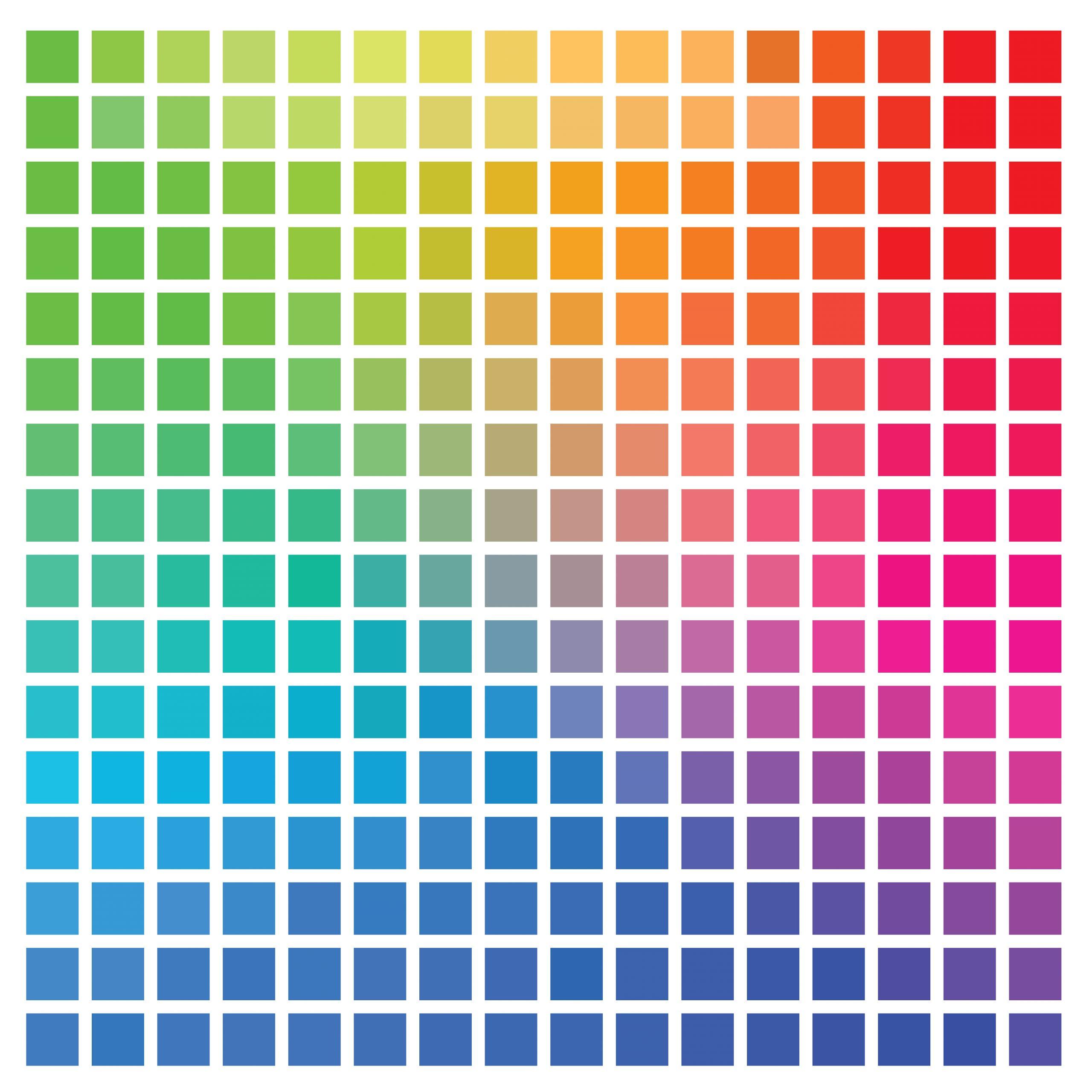
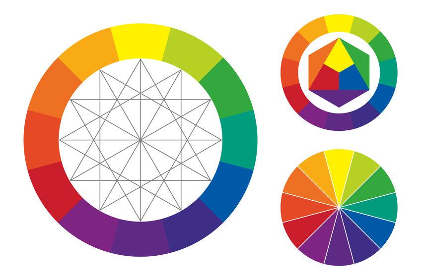
The Psychological Impact of Colors on User Experience
The intersection of color and psychology plays a pivotal role in shaping user experience on websites. Colors are not just aesthetic choices; they evoke emotions and influence perceptions, guiding visitors toward desired actions. Understanding this dynamic can dramatically enhance the effectiveness of your design.
Warm Colors: Shades like red, orange, and yellow are known to evoke enthusiasm and warmth. These colors can stimulate appetite and create a sense of urgency.
- Red: Often associated with passion and energy, can increase heart rates and evoke strong emotions.
- Orange: Conveys friendliness and encourages action, making it effective for calls to action.
- Yellow: Represents optimism and clarity, which can brighten user experiences.
Cool Colors: Blue, green, and purple tend to create a sense of calm and trust. These colors are particularly effective in professional or health-related websites, as they promote feelings of relaxation and security.
- Blue: Instills a sense of trust and reliability, ideal for financial or healthcare sectors.
- Green: Symbolizes health and nature; it’s refreshing and can foster a connection to sustainability.
- Purple: Often associated with luxury and creativity; it adds a touch of sophistication.
Furthermore, it’s essential to consider the implications of contrast and font choices in conjunction with color. Proper contrast ensures readability and accessibility, while the font style can complement color choices to reinforce brand identity.
| Color | Emotional Response | Usage Example |
|---|---|---|
| Red | Excitement, urgency | Sales promotions, alerts |
| Blue | Trust, peace | Corporate websites, finance |
| Green | Health, growth | Eco-friendly brands, wellness |
| Yellow | Optimism, warmth | Children’s products, leisure |
Your choice of color can significantly impact user behavior and retention. A thoughtful color palette will not only create visual harmony but also evoke the right feelings at the right moments, guiding users smoothly through their journey on your site. As you design, let the psychology of color inform your decisions and watch as engagement flourishes.
Choosing the Right Background: Setting the Mood for Your Brand
When crafting a website, the background you choose is far more than just a canvas; it’s the emotional foundation of your brand. A well-selected background can evoke feelings, set expectations, and enhance the overall user experience. Whether you aim for sophistication, energy, or tranquility, the visual backdrop must align with your brand’s identity and message. Here are key factors to consider:
- Color Psychology: Different colors evoke different emotions. For instance, blue exudes trust and professionalism, while orange can inspire excitement and enthusiasm. Consider your target audience and the emotions you want to elicit when selecting your background color.
- Textures and Patterns: Introducing subtle textures or patterns can add depth without overwhelming your content. A gentle gradient or a light geometric design can create visual interest and sophistication.
- Image Use: High-quality images can serve as powerful backgrounds. Choose images that resonate with your brand values and message. Remember to ensure that any text overlaid on these images remains readable.
The alignment of your background with your brand’s purpose doesn’t stop at color and imagery. It extends into the realm of consistency across your entire website. A cohesive design language reinforces brand recognition, making it easier for visitors to remember you. To ensure this alignment:
| Element | Consistency Tips |
|---|---|
| Backgrounds | Maintain a uniform style across pages; use similar shades or textures. |
| Fonts | Limit font styles to two or three that complement each other. |
| Imagery | Use a consistent image style (e.g., photographic, illustrative) that matches your brand voice. |
don’t forget the importance of accessibility. A beautiful background is only effective if all users can engage with it. Be mindful of contrast ratios to ensure readability and consider users with visual impairments. Tools like color contrast checkers can help you find a balance between aesthetic appeal and functionality.
Choosing the right background is an art form that requires thoughtful consideration and creative expression. Let your background reflect your brand story, serving as a harmonious complement to your message, guiding users seamlessly through their journey on your site. The right choice will not only beautify your website but will also fortify your brand identity, making your digital presence unforgettable.
Font Matters: How Typography Influences Readability and Engagement
Typography is more than just a decorative element; it plays a vital role in shaping the user experience on your website. The font choice impacts how visitors perceive your brand, the clarity of your message, and the overall aesthetic appeal of the site. A well-chosen font can engage users, while a poorly selected one can lead to confusion and frustration.
When considering font styles, think about the following factors:
- Readability: The easier your text is to read, the more likely visitors are to engage with it. Choose fonts that maintain clarity at various sizes.
- Brand Identity: Fonts convey personality. A quirky font may suit a creative brand, while a clean sans-serif might be better for a corporate site.
- Hierarchy: Use different font weights and sizes to establish a visual hierarchy. This guides users through the content seamlessly.
Consider implementing a font pairing strategy that combines complementary typefaces. This can enhance the overall design without overwhelming the reader. For example, a bold header font paired with a simple body font can create a striking contrast that draws attention to key messages.
Furthermore, the line height and letter spacing significantly affect readability. A line height that is too tight can make text feel cramped, while excessive spacing can disrupt the flow of reading. Aim for a balance that encourages smooth reading without sacrificing style.
| Font Type | Best For |
|---|---|
| Serif | Traditional, Elegant Designs |
| Sans-serif | Modern, Clean Interfaces |
| Display | Bold, Creative Branding |
| Monospace | Tech, Coding Themes |
remember that your choice of background color also plays an essential role in typography. A high-contrast background can significantly enhance readability, while a low-contrast scheme can lead to eye strain. Strive for harmony between your text and background to create an inviting reading environment.
typography is a powerful tool that influences both readability and engagement. By thoughtfully selecting fonts and considering their impact on your website’s design, you can create an experience that not only attracts visitors but keeps them coming back for more.
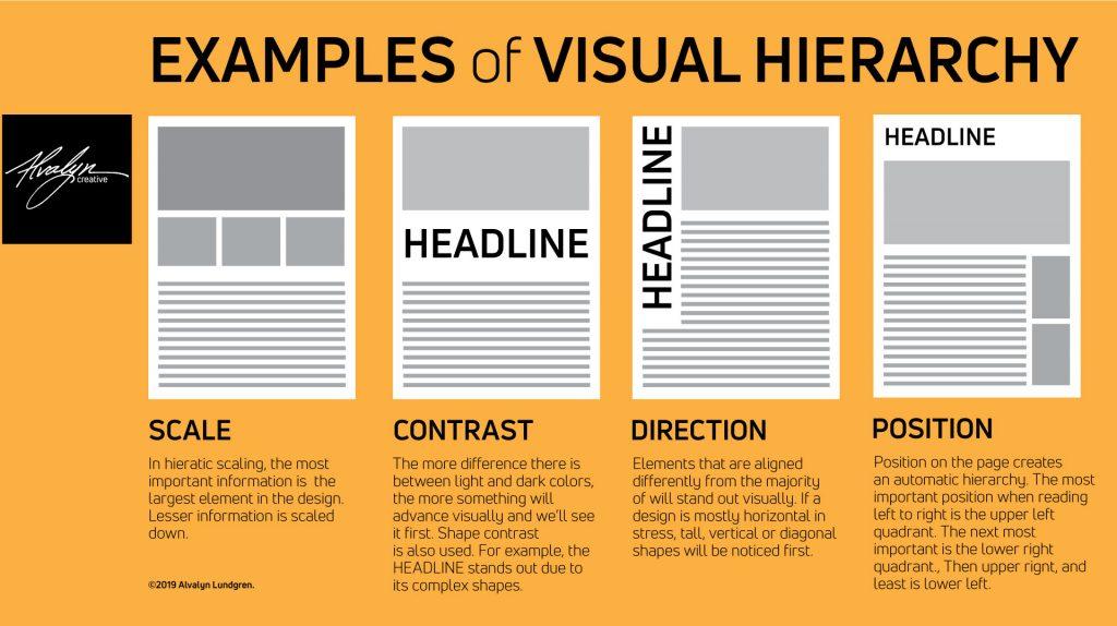
Creating Visual Hierarchy with Size and Style
In the digital landscape, where attention spans are fleeting, establishing a robust visual hierarchy is paramount. Size plays a critical role in guiding the viewer’s eye, directing them towards the most significant elements of your design. Larger fonts and images naturally draw attention, making them ideal for headlines, key messages, or calls to action. By strategically using size, you can create a clear distinction between primary and secondary information, enhancing user experience and engagement.
Consider the use of typography as a powerful tool in crafting visual hierarchy. Different font styles can evoke various emotions and responses. For instance, a bold sans-serif font may convey modernity and clarity, while an elegant serif font might evoke tradition and sophistication. The combination of these styles can add depth to your design, creating a flow that naturally leads the viewer through your content. Here are some tips to consider:
- Contrast is Key: Use contrasting font weights and sizes to emphasize important points.
- Limit Your Fonts: Stick to a maximum of three font families to avoid visual clutter.
- Consistency Matters: Maintain consistent styling for similar elements to strengthen your design.
Additionally, color and spacing play a vital role in establishing hierarchy. A well-chosen color palette not only enhances the aesthetic appeal but also guides users’ attention. For example, using a vibrant color for a button can make it stand out against a muted background. Here’s how to effectively use color and spacing:
- Color Coding: Use different colors to categorize information and lead users through your site.
- Whitespace: Integrate ample whitespace around key elements to create breathing room and draw focus.
To further illustrate the impact of size and style on visual hierarchy, consider the following table that summarizes common design elements:
| Element | Size | Style | Purpose |
|---|---|---|---|
| Headings | Large | Bold, Sans-serif | Grabs attention |
| Subheadings | Medium | Italic, Serif | Supports headings |
| Body Text | Small | Regular, Sans-serif | Conveys information |
| Buttons | Medium | Bold, Colorful | Encourages action |
By understanding and implementing the principles of size and style, you can create a dynamic visual hierarchy that enhances the usability of your website. The right balance of these elements not only improves navigation but also fosters a deeper emotional connection with your audience. Remember, each design choice should serve a purpose, reinforcing the overall message and identity of your brand.
The Power of Contrast: Enhancing Visibility and Appeal
In the realm of web design, contrast serves as a fundamental pillar that can either elevate or diminish the user experience. When thoughtfully applied, it can guide the user’s eye and emphasize crucial elements, ensuring that your message resonates clearly. Choosing the right background color is essential; a well-selected hue can enhance readability while reflecting your brand’s identity.
Utilizing contrasting colors for your text and background can effectively draw attention to key information. For instance, pairing dark text with a light background, or vice versa, can enhance visibility, making it easier for users to consume content. Consider these combinations:
- Dark gray text on a white background: provides a professional and modern look.
- White text on a dark blue background: creates a bold and sophisticated aesthetic.
- Bright colors on a muted background: can add vibrancy without overwhelming the viewer.
Moreover, font choices play a critical role in establishing hierarchy and guiding attention. A combination of font styles can create a dynamic visual experience, yet it’s vital to maintain readability. Consider implementing:
- Sans-serif fonts for headings: offer a clean, modern appeal.
- Serif fonts for body text: add a touch of elegance and tradition.
- Highlighting key phrases: with bold or italic styles to draw attention.
To further emphasize the impact of contrast in web design, let’s take a look at the following table illustrating effective color pairings and their emotional responses:
| Color Combination | Emotional Response |
|---|---|
| Black & White | Classic, Timeless |
| Navy & Gold | Luxury, Trust |
| Coral & Teal | Vibrant, Energetic |
the interplay of various aesthetic elements—backgrounds, fonts, and color contrasts—can significantly influence user engagement and perception. When implemented with intention, these components create a cohesive and appealing design that not only captures attention but also fosters trust and inspires action. Therefore, never underestimate the power of contrast; it is the secret ingredient that can transform your website from ordinary to extraordinary.

Incorporating Images and Graphics for a Cohesive Look
To elevate your website’s aesthetic appeal, incorporating images and graphics is not just an option; it’s a necessity. Well-chosen visuals can transform a mundane webpage into an engaging experience, guiding visitors through your content while reinforcing your brand identity. The right images create a harmonious relationship between text and visuals, enhancing readability and emotional resonance.
When selecting images, consider the following key aspects:
- Relevance: Ensure that the images align with the content and purpose of your website. They should complement the text, providing context and enhancing the message you wish to convey.
- Quality: Use high-resolution images that are sharp and clear. Blurry or pixelated graphics can detract from your brand’s professionalism.
- Consistency: Maintain a uniform style across your visuals, whether it’s through color palettes, filters, or the types of images used. This consistency supports a cohesive look that strengthens your overall design.
Graphics can also play an important role in guiding your user’s journey. Infographics, icons, and custom illustrations can break down complex information into digestible pieces. They not only attract attention but also facilitate better understanding and retention of your content.
To further illustrate how well-implemented visuals can enhance your design, consider the following table showcasing various graphic styles and their applications:
| Graphic Style | Best Used For | Benefits |
|---|---|---|
| Infographics | Data presentation | Increases engagement and understanding |
| Icons | Navigation and call-to-actions | Simplifies user experience |
| Custom Illustrations | Brand storytelling | Enhances emotional connection |
As you embrace images and graphics, always remember to optimize them for web performance. Large files can slow down your site and deter visitors. Use formats like JPEG or PNG efficiently and consider tools that compress images without losing quality. This ensures that your site remains visually appealing while providing a seamless user experience.
don’t underestimate the power of whitespace around images and graphics. Adequate spacing allows each visual element to breathe, reducing clutter and fostering a more focused viewing experience. This strategic use of whitespace reinforces your content hierarchy, guiding the reader’s eye through your website in a deliberate manner.
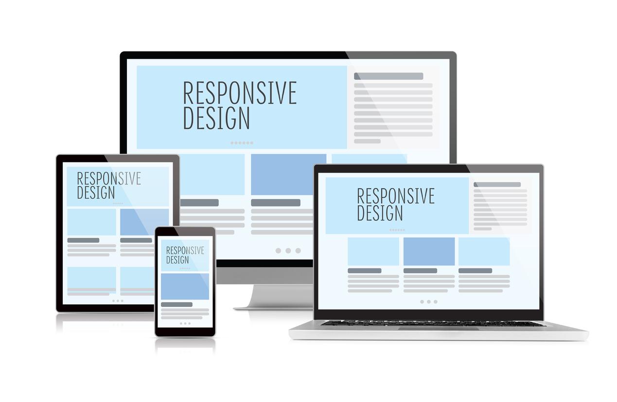
Responsive Design: Ensuring Aesthetics Across All Devices
In today’s digital landscape, ensuring a consistent and appealing aesthetic across all devices is paramount. As users navigate through websites on smartphones, tablets, and desktops, their experience should be equally engaging, regardless of the device in hand. This is where the principles of responsive design come into play, allowing for a harmonious blend of functionality and visual appeal.
Background options are vital in creating a captivating user experience. Consider the following elements when choosing your website’s background:
- Color Schemes: Choose palettes that evoke the desired emotions and reflect your brand identity.
- Images: Opt for high-resolution images that can scale without losing quality, ensuring clarity on all devices.
- Textures and Patterns: Subtle textures can add depth without overwhelming the content.
The font selection is equally crucial in maintaining visual consistency. A well-chosen typeface enhances readability and conveys professionalism. Here are key considerations:
- Font Size: Ensure that text remains legible on smaller screens by using relative units like ’em’ or ‘rem’.
- Line Height: Adequate spacing can enhance readability and make content more digestible.
- Contrast: High contrast between text and background improves accessibility and user experience.
To illustrate how different devices can impact aesthetic choices, consider the following table comparing design elements for desktops and mobile devices:
| Design Element | Desktop | Mobile |
|---|---|---|
| Background Image | Full-width with overlays | Centered and scaled |
| Navigation Menu | Horizontal layout | Hamburger menu |
| Text Size | 16px and above | 14px with scaling options |
In addition to backgrounds and fonts, other aesthetic options should not be overlooked. Elements such as buttons, icons, and images contribute significantly to the overall user experience. Strive for consistency across these components, ensuring they are responsive and visually appealing. Here are a few tips:
- Button Design: Make buttons prominent and easy to tap, especially on mobile devices.
- Iconography: Use icons that are intuitive and enhance the content without cluttering the design.
- Whitespace: Leverage whitespace to create breathing room around elements, guiding the user’s attention naturally.
Ultimately, investing in responsive design is not just about aesthetics; it’s about creating an inclusive digital environment. By focusing on these aesthetic options, you not only enhance the visual appeal of your website but also improve its functionality, providing a seamless experience for every user, on every device.

Accessibility in Design: Making Your Website Inclusive
In the realm of web design, aesthetic choices extend far beyond mere visual appeal; they encompass the very essence of accessibility. A well-thought-out background and font selection can significantly enhance the user experience for everyone, including those with disabilities. It’s crucial to ensure that your website is not only beautiful but also usable for people with varying needs.
Backgrounds play a pivotal role in the overall readability of your content. High contrast between text and background is essential for users with visual impairments. Consider the following guidelines when selecting backgrounds:
- Opt for light text on dark backgrounds or vice versa.
- Avoid overly busy or textured backgrounds that can distract from the content.
- Ensure sufficient contrast ratios; tools like the WebAIM contrast checker can help.
Font choices also demand careful consideration. The typeface you select can dramatically impact comprehension and accessibility. Here are some tips for font selection:
- Choose sans-serif fonts for easier readability on screens.
- Ensure font sizes are adjustable; ideally, use relative units like ems or percentages.
- Avoid using all caps, as it can be difficult for some readers to distinguish between letters.
Moreover, line spacing and paragraph structure should not be overlooked. Proper spacing between lines and paragraphs improves readability and makes the text less daunting. Incorporate the following practices:
| Element | Recommended Value |
|---|---|
| Line Height | 1.5 times the font size |
| Paragraph Spacing | 1.5em or more |
| Letter Spacing | 0.05em for clarity |
consider the emotional impact of colors and visuals. Color choices can evoke feelings and responses, making it essential to approach them thoughtfully. Utilize color blindness simulators to ensure your color palette remains effective for all users. Additionally, keep in mind:
- Limit the number of colors in your palette to avoid overwhelming users.
- Use colors that are harmonious and accessible, enhancing the user journey.
By integrating these elements into your design process, you pave the way for a website that not only captivates but embraces everyone. Accessibility in design is not just an obligation; it’s a commitment to inclusivity that fosters a welcoming digital environment for all users.
Consistency is Key: Maintaining a Unified Aesthetic
Creating a visually appealing website requires more than just the right images and text; it demands a cohesive look that resonates with your brand’s identity. A unified aesthetic not only attracts visitors but also keeps them engaged. When every element, from background to font, aligns harmoniously, your website transforms into a seamless experience that reflects your vision.
To achieve this, consider the following fundamental components:
- Background: The backdrop of your website sets the tone. Choose colors or images that complement your content and evoke the desired emotions. Whether you opt for a minimalist monochrome or a vibrant pattern, ensure it enhances readability and retains focus on key elements.
- Font: Typography plays a crucial role in defining your site’s personality. Select fonts that are not only visually appealing but also legible. Combine styles wisely; for instance, a bold header paired with a clean body font can create a dynamic contrast that draws attention.
- Color Palette: A consistent color scheme binds all elements together. Limit your palette to three or four colors that represent your brand. Use these colors across backgrounds, texts, buttons, and borders to foster a sense of unity.
- Imagery: Images should reflect your brand’s ethos. Whether using photographs, illustrations, or icons, ensure they share a common style, such as color treatment or visual theme, to reinforce your website’s message.
To illustrate these concepts, let’s examine an example of how consistent design elements can enhance user experience:
| Element | Consistent Approach | Impact |
|---|---|---|
| Background Color | Soft Blue | Calming effect, encourages trust |
| Font Style | Sans-serif for body, Serif for headers | Modern yet sophisticated feel |
| Accent Color | Coral | Highlights important features without overwhelming |
| Image Style | Desaturated with a blue tint | Unified visual theme, enhances brand recognition |
Moreover, consistency extends beyond design; it encapsulates the overall user journey. Every click should feel familiar, every transition smooth. By maintaining a unified aesthetic, you create an environment where users can navigate effortlessly, fostering a connection that makes them more likely to return.
In essence, each choice you make regarding backgrounds, fonts, and other aesthetic options contributes to a larger narrative about your brand. Strive for clarity and coherence, allowing your website to not just inform but also inspire. When visitors feel a sense of belonging through your aesthetic, they are more likely to engage deeply with what you have to offer.

The Role of Whitespace in Modern Web Design
In the realm of web design, whitespace—often referred to as negative space—plays a pivotal role in shaping the user experience. It’s not merely a gap between elements; it’s a powerful design tool that enhances comprehension and guides user interactions. By thoughtfully integrating whitespace, designers can instill a sense of order and clarity, allowing users to navigate websites effortlessly.
Utilizing whitespace effectively can lead to several advantages:
- Improved Readability: Ample spacing around text and images helps users absorb information quickly and reduces cognitive overload.
- Enhanced Aesthetics: Clean layouts with strategic whitespace create a sophisticated look that can elevate brand perception.
- Focused Attention: By separating elements, whitespace directs users’ focus to key components, such as calls to action (CTAs), thereby increasing engagement.
Consider the balance between design and functionality. A cluttered website can overwhelm visitors, causing them to abandon the page. In contrast, a minimalist approach that embraces whitespace can foster a tranquil environment, encouraging users to explore further. Implementing generous margins and padding not only enhances visual appeal but also strengthens the overall effectiveness of the content.
| Element | Whitespace Effect |
|---|---|
| Text Blocks | Increased legibility and engagement |
| Images | Greater impact and emphasis |
| Buttons | Improved click-through rates |
Whitespace also fosters a sense of elegance and luxury. Brands that prioritize clean, open spaces in their web design often convey sophistication and professionalism. This perception can significantly influence consumers’ trust and willingness to engage with the brand. For example, high-end fashion brands frequently utilize whitespace to showcase their products, allowing each item to breathe and shine independently.
Additionally, whitespace can enhance accessibility. A well-structured layout that incorporates adequate spacing makes it easier for individuals with visual impairments or cognitive disabilities to navigate the site. This inclusivity not only broadens the audience but also aligns with best practices in modern web design.
the strategic use of whitespace is not just a design choice; it’s a fundamental principle that affects usability, aesthetics, and user engagement. By embracing whitespace, designers have the opportunity to create a more inviting and effective digital environment—one that resonates with users on both emotional and practical levels.
Testing Aesthetic Choices: Gathering User Feedback for Improvement
In the world of web design, aesthetic choices can make or break a user’s experience. To truly understand how these choices resonate with your audience, gathering user feedback is essential. Engaging with your audience allows you to refine and enhance visual elements, ensuring your website not only attracts visitors but keeps them coming back.
When considering background options, the color palette you choose can evoke a range of emotions and responses. It’s vital to test various backgrounds to see how users interact with your content. Warm colors might stimulate excitement, while cool tones can promote tranquility. Conducting surveys or A/B testing can provide insight into which backgrounds encourage longer engagement and satisfaction.
Fonts are another critical element of your site’s aesthetic. The typography should not only align with your brand identity but also be legible and appealing. Experiment with different font styles and sizes, then solicit feedback from users about their readability and aesthetic appeal:
| Font Style | User Preference (%) |
|---|---|
| Serif | 45% |
| Sans-serif | 35% |
| Monospace | 20% |
In addition to backgrounds and fonts, icons and imagery play a crucial role in conveying your message visually. Icons should be intuitive, reflecting the actions or information they represent. Gathering feedback on icon designs can lead to more effective communication and a smoother user journey. Consider focusing user surveys on clarity and attractiveness of the icons used throughout your site.
Moreover, don’t overlook the significance of consistency in your design choices. A cohesive aesthetic across pages not only strengthens brand identity but also enhances the user experience. Ask users whether they feel your site maintains a harmonious look and feel, and use their insights to tweak any inconsistencies.
Ultimately, the process of gathering user feedback is not just about making changes; it’s about fostering a relationship with your audience. By actively listening to their preferences and experiences, you can create a website that resonates deeply, ultimately leading to higher satisfaction and retention rates. Embrace this feedback loop as a continuous journey toward improvement and innovation.
Staying Current: Trends in Web Aesthetics You Cant Ignore
In the ever-evolving world of web design, understanding the latest trends in background, font, and overall aesthetic options is essential for creating a site that not only captures attention but also enhances user experience. A well-thought-out design can significantly impact how visitors perceive your brand, making it crucial to stay ahead of the curve.
Backgrounds play a pivotal role in setting the mood of your website. With the rise of minimalist design, many sites are opting for clean, subtle backgrounds that allow content to take center stage. Here are some popular trends:
- Gradient backgrounds: Offering depth and dimension, gradients can add a modern touch without overwhelming your design.
- Video backgrounds: Engaging and dynamic, these backgrounds can draw users in while conveying a strong message.
- Textured patterns: Subtle textures can add personality and warmth to the digital canvas.
The choice of font is equally vital in establishing your website’s aesthetic. Typography has transcended mere functionality—it’s now a powerful design element. Here are a few trends to consider:
- Bold and oversized fonts: Making a statement, these fonts can be used for headers or calls to action, ensuring vital information stands out.
- Custom typefaces: Unique fonts tailored to your brand can reinforce identity and create a memorable impression.
- Serif vs. Sans-serif: While sans-serif fonts offer a clean, modern feel, serif fonts can evoke a sense of tradition and reliability. Consider your brand’s personality when making this choice.
| Font Style | Best Use |
|---|---|
| Sans-serif | Modern, tech-savvy brands |
| Serif | Luxury and traditional brands |
| Display Fonts | Creative projects and headers |
| Monospace | Tech and coding-related content |
Beyond backgrounds and fonts, the overall aesthetic choices in web design are evolving to meet user preferences. Elements such as white space and visual hierarchy are being utilized to create clean, organized layouts. This not only enhances readability but also improves navigation, making it easier for users to find exactly what they need.
Furthermore, the integration of micro-interactions—small animations or design elements that respond to user actions—can enhance engagement and add a layer of sophistication. These details may seem minor, but they contribute significantly to the overall user experience.
Staying current with these trends in web aesthetics is not just about following popular styles; it’s about crafting an experience that resonates with users and reflects your brand’s unique identity. As the digital landscape continues to evolve, embracing these aesthetic options will help ensure your website remains relevant and impactful.
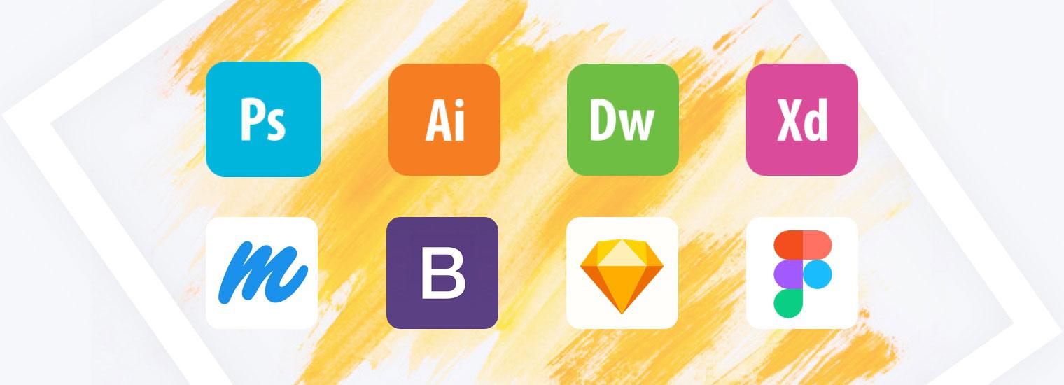
Harnessing the Right Tools and Resources for Design Success
In the journey of crafting an impactful website, the choice of tools and resources can either propel your design forward or hinder its potential. Selecting the right backgrounds and fonts is crucial, as they serve as the canvas and brush for your online masterpiece. When designers harness innovative tools, they can elevate their creativity and streamline their workflow.
Background Options: The background of your website sets the tone for the entire user experience. Consider these options:
- Solid Colors: Simple yet effective, solid colors can reflect your brand’s identity.
- Gradients: Adding depth and dimension can enhance the visual interest.
- Images: A compelling image can be the focal point of your design, creating an emotional connection with visitors.
- Patterns: Subtle patterns can add texture without overwhelming the content.
When choosing a background, remember to consider the readability of your text. Contrast is key; ensure that your font stands out against your chosen background. Tools like ColorZilla or Adobe Color can assist you in finding the perfect color combinations.
Font Selection: Typography is more than just letters; it’s the voice of your website. The right fonts can convey professionalism, creativity, or whimsy. Explore the following categories:
- Serif Fonts: Great for a classic and trustworthy feel.
- Sans-serif Fonts: Clean and modern, perfect for tech or minimalist designs.
- Script Fonts: Adds elegance, ideal for artistic or boutique brands.
- Display Fonts: Unique and bold, these can make a strong statement.
Utilizing resources like Google Fonts or Adobe Fonts can unlock a variety of typefaces to elevate your site’s aesthetics. Keep in mind that legibility and accessibility should always be prioritized. Aim for a harmonious blend of font weights and sizes to create a visually appealing hierarchy.
Essential Design Tools: The web is filled with resources that can enhance your design workflow. Here are some indispensable tools that every designer should consider:
| Tool | Purpose |
|---|---|
| Canva | Graphic design made easy for non-designers. |
| Figma | Collaborative interface design tool. |
| Unsplash | High-quality free images to enhance your background. |
| Adobe Creative Suite | Comprehensive tools for professional design needs. |
By leveraging these tools, you can streamline your design process and focus more on creativity. The synergy between the right backgrounds, fonts, and design tools can lead to not just a visually appealing website but one that resonates with your target audience.
Frequently Asked Questions (FAQ)
Q&A: The Need to Know About Background, Font, and Other Aesthetic Options When Designing a Website
Q1: Why is the aesthetic of a website so important?
A1: The aesthetic of a website is crucial because it serves as the first impression for your visitors. A visually appealing design captures attention, fosters trust, and encourages engagement. When your website looks good, it conveys professionalism and credibility, inviting users to explore further. Remember, people often judge a book by its cover; your website is no different.
Q2: How does background choice affect user experience?
A2: The background of your website sets the tone and mood for the entire user experience. It can evoke emotions, convey messages, and guide users’ focus. A well-chosen background enhances readability and complements your content, while a cluttered or distracting background can lead to confusion and frustration. Opting for a clean, cohesive background allows users to engage with your content without visual distractions and creates a memorable experience.
Q3: What role do fonts play in website design?
A3: Fonts are not just letters; they are a crucial component of your brand identity. The choice of font can communicate your brand’s personality—whether it’s modern, traditional, playful, or serious. Effective typography enhances readability, making it easier for visitors to absorb your message. By carefully selecting fonts that align with your brand and using them consistently throughout your site, you create a harmonious visual experience that resonates with your audience.
Q4: How can color schemes enhance a website’s aesthetic?
A4: Color schemes are vital in conveying emotions and messages. Different colors can evoke specific feelings—blue can instill trust, while red can create excitement. By strategically selecting a color palette that aligns with your brand and purpose, you can create a cohesive and inviting environment. Consistent use of color also aids in navigation and helps users differentiate between sections, making the overall experience more intuitive and enjoyable.
Q5: Are there any best practices for combining these aesthetic elements?
A5: Absolutely! Start by establishing a clear brand identity and ensure that your background, fonts, and color schemes align with that identity. Maintain consistency across all pages for a unified look. Use contrasting colors to improve readability and draw attention to important elements. Limit font choices to two or three styles to prevent visual chaos, and make sure your background complements your text rather than competing with it. Simple is often best; clarity and functionality should always come first.
Q6: What’s the takeaway for someone embarking on designing their website?
A6: Remember, designing your website is not just about making it look good; it’s about creating a welcoming space where your visitors feel valued and engaged. Embrace the power of aesthetic elements—backgrounds, fonts, and colors—and use them to tell your brand’s story. Trust your instincts, be bold in your choices, and let your unique personality shine through. With careful attention to these details, you can create a website that not only captivates your audience but also inspires them to take action. Your website is your digital handshake; make it memorable!
The Conclusion
In a world where first impressions are made in mere seconds, the aesthetics of your website are not just an afterthought—they are the very essence of your brand’s identity. As we’ve explored, the right combination of background, font, and other design elements can transform a simple webpage into a captivating experience that resonates with your audience.
Embrace the power of thoughtful design! Let your website reflect not only what you do but who you are. When you invest time and creativity into these details, you’re not just enhancing usability; you’re forging connections and telling your story in a way that is visually compelling and memorable.
Remember, every pixel matters, every color choice counts, and every font tells a story. So, as you embark on your design journey, harness these tools with intention and purpose. Your website is a canvas—paint it with passion, clarity, and authenticity. The world is waiting for your unique vision. Let it shine through every aesthetic choice you make, and watch as it transforms not only your website but the experience of every visitor who arrives at your digital doorstep.


New Providers
Enjoy The Speed Of Downloading & Uploading With 1GBPS Port
Affordable Dedicated Servers & Colocation Services. Services: Dedicated Servers Colocation Private Cabinet Colocation DDoS Protection
Up to 85% off hosting + website builder

Latest News
- 8+ Free Construction Templates and Page DesignsJuly 11, 2026 15
- How to Create a Graphic Design Portfolio That Gets HiresJuly 11, 2026 16
- Otter Blocks 3.2.0: AI Page Building and a New Design LibraryJuly 11, 2026 14
- 11 Best Web Hosting Services for Developers 2026July 11, 2026 18
- How to Create a Webshop: A Step-by-Step GuideJuly 10, 2026 21

We specialize in providing Web hosting reviews. Where you can search for potential hosts.